Renderosity Forums / Vue
Welcome to the Vue Forum
Forum Moderators: wheatpenny, TheBryster
Vue F.A.Q (Last Updated: 2024 Nov 26 6:57 am)
Subject: Is such a crisp look possible with Vue 6 Infinite??
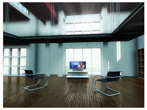
There are lots of reflective surfaces in these renders, and radiosity no doubt. I don't see why Vue wouldn't do it. It's just a question of where to place the main area lights ( in the windows), and fill lights. One thing though you won't be able to recreate in Vue is the special highligts on the back wall. This is a function within Cinema4D that is't implemented in Vue ( yet?), called environment. What it does is use an image map ( preferably HDR) and use the image in the highlights of the surface, thus recreating the illusion of a window behind the camera. Your only solutiobn in Vue would be to create a highlight function in Vue, and paint a window map in a paint program, load it in the variable highlights function. A lot more fiddling.
Also, Vue uses atmospheres for diffuse/ambient light balance. I suggest you start with a back atmosphere with no sun, no fog and no haze, and build your duffuse/ambient balance using main and fill lights.
Would be nice als to see one of your wips.
One trick is to render a scene as a huge image and then shrink it down to crisp it up. If you render normal size like I do, just sharpen the image later using a photo editor. Not by too much though.
www.youtube.com/user/ShawnDriscollCG
Remove the bump from your floor. Add lighting coming from above/behind you aimed at the scene. Brighten the shadows a bit. Move the camera up a bit so that more edges/surfaces of the furniture can be seen.
You may have to brighten the lighting outside as well. Add more reflection to the floor to bounce light under the walkways.
www.youtube.com/user/ShawnDriscollCG
Oh, right, I hadn't understood this was your work. Removing the bump from the floor is a very good idea. Also, there is a strange green-bluish ambient lighting in this scene that doesn't look right. Change the ambient colour in the atmosphere editor to a whiter colour. I think also the shadows under the mezzanine material are too dark, same for the upper level ceiling. You may want to brighten this with fill lights that cast no shadows and no speculars. More radisoity samples are needed too, use a custom photon map, and add more photons ( maybe 300000), up the tracing level, and the photon gathering levels too.
Don't forget the blue color from the transparency of the glass material if you used it for the window. Set it to black to remove the effect, or replace the glass material by a plain transparent one.
- agiel - www.linfa.net
With the latest updates, you can set the Advanced qualiity setting to as low as 30% (and yes, anything over 46% is a waste of time). It will save a ton of time and make little difference in your render. The biggest improvement to the render is setting the quality threshold slider in the AA setting to 75-80%. Go to 100% for really fine details. Don't add more subrays until you max out this slider first.
LVS - Where Learning is Fun!
http://www.lvsonline.com/index.html
The Advanced Effect Slider has has made significant improvements to my renders when it is past past 67% Problems with shadows, grain, light, water and clouds are gone when this slider is set to 100% The least benfit I see from your settings is the texture AA which I leave completely off. I would definitely use AES at 100% and up the object AA if you really want grain free renders. I strongly disagree that 46% is all that is needed.
Privacy Notice
This site uses cookies to deliver the best experience. Our own cookies make user accounts and other features possible. Third-party cookies are used to display relevant ads and to analyze how Renderosity is used. By using our site, you acknowledge that you have read and understood our Terms of Service, including our Cookie Policy and our Privacy Policy.


 This value was allready set like that. What would you recommend?


Hello I am working on a project with interior images. I am trying to achieve a real crisp and clear look like this:forums.cgsociety.org/showthread.php
My results are OK but not overwhelming.
Any advices, tricks and tips?
Cheers Oliver