orion23 opened this issue on Jun 06, 2005 · 22 posts
orion23 posted Mon, 06 June 2005 at 3:35 PM
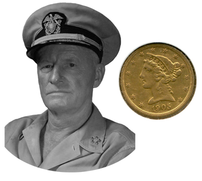
The attached photo is a jpeg of the image I'm trying to use, along with a shot of a random coin, just to show the basic look I'm trying to create. In the PSD file, the b/w portrait is already cut out and ready for whatever filtering/manipulation is required.
I've seen one tutorial for using a displacement map for doing it, but the final result didn't look realistic enough.
Any help would be greatly appreciated. I'll do the work, I just need a little advice on how to go about it.
retrocity posted Mon, 06 June 2005 at 8:26 PM
hummmm, i'm thinking towards a "bump map" of the greyscale face on a plan coin surface...
but i'm just thinking off the top of my head and offering a "quick" answer
might be able to embellish a little more later,
anybody else got ideas???
:)
retrocity

Hoofdcommissaris posted Tue, 07 June 2005 at 5:07 AM

Hoofdcommissaris posted Tue, 07 June 2005 at 5:08 AM

retrocity posted Tue, 07 June 2005 at 5:40 AM
Way cool Hoof!
a couple of tweeks and you could go into the "minting" business!
your screencaps always make it easier to understand (even if the Dutch is a "funny" language ;))
:)
scott
orion23 posted Tue, 07 June 2005 at 7:47 AM
I tried the Bump Map solution and got pretty good results. I'll also give the Render/Alpha Channel idea a shot, and see which one gives me better results. Thank you all! I'm sure one of these two ideas will do the trick.
karosnikov posted Wed, 08 June 2005 at 10:51 PM

Hoofdcommissaris posted Thu, 09 June 2005 at 12:53 AM
That looks much better than mine! Good one! I never understood that high pass thing, have to check it out...
thuffner3 posted Sun, 19 June 2005 at 3:22 PM

Thanks heaps in advance.
Neil
thuffner3 posted Sun, 19 June 2005 at 3:24 PM

Hoofdcommissaris posted Mon, 20 June 2005 at 3:36 AM

Hoofdcommissaris posted Mon, 20 June 2005 at 3:36 AM

thuffner3 posted Mon, 20 June 2005 at 6:19 AM

thuffner3 posted Mon, 20 June 2005 at 6:21 AM

thuffner3 posted Mon, 20 June 2005 at 6:28 AM
Hoof, It looks like the B/W image is the better of the two(2) The shadow on the right side of the nose is still giving me fits. Unfortunately the shadow is what gives the photo depth. I guess it's not that important for what my purposes are. As the photo is looking more and more like a woodcut all the time. I do have and image that is 9" x 7" @ 400dpi. My G-code software doesn't want to handle that on very well though. Orion, Sorry for stepping all over your message. I hope you can get as much from this as I'm getting. Thanks guys. Neil
Hoofdcommissaris posted Mon, 20 June 2005 at 6:32 AM
Mmmm. The nose needs work (just the one in the file, not her real nose of course ;-). And, I think you need to use the other version, now the face will be pressed into the coin, isn't it? I can not judge if this is a preview of the coin, or of the form the aluminium will be poured in. This looks rather acceptable, doesn't it ? The white shirt under her black sweater give the 'wrong' message, but it looks kind of royal, like she is wearing a robe with gems on it or something... I will post the nose job asap. You do not have a larger file to work from? I can try to reduce the noise that makes her skin look, well, noisy.
Hoofdcommissaris posted Mon, 20 June 2005 at 6:39 AM
Our messages crossed... you can send me your larger photo: hoof (at) cops.nl Once we have a good B/W original, you can reduce it until your app eats it.
Hoofdcommissaris posted Mon, 20 June 2005 at 8:28 AM

Hoofdcommissaris posted Mon, 20 June 2005 at 8:33 AM

thuffner3 posted Mon, 20 June 2005 at 9:16 PM

karosnikov posted Wed, 22 June 2005 at 2:09 AM
i was thinking very briefly about it, my answers were for creating one that looked good in Photoshop. Simply put high pass will reveal where contrast is. starting with the original pic, turn it into a 72 dpi image , that is about 600 pixels wide. do this useing the menu, image size. click ok, when done. save as. 72dpi.psd. ok. duplicate the background layer once. apply the filter 'highpass. to the background layer. use 3 pixel radius?. fade the layer abouve it by changing the layers opacity try 50%. go to the layers menu, i think and flatten image. paint the image area that you don't want black. i'd be interested to see how it resolves (forgive my dixlexic spelling)
karosnikov posted Wed, 22 June 2005 at 2:14 AM
when you use a high passed layer with a blending mode of hardlight, it does a verry interesting sharpening effect, depending on the stength/weakness of your filter - and opacity of the upper layer