
SeanE opened this issue on Jun 14, 2006 · 183 posts
SeanE posted Wed, 14 June 2006 at 3:19 AM
Image Resizing in the galleries is really NOT a good idea.
I want to be able to see an image fullsize straight off - not have to click again to see what it looks like properly. It looks amatuerish and shonky for a site like Rendo' to do this.
I have a couple that are desktop size and they look absolutely CRAP at the resize
Others that are 600x800-ish are ok as the difference isn't that notcieable but anything that is 1024x768 is horrible
After you get rid of the requirements for people to add their home address and phone numbers, and having to learn CSS, this should be #3 on the "TO DO" list
Sean
modus0 posted Wed, 14 June 2006 at 3:23 AM
You know, I was just about to start a thread on this, as I too dislike having to click twice to see a full-size image.
There's a reason I've turned of "image resize" in my browser, I'd much rather have to scroll than to see a pixelated shrunken image.
________________________________________________________________
If you're joking that's just cruel, but if you're being sarcastic, that's even worse.

Acadia posted Wed, 14 June 2006 at 3:26 AM
I like the option of being able to view the image smaller than it's actual size because not all computers can do the extremely high resolutions and scrolling left-right and up-down is a PITA when trying to view an image.
However, to view smaller should be the option, not have the image display small and have the option to zoom in.
I'd like to keep the ability to view smaller, but they should reverse the default.
"It is good to see ourselves as
others see us. Try as we may, we are never
able to know ourselves fully as we
are, especially the evil side of us.
This we can do only if we are not
angry with our critics but will take in good
heart whatever they might have to
say." - Ghandi
modus0 posted Wed, 14 June 2006 at 3:38 AM
Indeed, otherwise I might start rendering pictures 700x537 pixels for upload here, mostly to avoid image shrink (and "jaggies") and somewhat to protest "non-user' determined image sizing.
________________________________________________________________
If you're joking that's just cruel, but if you're being sarcastic, that's even worse.

Hawkfyr posted Wed, 14 June 2006 at 3:46 AM

For one thing, not everyone uses a high resolution on their monitors.
Also...it's because of stuff like this (Click on image)
You get the people that render HUGE for no reason.
The subject is clearly in the center of the image,and there is nothing other than that to justify such a large render.
This image could be cropped down to 600 pixels wide and you still wouldn't miss anything.
Naturally this is an extreme case, but take notice of how many people do it.
Tom
“The fact that no one understands you…Doesn’t make you an artist.”
Acadia posted Wed, 14 June 2006 at 6:18 AM
Geez, hawk and I are in agreement, LOL Did Hell freeze over!? :b_stunned:
"It is good to see ourselves as
others see us. Try as we may, we are never
able to know ourselves fully as we
are, especially the evil side of us.
This we can do only if we are not
angry with our critics but will take in good
heart whatever they might have to
say." - Ghandi
modus0 posted Wed, 14 June 2006 at 7:26 AM
Yeah, I agree on that too, I try to remove as much "empty" space from images I post here as possible, though I rarely crop when there's a full scene.
Hmmm... Maybe an option for the person uploading a picture to resize the image could be worked out? Or would that not get used?
________________________________________________________________
If you're joking that's just cruel, but if you're being sarcastic, that's even worse.

tainted_heart posted Wed, 14 June 2006 at 8:36 AM
I find the resizing algorithm to be horrendous! Most images end up badly aliased. What a poor impression the jagged, reduced image will leave on a viewer, many of whom will not take the time to zoom...especially if they are on dialup or a slow connection.
I have been satisfied with most of the changes involved with this conversion and certainly appreciate the hard work that went into completing it. However, this is a terrible way for an art site to showcase it's members work! The interim reduced image needs to go or the reduction algorithm needs to be vastly improved to show the image with the same quality as the full size version!
It's all fun and games...
Until the flying monkeys attack!!!

williamsn posted Wed, 14 June 2006 at 10:00 AM
There is no resizing algorithm in the gallery software. You are viewing the full-size image, but your browser has been instructed to display it at a smaller width. If you are seeing jagged edges, you might investigate the resizing algorithm of your browser. Last night all the images I looked at in Safari, Firefox (Mac and WIndows), and Internet Explorer (IE) looked absolutely fabulous. It might also be a problem with your screen depth settings (16-bit, 32-bit, etc). Just a suggestion. But we aren't resizing. Your browser is. N
-Nicholas
modus0 posted Wed, 14 June 2006 at 10:23 AM
Unh-uh, I've disabled image resizing in my browser, so I know it's not the browser doing the resized.
And if that were the case, the galleries wouldn't have a link titled "zoom in" and wouldn't open a new window with a "zoom out" link
I'm also viewing at 1280x1024, yet every image in the galleries is sized to a max width of 700 pixels. Height seems to vary some, but not much.
So trying to claim it's "our fault", like the slowness of the new forums (which wasn't our fault in the end, but a problem in the code) isn't going to fly for those who've figured out more than just the basic functionings of their browser of choice.
Of course, that's if the galleries open for me, which they've decided to stop doing in the last few minutes.
________________________________________________________________
If you're joking that's just cruel, but if you're being sarcastic, that's even worse.

cliff-dweller posted Wed, 14 June 2006 at 10:25 AM
williamsn wrote:
Quote - But we aren't resizing. Your browser is. N
:b_rolleyes: I'm trying to keep a positive attitude as these changes are being made, but please...you seem to be reacting pretty defensively to this point. The new Rendo coding is telling the browser to resize the image.
I personally have to agree that it's a bad idea to be resizing these images. This isn't a picture of a lamp or vacuum cleaner that someone is going to buy at an online store...it's people's artwork we're talking about...that's what this site is about...artwork, and 2 out of 3 viewers will not click the "zoom" button, so they'll see a version of the image that was NOT the artist's vision.
It's just wrong...sorry.
p.s. someone commented that they liked the zoom feature because they like to get a closer look at some of the details of an image...this seems to be a misunderstanding...the zoom button does not really make the artist's image bigger...it simply restores the image to the original size.
Check out my full gallery at Cliff-Dweller Artworks
williamsn posted Wed, 14 June 2006 at 11:09 AM
My mis-type. Yes, WE are the ones instructing your browser to display the image smaller. What I meant was, we aren't the ones actually doing the physical scaling. When we set, it is left up to the browser how to handle the scaling. However, when viewed in Safari, Firefox (on both Mac and Windows), and Internet Explorer (on Windows) with 32-bit color depth settings on our machines (pretty standard among most machines), we are not seeing the jaggedness that you describe. A screenshot would be very helpful. In order to keep within the size restraints of the forums, please crop the image rather than resizing it so that the resizing won't affect the jagged effect you are describing. Attach it here and I will do what I can. N
-Nicholas

Giolon posted Wed, 14 June 2006 at 11:21 AM
Williamsn, for an example, take a look at my newest upload:
http://excalibur.renderosity.com/mod/gallery/index.php?image_id=1237827
Look at how horribly aliased the shrunken version is (my first comment is even about that, and the blame was assigned to me instead of your new gallery format). Now click on it and see how it all goes away, b/c it's not there in the originally uploaded image. However, it's very bad that the first impression that viewers get of our artwork is one that's been mangled through HTML shrinking routines.
In case you are seeing a beautifully anti-aliased shrunken image on some magic uber browser you have, let me show you what I'm seeing in IE 6, 7 and Firefox. These are unaltered screencaps of what shows up in the shrunken version versus the "zoomed" image that displays when you click. The only editing on this screencaps is cropping to keep the file size small. Notice all the jagginess around the legs in the shrunken version. This occurs over the entire image in my browsers, and apparently at least one of my viewer's browser (look at the first comment on my image above).
Shrunken version vs "Zoomed" Original version
I would suggest allowing a "Shrink to Fit" option (defaulted to off) for people who want it, and know that they are degrading the quality of the images they are seeing. However, to force that upon all images by default is pretty inconsiderate of the artists.
¤~ RadiantCG ~¤~ My Renderosity Gallery ~¤
TerraDreamer posted Wed, 14 June 2006 at 11:28 AM

http://excalibur.renderosity.com/mod/gallery/index.php?image_id=1235392
Look at the jaggies my my signature, as well as on the petals of the lilly.
Terranuts.com does the very same thing. The image resizing by whatever gallery software he's using also does a poor job at resizing. As a matter of fact, I've yet to find a PHP gallery that does a good job at it.
modus0 posted Wed, 14 June 2006 at 11:39 AM
Attached Link: Complete image

Being reduced in size by 300x300 pixels doesn't make it look very good to me.
________________________________________________________________
If you're joking that's just cruel, but if you're being sarcastic, that's even worse.
Doc000 posted Wed, 14 June 2006 at 11:40 AM
Why resize the images at all? Telling the browser to resize an image with html accomplishes nothing because the file size is still the same. I'm on dial-up and a half meg image at 1024x768 takes just as long to load as a half meg image at 640x480. Resizing via html doesn't increase the speed...it just butchers the image and makes it look horrible. Now, if the software actually resized and resampled the image and reduced the file size, that might be a different story and useful to some. But, all that's happening is people are getting irritated looking at bad images and being forced to click once again just to see a piece the way the creator intended for it to be displayed.
HTML resizing = bad idea
If you insist in keeping this "feature", I suggest giving people the option to turn it off.
cliff-dweller posted Wed, 14 June 2006 at 11:42 AM
Giolon & TerraDreamer, those are both great examples of what's happening...I've noticed it several times looking through the galleries myself and have seen a couple other viewers making comments about the aliasing problem, not understanding that it's not the artist's fault...really a shame to have it this way...
Check out my full gallery at Cliff-Dweller Artworks

SkoolDaze posted Wed, 14 June 2006 at 12:06 PM
I am not one to complain about much, but if you take a really good look through the galleries, you will see the issue people are having with the forced scaling of the images to a max width of 700.
And while you are correct that most of the images look fine with the reduced image size, some are just looking downright horrible. For example, my latest image looks fine when clicked into http://excalibur.renderosity.com/mod/gallery/index.php?image_id=1237532 but when this image is viewed when I click "my summary" the reduction for this image looks horrid. Also, when you click into this image http://excalibur.renderosity.com/mod/gallery/index.php?image_id=1222048 , the reduction is distorting the image badly and the only recourse is to click into the larger image to see it without distortion. I am using the latest versions of several browser using state of the art tech on my system and do not have these issues at other online galleries.
I dont mind the resizing as much as I don't like the quality of the resized image.
For years I have used Renderosity as an online portfolio reference as I am slow to update my personal website. I may have to reconsider this option until this issue is addressed.
~
On a more positive note...
I was a bit skeptical when these new galleries came online but you guys have done a tremendous job of listening and reconciling issues as they were presented from the community. I am really beginning to like how these new galleries are shaping up :) Overall you guys did a great job with this!
thanks for your time
williamsn posted Wed, 14 June 2006 at 12:11 PM

-Nicholas
williamsn posted Wed, 14 June 2006 at 12:12 PM

-Nicholas
modus0 posted Wed, 14 June 2006 at 12:25 PM

I'd just like to note, the sample I posted was what I saw after clicking on the image thumbnail, it hasn't been resized at all by me, the jagged look in the skirt hem is what I see when opening the image in the new gallery setup.
Here's another, no resizing on my end, just what the site software has done. The hair strands especially are horrible looking.
I guess from now on, any image I post to the Renderosity galleries will be 700 pixels wide, maybe less, so people don't have to worry about clicking another button to zoom in.
________________________________________________________________
If you're joking that's just cruel, but if you're being sarcastic, that's even worse.
Giolon posted Wed, 14 June 2006 at 12:26 PM
Williamsn, are you looking at the zoomed in images and saying they're fine? B/c on my screen, on the dragon image linked in Modus0's original post, the non-zoomed image, the girls legs are all jaggy b/c of the HTML shrinkage routines. Yes, if you open up the zoomed image it looks great, nice anti-aliased, no problems. But the issues is that people see the crappy mangled version first and often won't click to see the correct version. Take a look at the screencaps I posted to show you how these things are showing up for people.
As another poster mentioned, it serves little purpose to force images down to 700px b/c you're not actually saving any bandwidth. The image file size stays the same, you're just telling the browser to display it in an ugly fashion.
¤~ RadiantCG ~¤~ My Renderosity Gallery ~¤
tainted_heart posted Wed, 14 June 2006 at 12:27 PM
Attached Link: Inspire Me

I'm using IE, my color depth is set to 32 bit, and My screen resolution is set to 1024 x 768, and I don't have Automatic Image Resizing set.
Here's a screenshot for an example, the image is Insprie Me by As Shanim. I cropped it to a width of 441 pxels. The effect is most obvious along her legs, but the "jaggies" can also be seen along the vest, her headband, her back, and even in the hair. This is very different from what you would see if you zoom the image. The resized image looks horrible. This is a prime example of why resizing should either be an individual option or not be done at all.
It's all fun and games...
Until the flying monkeys attack!!!

superza posted Wed, 14 June 2006 at 12:30 PM
HI Gang i agree about the two thumbs is not a Great idea.
We are forced to pass to an intermediate thumbnail of about 700*500 pixel that resizes image in a very Bad way, i dont' think is the browser, in the html page the width of 700 is a value forced by the web site.
For example look at that link, is my last render automatic resize
http://excalibur.renderosity.com/mod/gallery/index.php?image_id=1235042
The 700500 automatic resize is really Bad, looks like with noise added respect to the full screen image!!*
It is it possible modify that value via the CSS Stiles??
HAve a nice day
MAX :)

Miss Nancy posted Wed, 14 June 2006 at 12:32 PM
I wonder if it is a drain on system resources to have those extra code lines, e.g. the line(s) to instruct the browser to resize. I am guessing there is no way to add lines to instruct the browser to display the jpeg image at higher compression (lower quality), nor is there a way to recompress the image on upload to the gallery, but if there is a way, I reckon that might also be a drain on system resources. however, I have noticed problems with various gallery software in that there's a limit to the number of images before the system starts to slow down severely. here it appears to be around 20,000 or 30,000, whereas with others it's more like 5,000 to 7,000.
tainted_heart posted Wed, 14 June 2006 at 12:39 PM
Attached Link: Surang, a hell of a girl

I don't know what browser you're using, but I think the point is many others are not seeing what you claim to be seeing when we look at the resized image. The zoomed images are fine, but many of the resized images look horrible and we have given you examples.
Here's another prime example. Look at the jaggies along the outline of the girl. I'm sure this artist never intended her work to be seen in this condition. It's all well and good for you to sit there and say, "well it's not happening for me"...but it is happening for many others and changing our browsers is not a solution.
It's all fun and games...
Until the flying monkeys attack!!!
williamsn posted Wed, 14 June 2006 at 12:44 PM
Quote - Williamsn, are you looking at the zoomed in images and saying they're fine?
Nope. If you look closely at the bottom of one of the images, you will see the buttons for adding artist to favorites, etc. Those aren't screenshots of the images zoomed-in. Those are screenshots as the images in the same state that you are seeing jagged edges. > Quote - I don't know what browser you're using...
I'm using Safari, Firefox and IE and getting the same result on all of them.
-Nicholas
SkoolDaze posted Wed, 14 June 2006 at 12:46 PM
Please take an objective stance when it comes to this issue. I have been doing application development for over 15 years now and I have been guilty more than once of jumping to the conclusion that everything looks good on my computer, so there must be something wrong with yours.
I have learned through the years that this is not only condesending <sp?> to the person who is trying to tell you about an issue, but it is shortsighted as well. Just because all is right with your machine, doesn't mean all is right with the world. There is an issue here whether or not you want to recognize it as such. I have gone to several different machines now, with different hardware configurations, with several different browsers and this issue is repeatable. The only platform I have not been able to view this issue on is a Mac.
It could be there is something different about your machines or the machines where you are located that allow distortion free browser resizing without an algorithm. Because as far as I know, whenever the browser resizes an image, there is always the possibility for distortion.
thanks again for your time
tainted_heart posted Wed, 14 June 2006 at 12:50 PM
Quote - I'm using Safari, Firefox and IE and getting the same result on all of them.
I can't imaging how you are getting the same result on IE. Aside from the fact that I have a screen resolution of 1024x768 my other settings are probably the same as yours and I've shown you what I see. We've shown you we this is a problem for many of us, the question is what will be done to resolve it?
It's all fun and games...
Until the flying monkeys attack!!!
Giolon posted Wed, 14 June 2006 at 12:57 PM
Bingo! There it is right there. SkoolDaze picked it out. Look at willamsn's signature: "I <3 MY MAC". I'll bet that's what he's viewing these galleries on. Mac vs. Windows aside, I'll bet that all of us seeing this issue are using Windows. However, saying "switch to mac!" is not a valid solution.
Find a PC and look at the examples provided,williamsn. I'm sure you'll see the issue that we all are.
¤~ RadiantCG ~¤~ My Renderosity Gallery ~¤
Giolon posted Wed, 14 June 2006 at 1:21 PM
I was instructed to keep discussion to the same thread, so that nothing is missed. In that interest, bringing over from my other thread "RE: FAQ and info on the New Galleries":
Quote - StaceyG Q. Why are you resizing images?
A. There is no resizing algorithm in the gallery software. You are viewing the full-size image, we have instructed your browser to display it at a smaller width. If you are seeing jagged edges, you might investigate the resizing algorithm of your browser. Last night all the images we looked at in Safari, Firefox (Mac and WIndows), and Internet Explorer (Windows) looked absolutely fabulous.
It might also be a problem with your screen depth settings (16-bit, 32-bit, etc).
Just a suggestion. But we aren't resizing. Your browser is.
This is quite misguided. First of all, telling users to somehow "replace" the resizing algorithm used by their browsers is just downright comical. AFAIK, there isn't even a way to do this. If there is, I'd like to see the method of doing so provided. How many people would really go through that rigamarole and instead just remain unaware of it and look at the jaggy images thinking its the artist's fault?
Please take a look around thread. Some of us have posted screenshots of what we are seeing with the gallery's forced downsizing of images.
I am using WinXP SP2 using 32-bit color depth and a desktop resolution of 1280x1024, and I've checked in IE 6, 7, and Firefox on all with the browsers' "Automatic Image Resizing" turned OFF. Your galleries are adding "width=700" to the tags in the galleries and it is causing browsers to shrink the images with horrible distortion and compression causing artifacts such as jagginess. Telling people to switch browsers is not a solution (especially since I've tried several and all have the same issue).
Quoting from the general gallery feedback thread:
Quote - svdlI definitely DO NOT like the resizing of the images. Too much quality loss, and the fixed format does not take into account that higher resolution screens like 1280x1024, 1600x900 or even more are getting more common everyday. User options to select whether you want to see large images resized to a predefined screen size, or to view them as uploaded would be so much better. Take a look at how the Renderotica gallery software works if you want to know how it should be done.
That is an absolutely fantastic idea, svdl. The way that Renderotica does it is pretty much perfect, IMO. The option is in plain sight and visible so that people will see it, and it lets you know that the images you're looking at may have been shrunk (just as poorly over there as they are here I might add) to fit the screen. This makes the option to turn it on or off available and informative.
¤~ RadiantCG ~¤~ My Renderosity Gallery ~¤
SkoolDaze posted Wed, 14 June 2006 at 1:28 PM
Attached Link: Image Comparison
fyi...This is a direct screen cap of the image both zoomed in and out at the same time. It may be a bit large, but it does show the issue on my system.
Browser: IE6 SP2
HW Platform: PC
OS Platform: Windows XP Media Center Edition
Graphics: GeForce Go 7900 GTX 512MB (32bit Color)
Resolution: 1920X1200
Again, this was duplicated on WinXP Pro, Windows 2000 and Windows 98 using Netscape, IE5, IE6 and Firefox at varying resolutions and color depth.
thanks
SkoolDaze posted Wed, 14 June 2006 at 1:52 PM
I just wanted to add...
This issue is the same on my laptop, which is 3 months old as is on my desktop PC which is almost 3 years old. I also want to reiterate that I have galleries all over the internet and have not seen this type of distortion when they resize an image for display purposes. And by restricting the width to 700, you are resizing the image.
And as far as I know, there is no way to set options for an image resizing algorithm within a browser and even if there is, this would seem to be a bit much to ask of someone who is browsing your site to modify browser settings from the standard just to view images as they were intended to be viewed.

Sinamin posted Wed, 14 June 2006 at 1:56 PM
Quote - This one looks nice and smooth too but I'm afraid changing the image quality to fit the forums max filesize might have degraded it. We'll see. Edit: Yep, still looks great, even after downing the image quality to fit it into the forums.
Hon...your next trip outside the building should be to an eye doctor. If you can't see the extreme jaggies on her legs and outfit and your eyes are fine, you need to calibrate your monitor.
What irritates me is that there are MANY people saying this is an issue and you chime in that everything is fine on YOUR computer. Good for you! We're delighted.
However, professional designers/programmers/coders know that they must design to meet the needs of the MAJORITY of viewers. Clearly, you have failed to do that with limiting image size to 700.
If this isn't going to be fixed, just say so and limit our image sizes to 700 x 500. Or, just ignore our issue and keep telling us that it MUST be our computer since you can see it fine.
It's this type of response from admin that is an insult to our intelligence.
sinning every minute is an art form

bazze posted Wed, 14 June 2006 at 3:12 PM
please get rid of the image resizing!
www.colacola.se
superza posted Wed, 14 June 2006 at 3:19 PM
Quote - However, professional designers/programmers/coders know that they must design to meet the needs of the MAJORITY of viewers. Clearly, you have failed to do that with limiting image size to 700.
If this isn't going to be fixed, just say so and limit our image sizes to 700 x 500. Or, just ignore our issue and keep telling us that it MUST be our computer since you can see it fine.
You keep the right focus..
Full Quote!
Khai posted Wed, 14 June 2006 at 3:37 PM
http://www.hometrainingtools.com/tbimages/12192.lg.jpg try here ;)
Sinamin posted Wed, 14 June 2006 at 3:55 PM
cliff-dweller posted Wed, 14 June 2006 at 4:26 PM
sinamin2001 wrote:
Quote - What irritates me is that there are MANY people saying this is an issue and you chime in that everything is fine on YOUR computer. Good for you! We're delighted.
This drives me crazy, too! We were hearing this when many were talking about the poor site speed ("site speed is fine here" they'd say), now we're hearing it again on this issue. I do wonder whether anyone actually listens to themselves when they say things like "you might investigate the resizing algorithm of your browser" as a solution to what I guess they consider to be "our" problem.
I also wonder how many of the tech people & decision-makers actually create any of their own artwork...I'm sure some must, but I don't understand how they can be so dismissive of an issue that so directly affects the way artwork is present here, a site dedicated to art. {shakes head}
Check out my full gallery at Cliff-Dweller Artworks
Giolon posted Wed, 14 June 2006 at 9:49 PM
I feel like this thread is getting a little hostile. The admins are going to stop responding to it and dismiss our problems as those of trolls. :(
¤~ RadiantCG ~¤~ My Renderosity Gallery ~¤

Shardz posted Wed, 14 June 2006 at 10:07 PM
Business as usual from my standpoint. It's all about Options and the fact that we always end up screaming for them for months before we see them, if at all. I do appreciate the "Open New Window" option, but doesn't it contradict itself when we have to literally open a new window to see the original version of the image??
I was really shocked when I first viewed my new gallery as I mostly post at 1600x1200, and the "preview" images look horrible and unprofessional, to say the least. So, if trying to hack PHP to get our color preferences back isn't bad enough, now you have us writing in C++ to fix our browsers? LOL :blink: Wow!
I also think the "Delete Gallery" link should not be so readily accessible in the gallery page, and should also be an...[Oh, oh, here we go again with the "O" word] OPTION. It's all about options, customization, and ergonomics. Now I am seeing this flaoting popup window upon hovering over any thumbnail, and the background color almost matches the text color exactly. I have no idea in the code what that item is or how to fix it.
I understand there will be growing pains in this huge process of conversion, but denial isn't really helping anyone here, especially with the dramatic scope of change that has thrown most of us in shock already.
If anyone cares, my gallery is a pretty good example of what the word butchery defines. Many people won't bother to "Zoom" to see the real deal, and I think it's sad. This is the only site I know of that requires a BA in Computer Science just to operate and navigate comfortably.
Between hacking PHP script and coding in C++, I might as well give Nuclear Physics a shot next. Let's please put the broom away and solve some problems as there seem to be no shortage of those around here.

ramhernan posted Wed, 14 June 2006 at 10:21 PM
Hummm i fear that this problem is more general than the admins side can see due some special hardware/software configuration. but if i see this one as a visitor

I think that i would't waste my time to zoom it in the confidence that is the same image quality and just bigger size.
i dont think either that the vast majority of the 400K active members in rosity would even care to click the zoom option when an image looks like that.
As a programmer myself i understand that if the users telling me that something is not nice, then something is not nice even if i feel that is the 8th earth marvel.
I'm certain that this issue will be solved real soon, Rosity tends to listen at the end. :)
moving the right menu bar to the left, let enough room to let the image grow beyond the screen limits.
Cheers
Ramón
PD. sorry, i'm not shure but i think that to resize an image you must resample it in order to get rid of the problem, i do this always i insert an image in a web page and i need to resize it, not shure if this is the same issue.
If it looks as mere real life, then it don't worth the effort.
TerraDreamer posted Wed, 14 June 2006 at 10:28 PM
Quote - I was really shocked when I first viewed my new gallery as I mostly post at 1600x1200, and the "preview" images look horrible and unprofessional, to say the least. So, if trying to hack PHP to get our color preferences back isn't bad enough, now you have us writing in C++ to fix our browsers? LOL :blink: Wow!
You're imagining things. According to williamsn, everything is fine.
Quote - If anyone cares, my gallery is a pretty good example of what the word butchery defines. Many people won't bother to "Zoom" to see the real deal, and I think it's sad. This is the only site I know of that requires a BA in Computer Science just to operate and navigate comfortably.
I just tried to visit your gallery. When I click on the link to it from your home page, it takes me to the All and All new images, not your gallery. Everything is completely trashed on this site.
Miss Nancy posted Wed, 14 June 2006 at 10:28 PM
although i couldn't access the galleries in safari, I was able to access them in exploder (OS X). I can confirm nic's findings: the resized images are as smooth as the full-size images in OS X, due to what they call "sub-pixel rendering". more primitive systems (OS 9 and XP, which was based on OS 8 and 9) do indeed show the jagged resizing artifacts. however, vista will also have sub-pixel rendering, hence I daresay it's only a few more months' wait (until mar '07) and perhaps these resizing issues will be a thing of the past. :lol: seriously, though, if only 3% of clients can see smooth resized images, I reckon one must give in to the inevitable, especially as it appears to be the same load on the server whether the resized or full-sized image is brought up. perhaps the idea behind the resizing was to let somebody decide if they wanna load really huge images, but I think they can tell if they wanna load 'em just based on the thumb image.

Incarnadine posted Wed, 14 June 2006 at 10:50 PM
give us the option please!
Richard
Pass no temptation lightly by, for one never knows when it may pass again!
cliff-dweller posted Wed, 14 June 2006 at 10:52 PM
Miss Nancy wrote:
Quote - if only 3% of clients can see smooth resized images, I reckon one must give in to the inevitable, especially as it appears to be the same load on the server whether the resized or full-sized image is brought up. perhaps the idea behind the resizing was to let somebody decide if they wanna load really huge images, but I think they can tell if they wanna load 'em just based on the thumb image.
Gosh, I hope you're right and this will get changed very, very soon.
I actually think, and I really don't mean this to be disrespectful at all, that there is a tendancy for web designers to want to "keep control" of the way a website they've designed looks. I think this priciple is taught in school, and I understand it because, to them, these website designs are their own "artwork." So allowing images to be 700px or 900px or 1250px or whatever # of pixels wide will change the way the page looks...and control is lost. I just think the "cost" of keeping that controlled width of 700px is just too steep due to the effect it has on the artwork.
It's supposed to be all about the artwork.
Check out my full gallery at Cliff-Dweller Artworks
ThePinkus posted Thu, 15 June 2006 at 2:30 AM
Just to add another guy's opinion: resized images are horrible, and they would be just hugly if they were resized smoothly (which isn't the case anyway) -- as I've already clicked a thumb, I do not want to see another one, I want to see the real picture!
The best way to handle this? The Renderotica's way, as was already pointed out (and over there, of course, I have "original size" as default ;)! )
Second: let me second (he he!) Shardz -- take away that "delete gallery" (at least hide it well and then ask for confirmation a dozen time, not that I checked if confirmation is aready implemented ;) ), I was chilled to the bones when I realized my pointer was quitely resting on it, fingers on mouse buttons and all (BTW I just have this f§#!ing low-cost mouse with too light buttons and the mere finger's wheight can produce a click if I relax to much... just to explain my thrill ;^) )
Then finally I think due to mention it appears You're otherwise doing a HUGE and fine job (though it seems I can't acces the galleries at all presently... but I guess this is the warming up process ;)! )
Regards,
Stefano
tainted_heart posted Thu, 15 June 2006 at 5:16 AM
Quote - perhaps the idea behind the resizing was to let somebody decide if they wanna load really huge images, but I think they can tell if they wanna load 'em just based on the thumb image.
It makes no difference, the full image is being loaded, the gallery software is just forcing the image to be displayed at a smaller size. It is utter nonsense to treat a gallery image the same way they treat an image in a forum.
It's all fun and games...
Until the flying monkeys attack!!!
PJF posted Thu, 15 June 2006 at 5:39 AM
Just before the shut down yesterday I came up with a CSS solution to the auto 700 pixel width (image resizing) thing. Once the galleries are back up and I've finished work, I'll post the result.

urbanarmitage posted Thu, 15 June 2006 at 5:45 AM
Well, if I could get into the galleries right now I'd post screenies but ... :)
Take a look at my 'African Skies 6' submission. Look closely at the moon and you will see that it is terribly 'jaggy' on the image that comes up when you click the thumbnail. The moon doesn't even look round any more. If you then view it at original size it looks exactly the way it was supposed to.
I use Windows XP, IE 6, and image resizing is most definately switched off (that 'feature' drives me absolutely batty!)
williamsn there is definately a problem for more than just a few of us. We're not all just smoking our socks. :)

3dvice posted Thu, 15 June 2006 at 6:27 AM
The resizing thing is an offense to the artwork and artists. There's neither benefit for the site performance, nor for the artwork! To set the width attribute to 700px is just to protect the site layout/design. So it seems, the site design is more important than the content/artwork displayed! ??? I wouldn't mind down-scaling and another click, if the quality would be okay, but in fact it is not. I'd rather prefer to delete my gallery images and upload images not wider than 700px, than have them displayed in such bad and ragged quality.
Le cinéma substitue à notre regard un monde qui s'accorde à nos désirs. - André Bazin
tainted_heart posted Thu, 15 June 2006 at 6:53 AM
Quote - The resizing thing is an offense to the artwork and artists. There's neither benefit for the site performance, nor for the artwork! To set the width attribute to 700px is just to protect the site layout/design. So it seems, the site design is more important than the content/artwork displayed! ???
I have to agree. The art should be paramount in the gallery and the gallery layout should be designed to display the art at the highest quality.
It's all fun and games...
Until the flying monkeys attack!!!
urbanarmitage posted Thu, 15 June 2006 at 7:15 AM


TallPockets posted Thu, 15 June 2006 at 7:54 AM
WILLIAMSN: Hello. You are the site administrator? It amazes me, sir, that you give such a deaf ear and little, if any, real creedence to opinions offered by all above. Some are qualified programmers, as well. Yet, you seem to easily disregard, without much respect even, their credibilities.
I also read numerous artists above commenting on what 'they' see on their monitor screens. I have the same problem(s) mentioned by those above.
I ran a few businesses in my day and LORD knows I sure am not the brightest bulb in the room, but my eyes see what they see, as do many, many others above. It boggles the mind how you can readily dismiss all commentaries above, my good man.
Your P.R./public relations skills lack mightily, from my humble perspective, sir. If you are the 'face' of renderosity, I suggest they can do better.
Just one person's simple thoughts.
With all due respect, TallPockets.
superza posted Thu, 15 June 2006 at 8:34 AM
Quote - Just before the shut down yesterday I came up with a CSS solution to the auto 700 pixel width (image resizing) thing. Once the galleries are back up and I've finished work, I'll post the result.
Hi have you any news about your CSS test?
I was triyng too trick with css style but without any result on the 700 pixel limitation issue
TerraDreamer posted Thu, 15 June 2006 at 9:10 AM
Quote - Q. Why are you resizing images?
A. There is no resizing algorithm in the gallery software. You are viewing the full-size image, we have instructed your browser to display it at a smaller width. If you are seeing jagged edges, you might investigate the resizing algorithm of your browser. Last night all the images we looked at in Safari, Firefox (Mac and WIndows), and Internet Explorer (Windows) looked absolutely fabulous.
It might also be a problem with your screen depth settings (16-bit, 32-bit, etc).
Just a suggestion. But we aren't resizing. Your browser is.
@Stacey: This information is incorrect. It's obvious these are the words of one extremely naive williamsn. We already know the issue is with Windows or earlier versions of the Mac OS. Please do members here a favor by removing the above from your gallery FAQ sticky. It is disinformation at its finest; never mind the fact that it's an outright lie, and will only cause confusion.
ThePinkus posted Thu, 15 June 2006 at 9:32 AM
Well... I think we could recognize one side of this matter which is not so bad, that is, given that the downloaded images are actually at the original size, we can save them directly from the picture page (no need to display the "zoomed", aka un-resized, for this) -- the resulting image will be the original one that we can then display with our preferred software just the way we like (at least IE works this way)!
Not that I changed my mind though, I'd still prefer to see the original in the browser in the first place...
But this is presently a better way than the "zoomed" one, IM(very own)O.
Regards,
Stefano
bazze posted Thu, 15 June 2006 at 9:49 AM
I don't like the resize-thing but understand the purpose from Rendos view.
Making the browser resize the image is a poor solution (52 reasons why already stated in this thread).
BUT - if you decide to stick with it then please take a look at how CG-talk has solved the resize issue. The resized images at CG-talk look great (their forum software/server resizes the images and not the visitors browser).
www.colacola.se

cherokee69 posted Thu, 15 June 2006 at 10:12 AM
Quote - BUT - if you decide to stick with it then please take a look at how CG-talk has solved the resize issue. The resized images at CG-talk look great (their forum software/server resizes the images and not the visitors browser).
Rosity considers the way they are doing it to be the right way and everyone else that's doing it correctly is wrong. Haven't you realized that already..LOL

StaceyG posted Thu, 15 June 2006 at 10:56 AM
I will get with the programmers to discuss this please just be patient and I'll see what I can do
Thanks
3dvice posted Thu, 15 June 2006 at 12:56 PM
Just a proposal: Example for proper anti-aliased rescaling with PHP and the GD library 2.x ------------- code example ------------------------------ $source = ImageCreateFromJPEG('test.jpg'); $width = ImageSx($source); $height = ImageSy($source); $x = $width/1.5; $y = $height/1.5; $destination = ImageCreateTrueColor($x,$y); ImageCopyResampled($destination,$source,0,0,0,0,$x,$y,$width,$height); header('Content-Type: image/jpeg'); ImageJPEG($destination,'',100); -------------- end code example ------------------------- No ragged edges here! plus a benefit for slow dial-up connections (smaller filesize) No need for bad quality rescaling in the browser with the width attribute of the image tag in HTML or CSS!
Le cinéma substitue à notre regard un monde qui s'accorde à nos désirs. - André Bazin
StaceyG posted Thu, 15 June 2006 at 1:29 PM
Okay here is the downlow on this issue. The programmers are going to run a script that will be retroactive and for future images that our software will resize the image during upload. The full image will be the same size, just no way around this because of the tables but they will be clear good quality images and of course you will still be able to click the zoom to see it at full size. But the good news it they will run the script (that may take a day or two) going back through all images to fix and all going forward. Hope I explained this right, LOL.
Oh and the ebot issue has been resolved today.
williamsn posted Thu, 15 June 2006 at 1:36 PM
3dvice, What Stacey is saying is that we're going to be using a [very similar] script like the one you posted. It will benefit people on dial-up, not blow up the page design, and keep the jagged edges from appearing. You may see some weird things happening with your images in the next day or two as things get changed. It will all be okay. Just be patient  , N
, N
-Nicholas
3dvice posted Thu, 15 June 2006 at 1:43 PM
Thanks, Stacey that's good news! :)
Le cinéma substitue à notre regard un monde qui s'accorde à nos désirs. - André Bazin
3dvice posted Thu, 15 June 2006 at 1:46 PM
Thanks Nicholas! Good news, very good news! :D
Le cinéma substitue à notre regard un monde qui s'accorde à nos désirs. - André Bazin
PJF posted Thu, 15 June 2006 at 2:03 PM
LOL, well I guess this makes a CSS fix redundant. I'd just finished it off, too.
Now that the 700 pixel dimension is being hardcoded for the gallery presentation page and I can't offer a user-choice solution (via CSS), I'll chime in with my moan:
Forcing art to fit the arbitrary design of a web page is appalling - the fact that it is happening demonstrates that the owners of Renderosity don't really understand the nature of their user base. The fact that the "solution" is to reduce the (unforseen) 'mechanical' harm of the page design demonstrates that the owners don't know how to listen - or just don't care.
Having a uniform page presentation for every piece of work in every gallery is more important than the protests of the artists producing the work. The uniform page presentation serves no purpose other than satisfying some administrator's notion of what looks good.
I'm finding it all rather sad.
Miss Nancy posted Thu, 15 June 2006 at 2:27 PM
there are any number of resizing algorithms (bicubic, bilinear, nearest neighbour et al.) some of which are better than others, depending on the jpeg content. the same is true for gif resizing, but I reckon very few users are uploading gifs. however, the machine will likely use the same algorithm for all images, hence we can expect that some will be resized in a way that may degrade the image. e.g. bicubic is usually good to preserve the smooth gradients of a poser jpeg, but bilinear is often better to preserve sharp lines of a drawing. in any case, this may tend to slow things down, but I don't have any experience with a server doing resize on upload. the other detail (recompressing the jpeg on upload) will cause the dreaded "jpeg artifacts" to appear, hence I suspect y'all won't be recompressing them on upload.
ThePinkus posted Thu, 15 June 2006 at 2:29 PM
Hmmm... is this going to be THE solution?
I've hoped for options... to me the problem is the resizing itself (of course it's better if it's well done, but this gets me halfway to where I'd like to be... well less than half-way, truly, one step forward and one backward, I dare say...).
Yep! We'll see a better preview (but then, wasn't there a thumb already? A thumb already clicked upon?)...
Yep! We'll save bandwidth... or not?... Well not if one is looking for the true picture, for, if this is the case, we are going to waste bandwidth (as we are downloading an intermediate unneeded something!)! (and this yields slow-down of the service, am I wrong?)
To tell the truth, I'd rather prefer the present situation -- low quality display of the true picture, rather then hi-quality display of a reduced version faking what I'm looking for! Presently I can save the real picture directly (or eventually "zoom in" without further load on the connection), while if this solution is going to happen I would have to download the picture after a completely unuseful intermediate step...
Sorry, but I don't like this solution, though I realize the site would be better looking this way... and yet I still think the first priority should be the pictures have to look good!
OK, but maybe I'm not among the majority... but then again options could satisfy almost anyone of us!
Alas!, easy to guess implementing options is harder work... and full-sized display of the pictures would hardly fit into the new layout...
But can You at least leave us the option among "server resized" vs "browser resized" (I would choose the second on my part, but the first could be a more likely default perhaps...)?
Let me conclude with a big "Thank You!" for Your unfailing attention to our unfailing needs ;^)!
Regards,
Stefano
ThePinkus posted Thu, 15 June 2006 at 2:38 PM
PS just reading PJF's post... that would be THE solution to me!
I really wonder why having all the pain of producing that bunch of resized pictures (and keeping them in storage, and having to upload first the downsized, then the true picture...), seems all a waste to me!
???????????????
PJF posted Thu, 15 June 2006 at 2:45 PM
Quote - ... but then again options could satisfy almost anyone of us! ... and full-sized display of the pictures would hardly fit into the new layout...
Actually, full size on the presentation page worked just fine - at least it worked as well as it did in the old gallery. I know this for a fact because I altered my CSS to display the images full size.
The option was there. It worked. People would have been able to choose. The extra work involved for the coders was nil. But now the option for an option is gone.
ThePinkus posted Thu, 15 June 2006 at 3:01 PM
OMG, PJF!!!!
Can't they think on it just one more time and leave us that option???? I really hope so!!!!!!!!!!!!!!!
cliff-dweller posted Thu, 15 June 2006 at 3:39 PM
PJF wrote:> Quote - Forcing art to fit the arbitrary design of a web page is appalling - the fact that it is happening demonstrates that the owners of Renderosity don't really understand the nature of their user base. The fact that the "solution" is to reduce the (unforseen) 'mechanical' harm of the page design demonstrates that the owners don't know how to listen - or just don't care.Having a uniform page presentation for every piece of work in every gallery is more important than the protests of the artists producing the work. The uniform page presentation serves no purpose other than satisfying some administrator's notion of what looks good.
I'm finding it all rather sad.
I agree with you completely...this is very poor decision and makes me very sad. Sure, much better to alter everyone's artwork than change the poor php coder's precious web design. Sheeesh!
:b_upset: :b_stunned:
Check out my full gallery at Cliff-Dweller Artworks
williamsn posted Thu, 15 June 2006 at 3:42 PM
I think maybe you are misunderstanding, cliff-dweller. We will not be alterint everyone's artwork. We will simply be making a third, smaller copy of their artwork that will display within the constraints of the page. Clicking on the image ("zooming in") will still show the ORIGINAL, unaltered, full-size image that the user uploaded, just like it does now. N
-Nicholas
Giolon posted Thu, 15 June 2006 at 3:44 PM
While it's not my preferred solution to the issue, I believe that this new actual re-sizing approach will be better than before. I will reserve final judgement until I can see the quality of the resizing that is done, but I don't think it can be worse than it is now.
Thank you for listening to our concerns.
However, this begs for the question: why can't Renderosity borrow the approach taken at Renderotica where deciding whether or not to rescale the images to fit the browser is a choice each user may make?
¤~ RadiantCG ~¤~ My Renderosity Gallery ~¤
cliff-dweller posted Thu, 15 June 2006 at 3:49 PM
I'm well aware of what you're saying, williamsn. I assure you, 3 out of 4 viewers will not be taking the extra step to view the original version of the image...there have already been so many extra clicks added with the whole site conversion that most people will just look at the altered version which conforms to your 700px constraint...
...it's just human nature and when you design these things you need to take human nature into account.
If you'd regularly taken a few hours to browse the galleries you'd realize what I'm saying...some people do that every night, so extra clicks mean you see less artwork...so you elominate the extra clicks where you can...as I say, it's just human nature...
yep, very sad indeed...
Check out my full gallery at Cliff-Dweller Artworks
PJF posted Thu, 15 June 2006 at 4:23 PM
Quote - We will simply be making a third, smaller copy of their artwork that will display within the constraints of the page.
Just to be clear - on the gallery image presentation page the artwork will now be adjusted to fit the constraints of the design of the image presentation page. The design of the image presentation page has been deemed to be more important than the image being presented.
So important, in fact, that the coders will be given more work to do; and both the site and the members will have to endure extra bandwidth use to accommodate it.
Imagine you've taken your painting to be framed. You go back a couple of hours later to pick it up and are presented with an inkjet print in a small frame. You are told that all pictures in frames must be the same size ("we just think our one-size frame looks nice, you see"). You explain that you wanted to display your art full size. You are handed your original canvas.

Unicornst posted Thu, 15 June 2006 at 4:40 PM
Quote - We will not be alterint everyone's artwork. We will simply be making a third, smaller copy of their artwork that will display within the constraints of the page. N
That IS an alteration.
From a merchant viewpoint, this won't help with sales either. There are hundreds of images put in the Product Showcase to show off skin texture. First impression is everything when it comes to selling a product. A 700 X whatever image does not make a good first impression. Even the market promos are 800 X 800. And the original images there are sized to show details at 800 X 800.
People view a new product in the Product Showcase and don't react with a WOW! because the first image they see is so small....You can pretty much bet they won't be buying it. Just something else to think about.
Janet

danamongden posted Thu, 15 June 2006 at 4:58 PM
Resizing the image (even with quality) is still a very poor choice. I want to see the art at its original resolution. If I need to resize it for easier viewing, I can do that on my end. Don't make that decision for me!
Likewise, I don't like the idea of you altering (and YES, YES, YES it is an alteration) of my artwork to save your precious page layout. I know you've put a lot of work into it, but we have collectively put in far more work into our art. The fact that you're even thinking in these terms when another approach (i.e. that used at Renderotica) is available is a sign of your misplaced priorities.
Yes, it's a free site, so what am I going to do? Well, maybe it is time to start looking elsewhere, and if I do, I'll be taking my marketplace dollars with me.
cliff-dweller posted Thu, 15 June 2006 at 5:00 PM
PJF, Unicornst and anyone else who objects to this resizing...he just doesn't get it...I don't think he can look at it from an artist's viewpoint...only sees it with a programer's eye.
I wish the admins who are accomplished artists...I know Debbie M. is one and surely some of the other admins are, too...I wish they would step in an assert themselves and stand up for the artists/members who feel so strongly about this...I feel they must understand the problem with this resizing scheme.
PJF, my first reaction was also "think of all the extra bandwidth this will take" and, considering how slow the site speed is, it seemed a bad choice on that basis alone. But then I realized that it will actually probably save them bandwidth because only a low percentage of people will ever click that extra time and look at the full-sized image...so only the so-called "intermediate-sized" image will typically have to be transferred to the viewer...very sneaky, I think...
Check out my full gallery at Cliff-Dweller Artworks

TrekkieGrrrl posted Thu, 15 June 2006 at 5:03 PM
If you're seeing these pics smooth, Williamsn, then your monitor needs replacing, it has become fuzzy with age.
Either that, or you're in dire need of glasses!
The resezed pictures in this thread, including the ones you showed, all look absolutely horrid!
FYI: WinXP Home, Monitor: ViewSonicVA1912w, 1440x900, 32bit colour.
When everybody else disagrees with you, it MAY be that you're the one in the wrong...
FREEBIES! | My Gallery | My Store | My FB | Tumblr |
You just can't put the words "Poserites" and "happy" in the same sentence - didn't you know that? LaurieA
Using Poser since 2002. Currently at Version 11.1 - Win 10.
cliff-dweller posted Thu, 15 June 2006 at 5:07 PM
danamongden wrote:
Quote - Yes, it's a free site, so what am I going to do? Well, maybe it is time to start looking elsewhere, and if I do, I'll be taking my marketplace dollars with me.
If you buy stuff in the store here, part of what you pay goes towards covering the costs of running the other parts of the site (like the galleries). Plus, a store item you use in one of your images may catch somebody else's eye and they may go buy it from the store here.
It's a symbiotic relationship, these galleries are...both sides benefit.
Check out my full gallery at Cliff-Dweller Artworks
cliff-dweller posted Thu, 15 June 2006 at 5:10 PM
ernyoka1, I believe i read in another thread that he's using a top-of-the-line Mac and apparently it resizes the images with little or no aliasing problems...I think his signature refers to his Mac, too
Check out my full gallery at Cliff-Dweller Artworks
tainted_heart posted Thu, 15 June 2006 at 5:14 PM
StacyG, thank you so much for getting involved. Your effort is certainly appreciated. While I think that resizing is the wrong approach, I will defer judgement until I see the effect the changes have on the images. I am still of the conviction that the galleries should showcase the artwork and not the layout of the page. Standardizing the pages in the forums is certainly warrented, but it makes no sense to do so in the galleries at the expense of the artwork.
It's all fun and games...
Until the flying monkeys attack!!!
TrekkieGrrrl posted Thu, 15 June 2006 at 5:21 PM
Well I found another, more important error: How do you GET to the gallery now? The link in the top bar takes you to the old, now dead, link!
FREEBIES! | My Gallery | My Store | My FB | Tumblr |
You just can't put the words "Poserites" and "happy" in the same sentence - didn't you know that? LaurieA
Using Poser since 2002. Currently at Version 11.1 - Win 10.
Shardz posted Thu, 15 June 2006 at 5:49 PM
Ok, the Shardz-Unit will chime in once again, and I'm sure there will be lots of enthusiastic viewers [sic]. This time I will start with some positivity, and there have been quite a few changes thus far for the better after the conversion. I can imagine what a nightmare this must be to the staff as we all had anticipated it would be months ago.
I understand the concept of creating a presentation page, conforming its' size to a standardization, then implementing an algorthm which attempts to polish it the best it can. What that will do to my 1600x1200 conversions is yet to be seen, and even understanding this concept without really agreeing with it, the bandwidth issue is indeed a valid argument.
Just to view my Favorite Images in my profile, there are four pages to click on. To view images in full original form is yet another click and another image downloaded. This is effectively doubling the load on the servers, time on our side to view them, and just a whole lot of extra clicking going on. The Mouse Over popup stat window was a clever idea to save on some of that non-sense, but I'm already finding it a bit annoying as it gets in the way.
What it comes down to is OPTIONS, as I have posted previously and have always been an advocate of in my relevant membership here. It strikes me funny that the old site had more user control and was more steadfast in viewing images in just one click. The start of this downfall was allowing the extra browser to open a separate window, and now that option has been included in our profile options, we are still essentially opening a new window to see the full image!
When I start to hear of 'hard coding' anything I get nervous because whatever that instance will bring us, we are stuck with it. It's all about choice and opinions, especially in the art world. I like black, you like pink, I might not like nudity, you might thrive on it. You might have more time than me to click around 100% more, or perhaps I might be on Pogo playing games until this is all fixed. =)
Personally, I spend weeks ensuring that every detail in my work is the best I can get it at my skill level, and to have anything altered simply to conform to a silly schematical preference of a single person, I don't believe this is going to work or be very popular to say the least. Hopefully the people will be heard on this issue, and that we can all arrive at a comfortable medium. Slaps forehead
Miss Nancy posted Thu, 15 June 2006 at 5:49 PM
trekkie, gallery temporarily in the "market "server. nothing wrong with nic's eyes. anybody with OS X (10.3/4) and an apple flatscreen will see them as smooth, due to sub-pixel rendering (not available in XP, but will be available in vista).
Unicornst posted Thu, 15 June 2006 at 5:56 PM
Quote - danamongden wrote:
Quote - Yes, it's a free site, so what am I going to do? Well, maybe it is time to start looking elsewhere, and if I do, I'll be taking my marketplace dollars with me.
If you buy stuff in the store here, part of what you pay goes towards covering the costs of running the other parts of the site (like the galleries). Plus, a store item you use in one of your images may catch somebody else's eye and they may go buy it from the store here.
It's a symbiotic relationship, these galleries are...both sides benefit.
EXACTLY! Which is why I put my two cents as a merchant in here.
You get this awesome new outfit and make an awesome render with it. You work hard on it for hours or even sometimes days (I've worked for days on some images) . You're so proud of that image. You come here to post it and BAM! your awesome image that took you so long to make is auto-resized and looks horrible and that great outfit that others might have bought because you made it look so good gets to sit in the MP and not generate any sales at all.
Sorry about all the awesome in the above paragraph, but I'm trying to make a point and not spin the wheel of adjectives. grin
WIlliamN...do all us artists and merchants here a favor. Go to a friends house that has a regular PC like the majority of the people here and browse the galleries. Do it as you keep instructing us to do it. Click on the thumb and then click on the image to see the original image as it was intended to be seen the first time. Do this on each and every image posted and then come back here and tell us that this works.
I'm about to get even more long winded here...so skip it if you don't care to read it.
When I first came to Renderosity, the one thing that impressed me the most was the layout for the galleries. You saw a thumb and clicked on it and there was the image full size. Most, no...ALL, the other art sites that I had seen you clicked on the thumb and then the image and then you could "zoom" in on the original. So when I got brave enough to post my first image ever, I chose to post it here because of the fact that you did not have to jump through hoops to see the image as the artist meant it to be seen.
No more though. Rendo has joined the rest and it is a sad day as others have said that the people who made this such a great site seem to be more concerned with the site layout than with the art within.
So please...PLEASE...go back to being able to see the image full size after the thumb or at least make it an option.
Off soapbox now.
modus0 posted Thu, 15 June 2006 at 6:23 PM
Maybe they should rename this place to Deviantosity.
From now until I either find another site to post my images on that won't resize them, or the resize is done away with, I'll only be posting 700 pixel width images to my gallery. That way people won't have to do that extraneous click to view the image as intended, saving everyone lots of time.
Now, I admit I'm not the most prolific image poster here, but it seems to me that when more than 95% of the people who post images are crying out against this resize feature, then the smart solution would be to remove it, not look into ways to make the preview look better.
To me, it seems that Renderosity has nothing to lose and everything to gain in getting rid of the gallery resize, or at least make it an option (with the improved resize code) for those who still use tiny screen resolutions.
________________________________________________________________
If you're joking that's just cruel, but if you're being sarcastic, that's even worse.
Khai posted Thu, 15 June 2006 at 6:23 PM
so.
another layer of complexity instead of just removing 1 line of code and doing what everyone wants.
interesting.
do you like making things difficult for yourselves?
Giolon posted Thu, 15 June 2006 at 6:26 PM
Quote - To me, it seems that Renderosity has nothing to lose and everything to gain in getting rid of the gallery resize, or at least make it an option (with the improved resize code) for those who still use tiny screen resolutions.
Pride maybe? he he. But think of how many happy artists (who are potential customers) they would gain...
¤~ RadiantCG ~¤~ My Renderosity Gallery ~¤
Incarnadine posted Thu, 15 June 2006 at 6:33 PM
Naw, they are probably scared to talk to Diane and SysAdmin at 'rotica. - That system WORKS!
(no intent to malign, just a certain degree of frustration at seeing someone heading off down what I consider the wrong path)
Pass no temptation lightly by, for one never knows when it may pass again!
Khai posted Thu, 15 June 2006 at 6:36 PM
oh.. and if I'm right, you've doubled (at the very least) your storage requirements with this (2 of every image) and INCREASED server load (resampling the image per upload.)
erm...
simple question.
WHY?
PJF posted Thu, 15 June 2006 at 7:34 PM
OK, the galleries are back and still seem to be operating without the 700px hard code.
So take a look and see how well the gallery image display page works with full size images.
In the CSS where it says:
.gallery_display_image_cell
insert this:
**width: auto;
**after the {
where it says:
**.gallery_display_notes_cell
**insert this:
**width: 100%;
**after the {
where it says:
**.gallery_display_details_cell
**insert this:
**width: 20%;
**after the {
I occasionally (very rarely) get a white bar down one side, but other than that this seems to work OK in IE and Firefox.
Save your CSS first in case you don't like it or make a mistake. That's all there is to it.

FlyByNight posted Thu, 15 June 2006 at 8:16 PM
I'm also only posting 700 pixels wide images until this changes. Like everyone else I work hours to days on a single image and didn't intend to have them viewed smaller than their original size.
Right now the "Delete Gallery" button is looking much better than my art work ...
FlyByNight
Giolon posted Thu, 15 June 2006 at 8:20 PM
PJF: How many general users know how to or are willing to take the time to learn to hack the CSS to get the gallery to properly display images full-size? I'm willing to bet not many.
¤~ RadiantCG ~¤~ My Renderosity Gallery ~¤
jdehaven posted Thu, 15 June 2006 at 10:34 PM
Greetings,
First of all, I must say that Renderosity has inspired my creative side to a level perhaps unattainable without the interaction with other artists. I have thoroughly enjoyed my experience here. Considering that I am not a paying member, I also understand that this is a free service to me- offered by the folks at Renderosity. Granted I have purchased items from the store, but as it stands, my membership here is not on a level that I feel that I can demand a level of service or support.
However; as a user of this site and by day performing the tasks of Network Admin, Web designer, developer, SQL Server admin, IT Manager, etc.. I have a certain level of understaing of both user need and administrative duty. To preface this further, I am also cross platform- meaning I have a very deep understanding of Windows Server systems and Macintosh OS 8,9,10.x and Linux. I build from scratch, maintain, develop computers, web sites, applications and service the needs of a large corporation on an executive level. Not to brag, just prefacing my case with evidence that I am speaking from experience.
The pixelation issue is academic- anyone with basic HTML skills knows that forcing a display size for an image that conflicts with it's original size will yield pixelation, even simple dabbling in wysiwyg applications like Dreamweaver or Go-Live would show this, albiet OSX corrects this with sub pixel filtering. But the point is this- when testing applications one does not only test other browsers, but other platforms- particularly considering the vast size of the Windows user base.
Operating system preference is one thing, ignorance is another.
People who go on and on about how this is better than that are wasting the air we breathe- who cares, its all about what people want to use, and if one prefers to live in the dark and not experience the entire computing realm as a whole, so be it and let them be ignorant of the other side. Those of us who know there is more money to be made by understanding ALL systems will reap the rewards.
On top of this, another very simple issue is present:
One click or two.
Shall we click on the thumbnail that is interesting, then be presented with a small image, then click on that to see the full image? One click, then another.
An extra step, not there before... Completely unnecessary...
Shall we take the viewing of these works of art and add another step? Was this step there to begin with? Is it a good idea to add this step? What is the purpose of this extra step? Is this beneficial for some reason? Why?
Its one thing to object to change, change in itself is not bad if there is a benefit.
What benefit is to be had with having an extra step to view the artwork here? What benefit is adding the extra CPU resources to resizing an image every time it is uploaded, only to have the very community that provides content overwhelmingly dissatisfied with the result?
Even with a basic understanding of language, it is plain to see that the resizing of the preview picture and the added cursory step of clicking on the image to view the full artwork as it was intended is ticking people off. This is my first message in the forum since becoming a member several years ago- becaus this issue is so irritating yet so fundamental.
Please understand that my language is not meant to hurt or harm, but merely stress the very simple nature of the communities requests. I have posted quite a few works here, and they seem to have gotten progressively better through my experience with this community, and as a result I have a level of concern for how this wonderful site progresses- a vested interest if you will.

stonemason posted Fri, 16 June 2006 at 12:12 AM
Quote - Forcing art to fit the arbitrary design of a web page is appalling - the fact that it is happening demonstrates that the owners of Renderosity don't really understand the nature of their user base. The fact that the "solution" is to reduce the (unforseen) 'mechanical' harm of the page design demonstrates that the owners don't know how to listen - or just don't care.Having a uniform page presentation for every piece of work in every gallery is more important than the protests of the artists producing the work. The uniform page presentation serves no purpose other than satisfying some administrator's notion of what looks good.
I'm finding it all rather sad.
i second that.
these gallerys don't hold much appeal to me now..I've uploaded an image today & am not happy with the presentation.
stonemason posted Fri, 16 June 2006 at 12:15 AM
Quote - the "Delete Gallery" link should not be so readily accessible in the gallery page,
it does look enticing though...like a big red button you can't help but push :)

linkdink posted Fri, 16 June 2006 at 4:09 AM
I"m another vote For options when it comes to image resizing, and Against adding unecessary clicks to the process.
The galleries should be all about making our pictures look nice - not fitting the arbitrary constraints of the layout.
Please provide us with options so that we can once again see an image the way the artist intended with one click on a thumb.
Thank you.
stonemason posted Fri, 16 June 2006 at 4:57 AM
superza posted Fri, 16 June 2006 at 5:07 AM
Quote - OK, the galleries are back and still seem to be operating without the 700px hard code.
So take a look and see how well the gallery image display page works with full size images.
In the CSS where it says:
.gallery_display_image_cell
insert this:
**width: auto;
**after the {where it says:
**.gallery_display_notes_cell
**insert this:
**width: 100%;
**after the {where it says:
**.gallery_display_details_cell
**insert this:
**width: 20%;
**after the {I occasionally (very rarely) get a white bar down one side, but other than that this seems to work OK in IE and Firefox.
Save your CSS first in case you don't like it or make a mistake. That's all there is to it.
Great Man!!
It works very fine!!!!
PJF posted Fri, 16 June 2006 at 5:24 AM
As a refinement, just after the new
width: 100%;
in the
**.gallery_display_notes_cell
**insert:
text-align: center;
This will put the artist's notes nearly in the middle underneath the image, instead of off to the left.

Mahray posted Fri, 16 June 2006 at 5:49 AM
Thank you, thank you, thank you... (I'm sure you get the drift). Works perfectly on my box.
Come visit us at RenderGods.
Ignore the shooty dog thing.
cherokee69 posted Fri, 16 June 2006 at 7:03 AM
Peter,
Nice work on the CSS for the images. Works good. Now, one more little thing. Is there a way for us to use coding in our CSS Style Sheet to get rid of that pesky popup when the mouse moves over a thumbnail?
tainted_heart posted Fri, 16 June 2006 at 7:53 AM
Thanks PJF, the CSS works fantastic. No more resized images and no extra "clicks" needed! Hopefully, whatever changes the programmers make won't interfere with the CSS. It's such a simple solution, I don't know why the "amazing" williamsn :rolleyes: didn't suggest it. Can't see the forest for the trees I guess.
It's all fun and games...
Until the flying monkeys attack!!!
stonemason posted Fri, 16 June 2006 at 8:04 AM
how many people know how to use CSS?
I didnt even know what it was until the forums switched over :
cherokee69 posted Fri, 16 June 2006 at 8:08 AM
Quote - how many people know how to use CSS?
I didnt even know what it was until the forums switched over :
Neither did I can I still don't know how to use it, but with the help of some good people here and their suggestions on what to do, it's helped alot...but I still don't understand it.
bazze posted Fri, 16 June 2006 at 8:09 AM
you're also expected to check your browsers image resizing algorythm (and do something about it)!
:)
www.colacola.se

drawbridgep posted Fri, 16 June 2006 at 8:25 AM
I heard that The Lourve is downsizing. All images will be photocopied and displayed at around 75% of their intended size. The Lourve could give no real reason for this, other than they liked the way the gallery looked better. Anyone who wants to see the pictures as the artists intended have to go though to another room for each picture. In trials, it was found that most visitors didn't have the time for this and just looked at the cut down image.
A spokeman said that he thought the images looked great at the new size.
(Intended with a huge smilie)
PJF posted Fri, 16 June 2006 at 8:31 AM
tainted_heart, you're welcome for the CSS stuff - but I must protest at your comments re williamsn.
He is a coder (a coding assistant, I think). He does the bidding of his employers (and lot more for this site besides - in his own time). I suggest you direct your irritation to the Renderosity seniors responsible for policy.
And there is no comparison between what I'm doing and what williamsn does. I'm dabbling with stuff I don't understand to achieve minor tweaks; he's helping keep a major world commercial website site going under extremely difficult circumstances. In fact, the only reason we can do this CSS stuff at all is that Renderosity coders enabled the feature...
If I'd been as amazing as williamsn at his young age, I'd be a lot further along in life at my starting-to-creak age. ;-)
Angelsinger posted Fri, 16 June 2006 at 10:27 AM
Well, Safari = Mac only browser, so that was the 1st big clue right there. I love my Mac, too, but I use my PC far more because it's newer (better specs) and has a large screen.
That having been said: Can you PLEASE accomodate the majority? This makes no sense. The images look like absolute s***.
If anything, follow Acadia's suggestion and reverse the default. Let the image display at its original size, and allow the user to zoom out. I know you guys don't want large images stretching the tables in which they appear, and so this is your idea of uniformity... but it sucks. Out loud.
modus0 posted Fri, 16 June 2006 at 10:55 AM
You know, after changing to PJF's script, and looking at several images larger than 700 pixels wide, I don't see how it messes with the tables in any unsatisfactory manner.
In fact, for someone of my screen resolution (1280x1024) it removes a lot of that annoying white border on both sides of my browser that's even there here in the forums.
So the excuse for the tables seems to be an empty one that is simply being used so someone in charge here can pretend they're at Burger King by "having it their way" instead of listening to the users and doing the right thing.
I would like one of the PTB to agree to try seeing if some of the options people want are possible, instead of using "well, it'd mess with X other feature, so we can't", which I feel is a complete and utter cop-out.
Don't say you can't, find ways that you can.
________________________________________________________________
If you're joking that's just cruel, but if you're being sarcastic, that's even worse.
SkoolDaze posted Fri, 16 June 2006 at 11:06 AM
Quote - OK, the galleries are back and still seem to be operating without the 700px hard code.
So take a look and see how well the gallery image display page works with full size images.
In the CSS where it says:
.gallery_display_image_cell
insert this:
**width: auto;
**after the {where it says:
**.gallery_display_notes_cell
**insert this:
**width: 100%;
**after the {where it says:
**.gallery_display_details_cell
**insert this:
**width: 20%;
**after the {I occasionally (very rarely) get a white bar down one side, but other than that this seems to work OK in IE and Firefox.
Save your CSS first in case you don't like it or make a mistake. That's all there is to it.
Thank you for this. It looks great and I have yet to see any issues in my gallery.
~
I appreciate everything that Renderosity does. For providing us an online art gallery as well as a forum to not only discuss art, etc... but to gripe and/or discuss site issues. It is rare indeed where a private corporation on the internet listens to not only the concerns of its paying customers, but its non-paying customers as well.
So I say this with all the best of intentions. Allow a simple change like the one quoted above to be an option. It will appease us who want to see the full sized image in one click (and for those who are clueless about CSS) while maintaining the controlled uniformity you guys are looking for. If you really want to shrink/stretch images to fit the 700px width and make it 2 clicks to view the image the artist wanted seen, it is your site, but as a consumer I would ask if you would at least entertain the idea of allowing an option so that it is one click from the thumb to the image the artist intended...
Thanks and...
HAPPY FRIDAY!!!!
jdehaven posted Fri, 16 June 2006 at 12:12 PM
Indeed the simple modification of the style sheet to enable the window to automatically size based on the image works beautifully- and this should just be set to the default css sitewide. Probably the simplest way to fix this issue period-- no programming the resizing of images upon upload, no hours wasted coming up with more code to throw at the issue. Just make the few changes to the sitewide default css- problem solved!

originalkitten posted Fri, 16 June 2006 at 1:44 PM
That script is awesome ty!!!!!! I wish Rosity would copy your script and put it in the coding so everyone gets that set up, or has the choice to it.
"I didn't lose my mind, it was mine to give away"

Forevernyt posted Fri, 16 June 2006 at 2:14 PM
As cliff-dweller said, when they black box the art, will this workaround still be effective? I'm with the majority on this one. I don't like the smaller version or the fact you have to click on the image. I also don't really like the huge popup box that shows up over the thumbnails.
Can we have the old galleries back? :)
And if anyone is totally dissatisfied with the new galleries, be sure to visit us at www.dreamslayerartworks.com.
:)
MariaAJMD posted Fri, 16 June 2006 at 2:31 PM
I don't like having to "click" on a image "again" to see the image at the size and quality that the artist originially posted it and find it a waste of my time to have to keep on clicking just to see the original image. And the solution seems not a solution at all. Why then I'll have to upload the image twice, using more of my system recourses and also using more of rendo's bandwidth. Not such a great solution.
What I really want is the "option" to chose to not have the resized versions of the images, to begin with. I'd much rather upload the artists original posted image in the first place than have to click again and wait for the image to upload for a second time.
Well, I said my two-cents worth now I'm crawling back into my hole.
Maria
originalkitten posted Fri, 16 June 2006 at 2:33 PM
Quote - As cliff-dweller said, when they black box the art, will this workaround still be effective? I'm with the majority on this one. I don't like the smaller version or the fact you have to click on the image. I also don't really like the huge popup box that shows up over the thumbnails.
Can we have the old galleries back? :)
And if anyone is totally dissatisfied with the new galleries, be sure to visit us at www.dreamslayerartworks.com.
:)
Yup I agree hun....definitely should take a visit there!
"I didn't lose my mind, it was mine to give away"
Unicornst posted Fri, 16 June 2006 at 2:38 PM
danamongden posted Fri, 16 June 2006 at 3:54 PM
I am not a lawyer, but...
I was complaining about this to a friend of mine, and his response?
"If they rescale the image on the server, wouldn't they be creating a derivitive work? As the copyright holder, you have to give permission for them to do that."
Sure, it would just be a TOS update to manage that, but I don't know how they could retroactively apply that to all the previously posted images.
Or, maybe... maybe we could just go back to having the full-sized image, eh?
SeaCrystal posted Fri, 16 June 2006 at 4:47 PM
Having to "click" on an image "again" to see the "original image size and quality" is a waste of my time.. I sincerely hope that this feature be disabled by Renderosity. I like many of the new changes, but certainly do not like the resizing of images. It's disturbing to most artist, (which BTW is R'osity's main CASH FLOW ) since most of us view the merchants images and then buy what we see. .it would be my guess that the MONEY spent in the Market Place will start to be 'DOWNSIZED' if this doesn't get resolved...
Thanks to PJF for all the CSS help.. At least I figured out enough of it to get that white background turned OFF, and thanks to Cliff-Dweller for the link to this forum thread..
Imagination is the highest
kite one can fly...

dlk30341 posted Fri, 16 June 2006 at 6:20 PM
I typed in the line to center the text, but it didn't work...could someone please copy & paste there line of code here, for that particular line?
Thanks :)
Shardz posted Fri, 16 June 2006 at 6:24 PM
Thank you so very much PJF for the tweaks! I added those to my custom style and it works wonderfully! This is the way it should be; one click, one view. I don't think it will get any better than this...until they mess around with the code again.
As far as the site modifying our images and the legalities of it all, that definitely raises some interesting points. I don't spend all the time that I do on my work to have it anti-aliased, even my thumbnails are compressed with Ulead WebRazor and are thought out precisely to the kilobyte. Even though this is a free site, and Renderosity holds the right to run it the way they see fit, does that give them the right to duplicate, alter, and publically post our work as non-intellectual right holders of said works?
With the styles and these wonderful tweaks to the scripts that now enable the galleries to perform like they should quite efficiently, I really don't see a demand, need, or function that calls for duplicating and anti-aliasing anything whatsoever.
One click, one view. It's just that simple! I'm not sure why they are over complicating something so overly simple that is apparently already fixed, in my opinion. It's kind of like flying to Japan to eat sushi, or building a spaceship to get closer to the sun for a better tan. It just doesn't make any sence at all and I hope they take all this into consideration before the general populace rebels.

Rubbermatt posted Fri, 16 June 2006 at 6:28 PM
Oh look the gestapo deleted my post
counting down the seconds til this one gets deleted too
PJF posted Fri, 16 June 2006 at 7:08 PM
Here you go, dlk30341:
.gallery_display_notes_cell {width: 100%; text-align: center; background-color:#242935; padding:4px; border-bottom:1px solid #404040; }
Please note! This shows my colour scheme. Change the color codes to your preference before copying the text in. Type carefully - one error and that part won't work.
Incarnadine posted Fri, 16 June 2006 at 8:17 PM
Thank you PJF, your CSS is exactly what I want for my gallery surfing - it is perfect for me. I am staring to warm up bigtime to the galleries with this.
Pass no temptation lightly by, for one never knows when it may pass again!

Natolii posted Fri, 16 June 2006 at 8:27 PM
Actually, I took one look at my gallery page and started deleting... Then I found the "Delete My Gallery" option.
That being said, I think that this was yet another change that was poorly planned, tested and implemented.
If Williamsn was the ONLY one who tested these changes, then R'osity dropped the ball (Yet again).
Incarnadine posted Fri, 16 June 2006 at 8:36 PM
Why did you delete your whole gallery? They have everything working well now and with the CSS it is behaving quite cool.
Pass no temptation lightly by, for one never knows when it may pass again!

DrMCClark posted Fri, 16 June 2006 at 8:46 PM
Just my $0.02, but a "resize" option really would be the best. I've got dual 21" monitors at 1600x1200. Why the devil would I want the images resized?
Matt
danamongden posted Fri, 16 June 2006 at 8:58 PM
I just tried PJF's CSS changes, and HOORAY! They actually work. I click the thumbnail and get the real image. That should definitely be the default. I'll probably want to tweak a few extra things, but that definitely fixes the core problem and eliminates 90% of my bad reaction to the new galleries. If you haven't done it yet, you can make this change in Galleries, My Options.
Now I just have to hope this fix doesn't get broken by R'osity forcing everything back to 700 by changing the images on the server side.
Admins -- are you still there listening?

BlackSpartan posted Fri, 16 June 2006 at 9:07 PM
Good job on the scripting, PJF. We do appreciate it.
That being said, wny did a user have to do it in the first place?
Most likely because someone else would not. Someone who's job it was to listen to us and fix it.
I'm going to get off my soapbox now, and let you get back to your day
DrMCClark posted Fri, 16 June 2006 at 9:08 PM
Same here. PJF's fixes worked like a charm.
MariaAJMD posted Fri, 16 June 2006 at 9:17 PM
I couldn't get the script to work. Though I tried. I'm not sure what I did wrong. Thank you for the Scripts anyway, PJF. HUGS Maria

Ironbear posted Fri, 16 June 2006 at 9:18 PM
Reads thread, looks at Tim Gallery hoseup, Clueless Admin Tricks, Helpful User Tricks [Hiya PJF! :)], Clueless Admin Obfsucations ["No. We MEANT to do it that way!" buzzer! - that one doesn't work for my cats either], Flaming Member Implosions, Post Deletions... all we're missing is a "This Thread Is Going No-Where!" just before it goes to Coordinator Hell and disappears. And a Mid-Year Contest Conspiracy. You guys are having your Annual Company BBQ and Footshooting early this year again, huh? And you didn't even invite me! ;]p~ STOP that. You'll throw my calendar waayyy off, and next thing, I'll be sending out XMass cards in August. Shame on you. Shape up and get back on the Proper Schedule, like, right now or I'll send Kammerer over here to laugh at you as well. ;)
"I am a good person now and it feels... well, pretty much the same as I felt before (except that the headaches have gone away now that I'm not wearing control top pantyhose on my head anymore)"
Incarnadine posted Fri, 16 June 2006 at 9:23 PM
Thats just plain nasty ironbear (LOL) I assume you are just joshing around as legume wasn't mentioned (that would be serious!)
Pass no temptation lightly by, for one never knows when it may pass again!
Ironbear posted Fri, 16 June 2006 at 9:30 PM
No... as annoying as this no doubt is to members who actually post to the gallery here, it is nowhere near an act of Unmitigated Malicious Rendowankery that would warrant the horrors of a threatened Leguming. ;) We save the Pink Ponies of the Apocalypse for things that deserve them. Like Tim's birthday party.
"I am a good person now and it feels... well, pretty much the same as I felt before (except that the headaches have gone away now that I'm not wearing control top pantyhose on my head anymore)"

onefromb5 posted Fri, 16 June 2006 at 9:52 PM
I say it sould be an option to let the member turn on or off the see the full size picture instead of having to click on a picture more than once to get it. thats a waste of time and for those of us that have dial up a real pain in the @$$. Renderosity admin should really think about this option. REMEMBER ADMIN IF WE(THE USERS) DONT POST THEN YOU HAVE NO SITE.
SeanE posted Fri, 16 June 2006 at 9:54 PM
hmmm... seems I've really started something here...!
PJF --->
Can you post a full copy of the CSS code with your image width fixes included in the code where appropriate? I have already used your CSS code for the black background and grey text whch looks great.
It appears that people aren't happy with the changes and I agree with everyone who says that it shouldn't be up to the user to fix the probelm, but be the admin job to make the clients (the users) happy - not the other way around.
However if the admin aren't going to react - then power to the people! (in the form of the magicasl CSS code)
fires on the winter palace fom the battlecruiser Aurora
Natolii posted Sat, 17 June 2006 at 4:12 AM
Quote - Why did you delete your whole gallery? They have everything working well now and with the CSS it is behaving quite cool.
My choice, isn't it? Call it the straw that broke the camel's back and leave it at that.
PJF posted Sat, 17 June 2006 at 6:10 AM
Quote - Can you post a full copy of the CSS code with your image width fixes included in the code where appropriate?
There's a version of my CSS colour scheme with those fixes already included on this page:
http://market.renderosity.com/mod/forumpro/showthread.php?thread_id=2652220&page=2
Obviously folks will have to change the colours to their preference.
dlk30341 posted Sat, 17 June 2006 at 7:34 AM
Thank you PJF :) Sorry for the late reply.
Incarnadine posted Sat, 17 June 2006 at 8:05 AM
@ Natolii
Fair enough. Wasn't intended as a criticism, just a curiosity.
Pass no temptation lightly by, for one never knows when it may pass again!

3-DArena posted Sat, 17 June 2006 at 8:19 AM
Ok, the problem still exists obviously. Sure the CSS coding can help it - if you know to do it so that you can better see the images yourself. Problem with that is if you know it's a problem then you already dismiss the compression and jaggies as an issue of the resizing.
however if you don't know it's an issue than you just think it's all jaggy and crap.
I just uploaded the first image I've done in a while, it's sized at something like 847 X 869 or something similar and yet though it's being resized only a small amount it is still jaggy andlooks awful.
Not a very good artistic presentation. But then Rendo isn't about the art or artists anymore...
3-D Arena | Instagram | Facebook
I do not feel obliged to believe that the same
God who has endowed us with sense, reason, and intellect has
intended us to forgo their use.
-Galileo
danamongden posted Sat, 17 June 2006 at 8:29 AM
As I said before, PJF's CSS fix does the trick, and I have a slim hope that R'osity will make that the default or at least a supported option. However, I'm more concerned that the lack of responses from the admins on this thread means that they're proceeding with the BAD idea of forcing the resize at the server end, cutting the initial presentation of all of our art down to 700 pixels.
In the meantime, I'm holding off on my marketplace orders until this is resolved satisfactorily. If you have similar feelings, I would encourage you to do so as well. Sorry, vendors, but that's the one real stick I have available to use here.
Pity, too, because the floor tiles I wanted just went on sale.

Spiritbro77 posted Sat, 17 June 2006 at 10:26 AM
Thanks PJ, works well. Could you possibly post your code for the forums as well? I missed it the first time around and would like the forums to be uniform with the galleries etc. You color scheme works well for me. Thanks.
Spiritbro77 posted Sat, 17 June 2006 at 10:52 AM
"As I said before, PJF's CSS fix does the trick, and I have a slim hope that R'osity will make that the default or at least a supported option. However, I'm more concerned that the lack of responses from the admins on this thread means that they're proceeding with the BAD idea of forcing the resize at the server end, cutting the initial presentation of all of our art down to 700 pixels."
Of course they're proceeding as planned. In the six plus years I've been coming here I can't think of one instance where they DIDN'T just go ahead with a bad plan. They don't have it in them to admit they're wrong until the proverbial shit hits the fan and they have no other choice. The big brother "we know whats best for you" attitude is encoded in their damn DNA! :)

mylemonblue posted Sat, 17 June 2006 at 11:48 AM
Forgive me for noticing but doesn't the new art page style that the picture is on look like a direct copy of deviantArt.com's own format?
:b_shocked:
My brain is just a toy box filled with weird things
cliff-dweller posted Sat, 17 June 2006 at 2:59 PM
Okay, I decided to not post any comments about this in the forums for the whole day yesterday because it seemed, based on comments Stacey had made, that they were about ready to reverse course and drop this whole terrible resizing scheme. However, I did upload to the gallery a modified version of one of my earlier images which tried to demonstrate what's happening to gallery images now and explain what the issues are...all in the hope of bringing this problem to the attention of more members.
Well, today I have a lot more doubts about whether the admins actually are going to put an end to this resizing mess. They still seem stuck on looking at the whole situation backwards*..."this is the web design we have, now is there anything we can do within the constraints of the design to accomodate the outcry against the resizing."*
If this is really an art site, they have to turn that equation around and make the starting point "we must present the artwork as the artist created it" and modify the web design to make that the priority.
So now I'd like to ask other artists to post some images to the gallery like I tried to do which show what's going on and explain what's at stake. There are many, many people who never visit the forums and won't see what the issues are unless we bring the issues to them in the galleries. So many of you who are writing about this here in the forums are such amazing artists and you get hundreds & hundreds of views when you upload new images...please take the message out to the galleries and ask the members to let the admins know how they feel about our artwork being altered and ruined! There's so much at stake and I fear time is running out to reverse this...thanks!
Check out my full gallery at Cliff-Dweller Artworks
Kinouk posted Sat, 17 June 2006 at 4:37 PM
Thank you PJF for the CSS code for the images..works great ( big smiles). Now all I need is a code to change the background to black when viewing the images....I hate the off grey.
hugz to all
cherokee69 posted Sat, 17 June 2006 at 4:49 PM
Kinouk,
Here ya go, this is the one I'm using...
__________________________ copy below this line_______________________
BODY {background-color:#000000; color: #e3edf5; }
.content_cell { background-color:#000000; }
table.outside_table { width: auto; !important;}
a {font-family: Verdana, Arial, Helvetica, sans-serif; text-decoration: underline; font-size: 12px; color: #FFFFFF;}
a:link {color: #e3edf5;}
a:hover {color: #FFFFFF;}
a:visited {color: #e3edf5;}
select {z-index: -1;}
/* Sets the appearance of entry boxes */
textarea {background-color:#495F73; color: #e3edf5;}
.gallery_header { font-size:18px; font-weight:bold; text-align:center; }
.gallery_menu { text-align:center; }
.gallery_table { border:2px solid #404040; padding: 2px; }
.gallery_section_bar { background-color:#495F73; height:30px; }
.gallery_section_cell { font-family:Verdana; font-size:14px; font-weight:bold; padding:2px; height:30px; }
.gallery_section_link_cell { text-align:right; padding:2px; }
a.gallery_section_link_cell, a.gallery_section_link_cell:hover, a.gallery_section_link_cell:active, a.gallery_section_link_cell:visited { font-family:Verdana; font-size:12px; text-decoration:none; }
a.gallery_section_link_cell:hover { text-decoration:underline; }
.gallery_cell { padding:4px; }
.gallery_images_cell { padding:2px; }
.gallery_display_table { border:1px solid #404040; border-bottom-width:0px; }
.gallery_display_avatar_cell { border-bottom:1px solid #404040; background-color:#000000; padding:2px; }
.gallery_display_title_cell { border-bottom:1px solid #404040; height:50px; background-color:#000000; padding:2px; vertical-align:top; }
.gallery_image_title_div { font-family:Verdana; font-size:18px; }
.gallery_image_author_div { font-family:Verdana; font-size:11px; }
a.gallery_image_author_div, a.gallery_image_author_div:hover, a.gallery_image_author_div:active, a.gallery_image_author_div:visited { font-family:Verdana; font-size:11px; }
.gallery_display_filler { background-color:#000000; }
.gallery_display_image_cell { width: auto; padding:10px; text-align:center; background-color:#000000; border-bottom:1px solid #404040; }
img.gallery_display_image_cell { border:1px solid #404040; padding:0px; }
a.gallery_image_action_bar, a.gallery_image_action_bar:active, a.gallery_image_action_bar:visited { font-size:11px; text-decoration:none; border:1px solid #404040; padding:3px; padding-bottom:4px; white-space:nowrap; }
a.gallery_image_action_bar:hover { font-size:11px; text-decoration:none; border:1px solid #404040; background-color:#FFFFFF; white-space:nowrap; }
a.gallery_image_action_bar img { height:15px; margin: 0 0 -4px 0; }
.gallery_display_notes_cell { width: 100%; text-align: center; background-color:#000000; padding:4px; border-bottom:1px solid #404040; }
.gallery_display_details_cell { width: 20%; background-color:#000000; width:200px; border-left:1px solid #404040; border-bottom:1px solid #404040; padding:4px; font-size:11px; }
.gallery_notes_details_header { font-weight:bold; }
.gallery_notes_details_body { padding-left:8px; }
.gallery_comment_table { border:1px solid #404040; border-bottom-width:0px; }
.gallery_comment_header_cell { background-color:#000000; padding:4px; text-align:center; font-family:Verdana; font-size:18px; border-bottom:1px solid #404040; height:50px; }
.gallery_comment_avatar_cell { background-color:#000000; border-bottom:1px solid #404040; padding:2px; }
.gallery_comment_body { background-color:#000000; border-bottom:1px solid #404040; padding:4px; }
.gallery_comment_title_div { font-size:11px; }
a.gallery_comment_title_div, a.gallery_comment_title_div:hover, a.gallery_comment_title_div:active, a.gallery_comment_title_div:visited { font-size:11px; }
.gallery_comment_divider_cell { background-color:#495F73; border-bottom:1px solid #404040; height:10px; }
TallPockets posted Sat, 17 June 2006 at 5:00 PM
jdehaven for site administrator! **
I am reminded of the old, carpenter's axiom: "Measure twice - cut once"
It appears quite obvious what the artists at this site prefer. Thumb images leading directly to full size scale images. Nothing in between. It remains to be seen what, if anything, the site mangagers will or will not do. Time will tell.
I am also reminded of a friend of mine who loaded a large, moving van. He drove all day and night to his new home. Once there, he opened the back door of the moving van. Suddenly, his stomach became sickened. He realized he had packed all his 'most important' items first -- into the extreme front of the truck. SMILE.
They say this is a 'free' site. QUESTION: Does anyone from this site receive a paycheck or any type of income compensation? Or, does everyone work actually for 'free'?
If people DO get paid, how is income generated to said people to get such paychecks?
I am operating on the assumption that someone, somehow, makes money. From one another at this site in various degrees and methods. Am I correct in that assumption?
This yearly member questionaire asking those here for their thoughts, opinions, etc, on what they would 'like' to see at this wonderful site -- Can the most recent, completed such questionaire be posted in the Community Center Forum in its own thread? As a couple year member, I would be most interested in seeing such a survey.
I find it improbable that such a survey would have asked to remove the 'ebots' notifications of uploads and such from favorite artists? Could someone verify that or not?
Being in business in my past, from my humble perspective, I find THE most sore point to be a simple one. It appears to many here over my short time at this site, that it's very members who proliferate this wonderful site and only want to make it better (for themselves and the site owners) are casually dismissed. Even in crystal clear instances where 'visual' clarity is an issue and where the great majority are telling site owners of such problems.
I have, sadly, seen this same attitude bandied about, repeatedly, in my travels at this wonderful site.
To quote a serviceman friend of mine: "The GENERAL is ALWAYS in charge. However, any good general with his salt would be a FOOL to NOT listen to his troops."
PEACE & LOVE,
My best, TallPockets
(IF this is BOLD type, sorry. I tried, repeatedly, to 'uncheck' it and go 'light/normal' but it would not allow it? LOL). ~SIGH~
SITE OWNERS: a BIG thanks for returning the 'ebots' / favorite artists functions!
**

vikinglady posted Sat, 17 June 2006 at 5:05 PM
Kinouk,
Here is the color picker PJF has in another thread.
"
It's mostly a question of just changing the 'hex' code for the colours. Here's a visual two-way tool for working out colour-to-code or code-to-colour:
http://www.siteprocentral.com/cgi-bin/feed/feed.cgi
"
Hope this helps.
TallPockets posted Sat, 17 June 2006 at 5:12 PM
Note: As a first time, baby boomer user of a p.c., I appreciate the hard work of PJF and all others trying to give fixes to said imaging problems. However, it is way over my pay grade and many others. WINK.
UNTIL, IF and WHEN it appears the powers to be at this site decide against fixing the main problem entrirely, I will sit back and watch all this go by with both a smile and a wince.
I simply think it a most sad state when people have to be part time programmers in order to view marvelous artworks online.
"I was born in a revolving door and I've been pushed around ever since" . SMILE. T.P.
williamsn posted Sat, 17 June 2006 at 5:56 PM
TallPockets, We never "removed" the eBots for favorites features in the new galleries. We were simply having some unexpected, unrelated server issues that led to all the favorites eBots to fail to send, even tho the application attempted to send them. We would never have removed the eBots . However, the server situation is more or less resolved now, and you are welcome for getting it fixed rather than bring it back . N
-Nicholas
PJF posted Sat, 17 June 2006 at 6:01 PM
Quote - Thanks PJ, works well. Could you possibly post your code for the forums as well? I missed it the first time around and would like the forums to be uniform with the galleries etc. You color scheme works well for me. Thanks.
No probs. I've reposted it here:
http://market.renderosity.com/mod/forumpro/showthread.php?thread_id=2652305&page=1#message_2712189
Please read the provisos.
3-DArena posted Sat, 17 June 2006 at 6:20 PM
Quote - As I said before, PJF's CSS fix does the trick, and I have a slim hope that R'osity will make that the default or at least a supported option. However, I'm more concerned that the lack of responses from the admins on this thread means that they're proceeding with the BAD idea of forcing the resize at the server end, cutting the initial presentation of all of our art down to 700 pixels.
In the meantime, I'm holding off on my marketplace orders until this is resolved satisfactorily. If you have similar feelings, I would encourage you to do so as well. Sorry, vendors, but that's the one real stick I have available to use here.
Pity, too, because the floor tiles I wanted just went on sale.
I don't frankly care that I can edit my css (not that do not appreciate it though) here that is irrelevant and allows only those who know better viewing rather than the viewing by others who don't know to make the change.
As a site aimed at artists that claims it's trying to draw more professional artists this is a bad move.
3-D Arena | Instagram | Facebook
I do not feel obliged to believe that the same
God who has endowed us with sense, reason, and intellect has
intended us to forgo their use.
-Galileo
TallPockets posted Sat, 17 June 2006 at 6:31 PM
Williamsn: Hello, and thanks much for your clarification. I did not see where anyone, yourself included, had previously atributed the missing ebots to a server issue. Many others I read who posted, complaining of such missing ebots, appeared to not be informed with such clarity as to the real reason, as you just now did with myself. Maybe, I possibly missed such commentary from you or others in similar representation. If I did so, please, accept my most sincerest apologies.
I also tried going thorough all the threads/postings I could last thursday after the intial, first maintenance downtime period, but it took me three minutes per each page to load/view. And, your site said it would be shutting down at 2:00 p.m. (site time) for '2' hours that day. So, I was not online until today.
May I kindly ask if Renderosity is now using a 'new' server with the new switch over? Or, is the old server still being used?
Thanks again, kind soul, for clearing up the matter. For all.
As a final aside, kind soul. Most members here, and most management here, all want the same thing, from my perspective. The BEST site on the internet.
Good people can and will disagree. That is to be expected. As long as both sides truly listen to one another and truly try to solve issues, with respect afforded each, methinks this site can be such.
My best to you and yours,
PEACE
TallPockets.
williamsn posted Sun, 18 June 2006 at 3:27 AM
Well, tallpockets, we had on numerous occasions mentioned server issues, but you are right, I don't think we ever directly attributed the eBots issue to those server problems. Fact of the matter is, 95% of the eBots problems was the server and not the application, with the exception being the gallery subscription problems, which have been resolved. I do appreciate the patience as we work through this. I assure you it has been as aggravating for myself, Tim, Tommy, Stacey, Clint, Lillian, Debbie, et. al. as it has been for the rest of you. Rest assured that we are doing our best to listen, and to respect every side of every issue we hear. We ask only that all of you as well listen to everything we have to say too. There have been and will be compromises on both sides for many issues. There will also likely be issues where, after listening as much as we can, we say simply "it cannot be done any other way." Please know that, in all cases, our goal truly is the same as yours — to have the BEST ... not the second best ... the BEST site out there. N
-Nicholas

Georges_H_Hoens posted Sun, 18 June 2006 at 3:52 AM
Its now a fact that they impose to us these changes THAT NOBODY WANT and that this website does'nt listen no more to they customers. For me this is a kind of DESPOTISM.

Djeser posted Sun, 18 June 2006 at 4:02 AM
PJF, thanks very much for the CSS help. Much easier on the eyes and the nerves.
TallPockets posted Sun, 18 June 2006 at 5:42 AM
Williamsn: Thanks for the comments. Much appreciated. As I said earlier, most here I spoke with assumed the server issue to be the problem for the lack of speed upon the intial start up on the site changeover. The casual user associates server with a delivery system and blames it/them when this site runs slow. When other, normally working site funtions/areas don't operate, it is usually attributed by most to something else.
I agree with your above statement, there are times when things ''can't be done". However, I do find a distinction when someone tells me that and between someone telling me, "We won't change it". I hope that makes sense. Can't and won't, to me, are two different words. In my past business dealings, I always made sure my customers knew which I was actually saying and meaning.
I am assuming you are a customer in life as well. When I call my direct tv customer service rep, I always get answers from them. Even if I don't like what they tell me. But, they do answer all mine and anyone else's questions when they call. When I ran businesses, I always gave my customers answers to their questions. Even the old, grumpy customers (wink).
I know many people have put long hours into this wonderful site. As do many superb artists who put in many long hours and great sums of money into their personal work. It takes each to make a great site. In my previous businesses, management needed employees and customers and vice versa. Thus, my ongoing frustration, and what I see is the same from your wonderful members here for some time, as to the disconnect, at times, between both sides.
One employee once gave me the ultimate backdoor compliment. He said, "You always treat everyone the same, you suck". WINK. He went on to tell me that I always answered their questions and explained things to them so they were understandable whether they agreed with me or not.
I think this site needs one person who can be the spokesperson for this wonderful site on forum issues. If subjects are brought up not in the expertise of this person, they could ask others in various areas at this site for explanations and then pass them on to the masses. Such as is done in any other business. Then, everyone would know who is speaking for this wonderful site in finality.
I was also taught by my dear, late father that one has to earn respect from someone to get it back in return. It was not a right or to be expected without fair return as such.
I also learned in business that it was ok to admit, "I don't know but I will check into it and get back to you with an answer or find someone who can" and then follow up on it to make sure answers were given in appropriate time frames. I also learned to say, "I messed up" when I messed up. LOL. Believe me, I said that more times than I cared for. But, for me, I found it to be the most important thing to building trust between myself and employees. For the record, I was an employee many years before all this. Which is why I tried my hardest to never forget all the griping I did as an employee about the management, when entered I into management. WINK.
Not of all of the members here know 'computer speak'. So, talk to me like a third grader on his first computer when dealing with 'technical' issues. Those with computer programming backgrounds can just smile as they read. Just remember, just because one does not know how to bake a cake from scratch, however, does not mean that one cannot tell a good one from a bad one. WINK.
I think if the members here feel their site managers truly listen to them and act upon what most seem important issues, you will go a long way to establishing what you and all here want. THE best site.
Blessings to you and yours this Sunday,
My best, TallPockets.
SeanE posted Mon, 19 June 2006 at 2:57 AM
ok the changes to the CSS without the image resizing is oh so much better...!
thanx PJF

bonestructure posted Mon, 19 June 2006 at 6:20 AM
I don't entirely dislike the new gallery style. I do, however, dislike resizing images. Since they now open in a new page, what was the problem that you felt you had to resize them?
And NO, I am NOT going to screw around with a bunch of coding. Why should I?
Talent is God's gift to you. Using it is your gift to God.
drawbridgep posted Mon, 19 June 2006 at 8:37 AM
Not sure if it's been mentioned, but having a thumbnail, an intermediate and the full size image are exactly the same way that CGTalk and DAZ3d display their galleries. I don't think there was big fuss about that, mainly becasue that's the way it always was.
However, they both actually resize the intermediate as a separate file rather than getting the browser to do it in order to save bandwidth. Rosity's solution to this was cheap and nasty and something a personal website wouldn't even consider.
There seem to be two issues here: (a) people don't like change. If we had always had an intermediate file, then there wouldn't be any issue. and (b) the cheap and nasty way they've done it.
However, the CSS fix works and it's a simple and elegant solution. If rosity now go the CGTALK and DAZ route of having a third file, we're all (even the ones who are happy with the CSS tweak) going to have to hit an extra mouse click in order to see the original.
So yes, it was a shortsighted mistake to use a browser resize, but to those who aren't going to add the tweak out of principal, please don't make them consider having a third file, 'cause that's just going to screw those who are now happy with the tweak all over again and will still piss off the anti-extra click crowd..
Spiritbro77 posted Mon, 19 June 2006 at 9:47 AM
Quote - > Quote - Thanks PJ, works well. Could you possibly post your code for the forums as well? I missed it the first time around and would like the forums to be uniform with the galleries etc. You color scheme works well for me. Thanks.
No probs. I've reposted it here:
http://market.renderosity.com/mod/forumpro/showthread.php?thread_id=2652305&page=1#message_2712189
Please read the provisos.
Thaks man, I appreciate your efforts. That white backround was driving me crazy and we all know I'm not far from that to begin with :)

voodoo posted Mon, 19 June 2006 at 11:30 AM
I don't have a solution, but just an observation: because of having to click twice, among many other dislikes of the redisign, I have found myself visiting the galleries much less often than before. It doesn't look attactive at all, and seems to be a pain most of the time. Sure, it's a subjective opinion, but just had to write.
Will
cliff-dweller posted Mon, 19 June 2006 at 11:48 AM
drawbridgep wrote:
Quote - Not sure if it's been mentioned, but having a thumbnail, an intermediate and the full size image are exactly the same way that CGTalk and DAZ3d display their galleries. I don't think there was big fuss about that, mainly becasue that's the way it always was.
Rendorosity has had over 1.2 million images posted by members...DAZ or CGTalk a tiny fraction of that total. There are many reasons why Renderosity had become the place to showcase artwork online, but none of those reasons include the resizing of artists' work. The ease of use the old gallery format had made browsing the galleries a fun and efficient process. Adding extra clicks to accomplish what could be done so easily before just makes no sense. The reality is that many viewers will never click through to the artist's original composition, and that means that the current set-up hinders the achievement of the gallery's mission...to showcase artwork!
We're not simply against any change, and very few people have suggested bringing back the old setup. My initial reaction to the new layout was very positive, but when I found that the artwork (as many people view it) was an altered version, that fact trumped everything else...it's just wrong for a site dedicated to artwork to do such a thing.
Check out my full gallery at Cliff-Dweller Artworks
tainted_heart posted Mon, 19 June 2006 at 5:14 PM
Quote - There seem to be two issues here: (a) people don't like change. If we had always had an intermediate file, then there wouldn't be any issue. and (b) the cheap and nasty way they've done it.
It's not about resistance to change. The title of this thread is "Image Resizing is really NOT a good idea" and the focus in the thread has primarily been the poor quality of the resized images. The complaint about the intermediate image has been fueled by the concern that many people will see the jagged, poor quality intermediate image and not realizing the "jaggies" won't be in the full size image, they won't bother to zoom the image.
It's all fun and games...
Until the flying monkeys attack!!!
StaceyG posted Mon, 19 June 2006 at 7:29 PM
Please see the new announcement thread I posted this evening regarding this issue:)

hewee posted Mon, 19 June 2006 at 7:39 PM
Be nice if we can click on the thumbnail and if we then click on the image we have setup in the new setting you say we will have and I will pick full screen. That after seeing the full image it close when we click on it. No you have to click a thumbnail and it opens in a new window and then you have to click again to see the full image and that window open off set you you have to move it over to see it right. Then after seeing it you can close it. But you still have the other image to close before going back to the thumbnail page. Are you going to have it so it is like it used to be where we can just click on a thumbnail one to open the full image and then click on it again to close it?
StaceyG posted Mon, 19 June 2006 at 7:51 PM
I'm not sure what you are saying, can you please clarify? Sorry

Jumpstartme2 posted Mon, 19 June 2006 at 9:06 PM
Think he's talking about one click open, and then one click on the image to close it and go back to the gallery....{pre-conversion gallery}
~Jani
Renderosity Community Admin
---------------------------------------
StaceyG posted Mon, 19 June 2006 at 9:11 PM
You can still choose this in MY OPTIONS for the gallery:)
hewee posted Mon, 19 June 2006 at 9:52 PM
Yes one click to open a full image and then one click to close the full image like we had before the upgrade. I do not see that option now. In the My Option there is the "When browsing, open images in a new window" but it opens the thumbnail in a resized image and you have to click again to see the full size image and it opens up a full size scree that is off set. So I have to click on the menu bar to have it fill the screen. I can click anyplace on the full image to close it. But I have to click the X to close out the resized image. Like this thumbnail here from http://www.renderosity.com/mod/gallery/index.php?browse& the link http://www.renderosity.com/mod/gallery/index.php?image_id=1240890 when clicked on opens this http://www.renderosity.com/mod/gallery/index.php?image_id=1240890 and it is not the full image that we used to get before the upgrade when we clicked on a thumbnail. Then you click on this image again to get the full image here. http://www.renderosity.com/mod/gallery/media/folder_50/file_1240890.jpg Then I have to click and click and click more to get around now when before the upgrade it was all so easy and simple and you had one click on a thumnail to open a full image and then one more click on the full image to close it. The full image page used to open like any web page and was not a resized pop-up window that is off-set and the right of it off my screen like it is now.
PJF posted Wed, 21 June 2006 at 3:22 PM
Well, it's all over bar the shouting. The image resizing issue is resolved pretty much to everyone's satisfaction. A fine result for common sense.
As far as I can tell, the new gallery features work fine with my altered CSS. The resized images display properly (resized); the full-sized images display properly (full). Plus the artist notes are still in the middle instead of off to the side. Yay. I'll leave it in there and report any problems.
And those with the code change don't have to wait days for the conversions to work their way backwards. ;-)
modus0 posted Wed, 21 June 2006 at 3:45 PM
Actually, looks like the new code is buggy, as it doesn't resize the rest of the page so that the image fits properly within it.
Using the "view full-size regardless" option now causes the image to overlap the menu bar on the right, which severely detracts from the viewing experience.
________________________________________________________________
If you're joking that's just cruel, but if you're being sarcastic, that's even worse.
modus0 posted Wed, 21 June 2006 at 4:16 PM
Addendum to previous:
Seems to be a Firefox problem, williamsn is looking into it.
________________________________________________________________
If you're joking that's just cruel, but if you're being sarcastic, that's even worse.
bonestructure posted Wed, 21 June 2006 at 7:47 PM
I still have no idea of why anyone thought it was necessary to resize the images and make things more complicated than they need to be. Images open in a new window anyway, so why was it necessary to nprevent them from opening full sized? This was causing someone a problem? I simply don't see any reasoning behind it.
Talent is God's gift to you. Using it is your gift to God.
hewee posted Thu, 22 June 2006 at 12:04 AM

Miss Nancy posted Thu, 22 June 2006 at 12:11 AM
bone, I think they wanted to resize 'em on account of folks with dial-up connexions. I don't have any figures, but I estimate 30-40% of their clients are on dial-up.
Jumpstartme2 posted Thu, 22 June 2006 at 12:13 AM
Quote - I change my setting to "Display images full-size regardless of artist preference" but when you click on the thumbnail is shows the full image a long with the rest of the web page just like it has this pass week but it is full size. Only thing is you can not see the right side of the image that goes into the side frame and it put a white layer over top.
Several members have reported issues like this..the Admins and Programmers are aware of this and will try and figure out what the problem is just as soon as they can get to it
~Jani
Renderosity Community Admin
---------------------------------------
hewee posted Thu, 22 June 2006 at 12:34 AM
Well it looks like what I posted in my above post has just been fixed. Thanks :)
bonestructure posted Thu, 22 June 2006 at 6:43 AM
Well that's funny, cause, you see, I have a dial up connection and I have no problems with images opening to full sized.
Talent is God's gift to you. Using it is your gift to God.
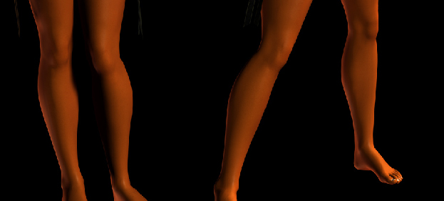
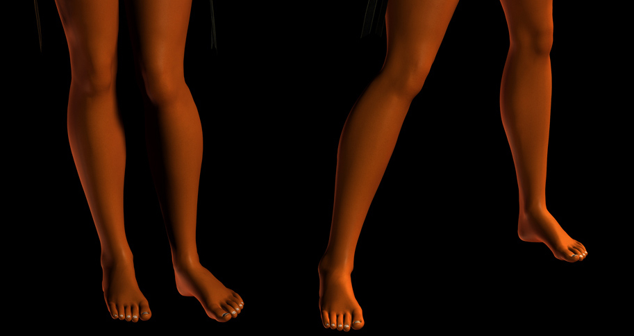