Stoner opened this issue on Mar 11, 2007 · 17 posts
Stoner posted Sun, 11 March 2007 at 5:14 AM

Good spelling is overaytead
Stoner posted Sun, 11 March 2007 at 5:15 AM

Good spelling is overaytead
Uncle_Riotous posted Sun, 11 March 2007 at 5:53 AM
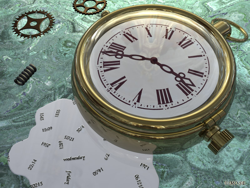
I like it but I'm not al that convinced by the grey (liquid?) with the words written on it, because it's pretty uniform it draws my eye to the least interesting part of the image.
RodsArt posted Sun, 11 March 2007 at 5:54 AM
Sweet design, that brass material is fantastic too.
___
Ockham's razor- It's that simple
pakled posted Sun, 11 March 2007 at 9:48 AM
fantastic modeling. Tiny point...probably the same font used on the face should be used for the leakage...but what do I know..;)
I wish I'd said that.. The Staircase Wit
anahl nathrak uth vas betude doth yel dyenvey..;)
Analog-X64 posted Sun, 11 March 2007 at 10:56 AM
great photo...and I agree with previous post that the liquid thing draws attention from the clock.
tom271 posted Sun, 11 March 2007 at 11:19 AM Online Now!
great Bryce watch... terrific modeling
----------------------------------------------------------------------------------------------------------------------------
Stoner posted Sun, 11 March 2007 at 11:39 AM
I got to have some kind of idea and concept when doing an image. That´s why I have the liquid. Is it a lame concept? Should I just have the clock?
Good spelling is overaytead
RodsArt posted Sun, 11 March 2007 at 11:51 AM
If your game, try making the liquid object transparent with a slightly darkened color. Also your base material doesn't seem to be catching any shadows,(are shadows off?) maybe the ambience is set high.....(clued in by the light hitting the green at the top) If it's a transparent green, you can put a darker non-transparent plane underneath it.
Try different set-ups....I like the concept of the liquid.
___
Ockham's razor- It's that simple
Death_at_Midnight posted Sun, 11 March 2007 at 2:12 PM
By chance I am working on a pocket watch, but one you can see all the insides, and have been making a lot of gears, rubies, and stuff.
An idea for the liquid... how about watch parts instead of the liquid. Or, several volumetric lights coming out from the bottom of the watch. Since the light would be fading.. it's kinda like once Time leaks out, or escapes, it's gone forever.. intangible. Anyway....
Uncle_Riotous posted Sun, 11 March 2007 at 3:38 PM
The liquid is cool but on first glance it didn't occur to me that it was liquid. Making it transparent or maybe a transparent kind of deep green which might tie it in to the back ground would make it interesting. If you're going that way you could also then put some of the dates/times in it rather than on it.
I really like the work and I can see where you're coming from, hope I didn't come over too negative.
Incarnadine posted Sun, 11 March 2007 at 10:33 PM
Concept is excellent!
Pass no temptation lightly by, for one never knows when it may pass again!
Stoner posted Mon, 12 March 2007 at 12:49 AM
I asked for help so I´m greatful to every opinion. I shall make the liquid more transparent and work with the lightning to get more natural shadows. Problem is that the HDRI-option don´t work well with shadows. I think I have to choose another way. I´ll be back with an upgraded image.
Good spelling is overaytead
Stoner posted Mon, 12 March 2007 at 3:57 PM

Good spelling is overaytead
Incarnadine posted Mon, 12 March 2007 at 6:00 PM
Very sweet!
Pass no temptation lightly by, for one never knows when it may pass again!
Death_at_Midnight posted Mon, 12 March 2007 at 6:41 PM
I like it! Those letters look very good.
Uncle_Riotous posted Tue, 13 March 2007 at 2:19 AM
That's so weird. The change is really subtle and yet it really makes a huge difference to the overall image. Very nice.