bclaytonphoto opened this issue on Oct 31, 2007 · 81 posts
bclaytonphoto posted Wed, 31 October 2007 at 6:21 PM
Our November Forum Challenge is
Selective Color
I know this is really more of a post work challenge but, we thought it would be a good excercise.
As with all forum challenges..The limit is THREE per member..
Feel free to discuss this, add link to show different methods, and of course comments on the submissions !!
Of course the most important thing is to have fun !!!!
I found a few tutorials to help us out
Photoshop tutorials, four different methods.
[ http://www.renderosity.com/mod/tutorial/index.php?tutorial_id=1618
](http://www.renderosity.com/mod/tutorial/index.php?tutorial_id=1618)[http://www.photoshopsupport.com/tutorials/or/selective-coloring.html
](http://www.photoshopsupport.com/tutorials/or/selective-coloring.html)http://www.dcresource.com/forums/showpost.php?p=132026&postcount=3
[http://www.gfxtown.com/?id=46099&s=nature&lang=en
](http://www.gfxtown.com/?id=46099&s=nature&lang=en)A pair of good tutorial for GIMP users
[http://www.gimp.org/tutorials/Selective_Color/
](http://www.gimp.org/tutorials/Selective_Color/)[http://www.gimptalk.com/forum/topic/Selective-Coloring-131-1.html
](http://www.gimptalk.com/forum/topic/Selective-Coloring-131-1.html)Paintshop pro
[
http://www.corel.com/content/pdf/paintshop/tutorials/283Selective.pdf
](http://www.corel.com/content/pdf/paintshop/tutorials/283Selective.pdf)http://www.hypergurl.com/selective.html
Fred255 posted Thu, 01 November 2007 at 6:55 AM
Great challenge here. I used the first tutorial when I first started. It took me about 5 minutes to learn the basics. I think it's the best and easiest to follow.
ecurb - The Devil
TwoPynts posted Thu, 01 November 2007 at 8:01 AM
Attached Link: Pensive
Great theme Bruce! I am a fan of the genre...in fact I just recently posted one to my gallery. Looking forward to seeing what people come up with.Kort Kramer - Kramer Kreations
zollster posted Thu, 01 November 2007 at 9:28 AM
OldHippieKeyboard posted Thu, 01 November 2007 at 2:22 PM
Thanks for the links to various ways of doing this!
"Morning Dew"
Duct tape is like the force.
It has a light side, a dark side, and it holds the universe
together...
____
TomDart posted Thu, 01 November 2007 at 6:25 PM
Keyboard, looks like a sothern USA shot...at least, that's where Dew really got popular right off. This selective color is nice and clean.
TomDart posted Thu, 01 November 2007 at 7:43 PM
One hint if you have not tried selective coloring, once the image is looking close but a few areas need to be desaturated, the quickest method I use is to "lasso" the area and then desatruate the selected area.
Bruce, thanks for the tuts. This should help encourage others who have not tried it to join in. Tom.
bclaytonphoto posted Thu, 01 November 2007 at 8:18 PM
very nice start to the challenge...Your welcome Tom..
I know folks have mixed feelings about this style of work. , but, here a chance to give it a try and put your own spin on it..
It's also cool if ya'all want to discuss which methods you like to use.
TomDart posted Thu, 01 November 2007 at 8:27 PM
Thanks, I thought I might be stepping too far but thought some help for others..eer..and me..would be quite welcomed. Tom.
babuci posted Fri, 02 November 2007 at 9:05 PM

seyya Tunde
girsempa posted Fri, 02 November 2007 at 9:40 PM

We do
not see things as they are. ǝɹɐ ǝʍ sɐ sƃuıɥʇ ǝǝs
ǝʍ
babuci posted Fri, 02 November 2007 at 10:16 PM

seeya Tunde
Benettor posted Sat, 03 November 2007 at 11:40 AM
girsempa posted Sun, 04 November 2007 at 6:23 PM

We do
not see things as they are. ǝɹɐ ǝʍ sɐ sƃuıɥʇ ǝǝs
ǝʍ
TomDart posted Sun, 04 November 2007 at 9:19 PM

astro66 posted Mon, 05 November 2007 at 1:11 PM

www.natural-photo.co.uk
"Dodging and burning are steps to take care of mistakes God
made in establishing tonal relationships. ~Ansel
Adams"
TomDart posted Mon, 05 November 2007 at 8:11 PM
Astro, I used the method from nattarious to do my first entry, simply because trying to paint a mask around foliage is almost impossible and terribly time consuming. Can you tell me what method you used for the sun shot?
Bruce said to go ahead and share methods and thoughts on selective coloring in this thread. So, I will share a few from my personal opinions. Some apply to your entry.
1. Be very careful in what image you choose to use selective color.
Your image uses the technique is such a subtle manner I do not notice that selective coloring was used in first view. To me, that is a good thing. Creation of a pleasing image more than a shock of color is to me more viable. Of course, in some shots like the Bennetor rose against a white background or the "mountain dew", the color is not shocking at all but works. The soft drinks could easily be used in advertising and are appealing as "is" simply from the total effect of the image and the transparency of the soft drinks with the color.
Just a though or two. Tom.
bentchick posted Mon, 05 November 2007 at 9:22 PM

Kim Hawkins
Kim Hawkins Eastern Sierra Gallery
TomDart posted Mon, 05 November 2007 at 9:35 PM
I think it works quite well...thanks for the neat shot and the info. Tom.
astro66 posted Tue, 06 November 2007 at 12:29 AM
Tom's right, it would be more helpful if I had explained how I had done it so...
Looking at it now I think it lacks a bit of punch, maybe I should have used an image with stronger colours to start with. I have tons of sunrise/set pics I'll fiddle around and see if I can come up with something a little better. :)
www.natural-photo.co.uk
"Dodging and burning are steps to take care of mistakes God
made in establishing tonal relationships. ~Ansel
Adams"
mhyrdin posted Wed, 07 November 2007 at 2:59 AM
Green Buoy
Here is my first contribution to this challenge, i have posted this picture in my galery last year ...
I will try to do something else this weekend !

astro66 posted Wed, 07 November 2007 at 1:44 PM


www.natural-photo.co.uk
"Dodging and burning are steps to take care of mistakes God
made in establishing tonal relationships. ~Ansel
Adams"
OldHippieKeyboard posted Wed, 07 November 2007 at 2:33 PM
For this one I played with an image from my gallery.
Duct tape is like the force.
It has a light side, a dark side, and it holds the universe
together...
____
OldHippieKeyboard posted Wed, 07 November 2007 at 2:54 PM
Another from my gallery...
Duct tape is like the force.
It has a light side, a dark side, and it holds the universe
together...
____
TomDart posted Wed, 07 November 2007 at 6:47 PM
Yikes..these last ones are super to my eyes. Astro, yes, this sunrise/sunset has much better compo and the coloring works well. The bouy shot I like because of compo and the fact that the green is subdued and fits in very well. The giraffe..well, just fine! The flower..a natural and nicely done.
I better get serious and shoot a good image for this challenge soon.....Tom.
babuci posted Wed, 07 November 2007 at 8:05 PM
Astro, I agree with Tom, No2 shot is well worked. I am " hunting" shots like this in a gallery. Not many.
seeya Tunde
kimariehere posted Wed, 07 November 2007 at 10:23 PM

kimmers ♥ :O)
aljaysart posted Thu, 08 November 2007 at 6:16 AM

aljaysart posted Thu, 08 November 2007 at 6:45 AM

astro66 posted Fri, 09 November 2007 at 12:44 AM

www.natural-photo.co.uk
"Dodging and burning are steps to take care of mistakes God
made in establishing tonal relationships. ~Ansel
Adams"
aljaysart posted Fri, 09 November 2007 at 4:07 AM
Quote - 3rd and final shot. 'Bluebell Wood'
That is Beautiful excellent.
frankman posted Fri, 09 November 2007 at 7:46 AM

TomDart posted Fri, 09 November 2007 at 7:58 PM

Anyway, tonight dinner was not fresh veggies but frozen pizza.
TomDart posted Fri, 09 November 2007 at 8:59 PM
Critique please? I have not been a true fan of selective coloring, even it I do have an idea of what makes it work. For this green bell pepper and two tomatoes, looking at it now it does not work very well. You might like it ok..I do not know.
We are used to seeing the real green of the pepper and of course the red of the tomatoes. Neither look good if desaturated all the way and the other is left with color. Perhaps, with only one pepper and the chopping knife the image would be better. Any thoughts? Tom.
frankman posted Sat, 10 November 2007 at 7:28 AM
Hi TomDart
This looks very good. But is that the real color of the tomatoes?
frankman posted Sat, 10 November 2007 at 7:53 AM

auntietk posted Sat, 10 November 2007 at 2:07 PM

"If your pictures aren't good enough, you're not close enough." ... Robert Capa
auntietk posted Sat, 10 November 2007 at 2:09 PM

"If your pictures aren't good enough, you're not close enough." ... Robert Capa
auntietk posted Sat, 10 November 2007 at 2:12 PM

"If your pictures aren't good enough, you're not close enough." ... Robert Capa
auntietk posted Sat, 10 November 2007 at 2:19 PM
Fun challenge! I always learn so much from these things. The tutorials are a bit over my head, but I did figure out a coule of different ways to make this happen. Thanks!
@ Tom: I'd love to see your pepper/tomato image done a slightly different way. Maybe if you took the original image with the original colors and desaturated everything but the knife blade? The only color then would be the reflection of the veggies in the knife. Just a thought - it might be kind of cool. (It might not, too - sometimes things look better in my head than they do on the screen!) I wouldn't "dull down" the colors that were left, I don't think.
"If your pictures aren't good enough, you're not close enough." ... Robert Capa
aangus posted Sat, 10 November 2007 at 2:31 PM

aangus posted Sat, 10 November 2007 at 2:34 PM

bentchick posted Sat, 10 November 2007 at 5:14 PM
Wow! That Bluebell Wood is really cool!!! I will have to try some of that kind of stuff! I love the different ideas everyone is coming up with!!! Fun stuff!!!!
Kim Hawkins
Kim Hawkins Eastern Sierra Gallery
TomDart posted Sat, 10 November 2007 at 5:21 PM
Aangus, quite well done I say. Very clean and natural.
awjay posted Sat, 10 November 2007 at 7:59 PM

just a small offering
bentchick posted Sun, 11 November 2007 at 8:37 AM
Attached Link: http://www.renderosity.com/mod/gallery/index.php?image_id=1558851
Here is my second one: I liked it so much I had to put this one in my gallery. I used the same process, except I upped the brightness and contrast first. I like Aangus' door picture so much, that I will have to try something like that myself. Off to the drawing board......... so to speak!!! LOL :P
Kim Hawkins
Kim Hawkins Eastern Sierra Gallery
bentchick posted Sun, 11 November 2007 at 8:03 PM

Kim Hawkins
Kim Hawkins Eastern Sierra Gallery
TomDart posted Sun, 11 November 2007 at 10:06 PM

The image: Too Many Shoes Look Alike.
rockstrider posted Mon, 12 November 2007 at 12:10 PM
Attached Link: What fire?

Liam. posted Tue, 13 November 2007 at 6:29 AM
BibbyBear posted Tue, 13 November 2007 at 7:16 AM

It took several attempts to get a reasonably clear shot of this beautiful ceiling with all it's golds, blues, yellows and of course, reds!!
I've opted to select the reds from this one and then just played with the contrast and curves for the background - I sort of like the effect but would appreciate your views on it.
Some great shots posted here already though and it's great to see so many different variations on selective colouring and the many different methods used to achieve it.
Great work everyone!!
Chrissy xx
"I don't suffer from insanity,
I enjoy every minute of it."
:lol:
CCCD Photography CCC
Dezynz
PeeWee05 posted Tue, 13 November 2007 at 8:01 AM
Oh I love the onces with the dog and the girl.
Carl knows I like his fire truck one too.
Rights Come With Responsibilities VAMP'hotography Website VAMP'hotography Blog
bclaytonphoto posted Tue, 13 November 2007 at 5:18 PM

GiMi53 posted Fri, 16 November 2007 at 3:15 PM

"In Life, as in Photography, things look much
brighter, once you remove the lens
cap"
awjay posted Fri, 16 November 2007 at 3:30 PM

zollster posted Fri, 16 November 2007 at 5:59 PM
awjay posted Fri, 16 November 2007 at 7:05 PM
YES I THOUGHT SO TOO
astro66 posted Sat, 17 November 2007 at 1:39 AM
Agreed, it's a great shot. The selective treatment really works on this.
www.natural-photo.co.uk
"Dodging and burning are steps to take care of mistakes God
made in establishing tonal relationships. ~Ansel
Adams"
awjay posted Sat, 17 November 2007 at 5:16 AM
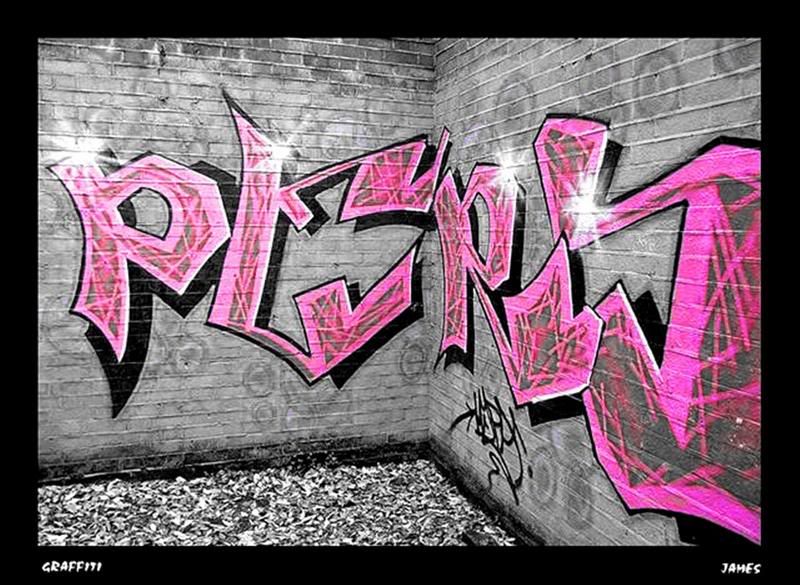
that and the graffitti artists work certainly seem to make it pop out at you....
Valerie-Ducom posted Sat, 17 November 2007 at 6:58 PM

Valerie-Ducom posted Sat, 17 November 2007 at 6:58 PM

Valerie-Ducom posted Sat, 17 November 2007 at 6:59 PM

X-PaX posted Sun, 18 November 2007 at 6:23 AM

By the way. I've written a german tutorial for Paint Shop Pro some time ago.
Maybe somebody is interested.
www.cwhp.de/tutorials/tutorial.php
X-PaX
X-PaX posted Sun, 18 November 2007 at 6:55 AM
X-PaX posted Sun, 18 November 2007 at 7:45 AM

I love walks through a forrest and sometimes it is very hard to see such a soil.
X-PaX
awjay posted Sun, 18 November 2007 at 9:10 AM
#3....
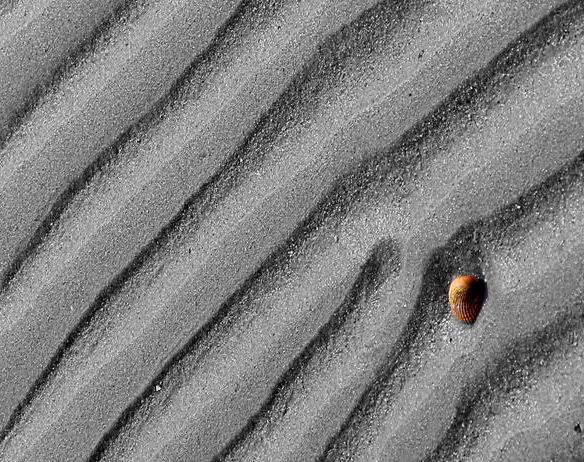
simple shell.....

macrowawe posted Sun, 18 November 2007 at 10:15 AM

bclaytonphoto posted Wed, 21 November 2007 at 4:55 PM
Very impressive work for this challenge...You folks ROCK !!!
rockstrider posted Thu, 22 November 2007 at 2:36 PM
Attached Link: Acer Japonica

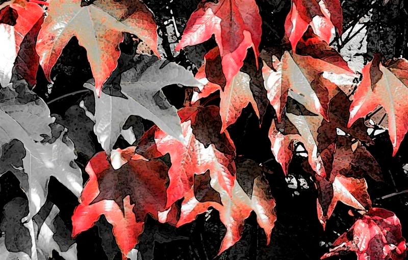
This was done by desaturating a background copy, then adding a layer mask at 100% opacity for the brighter leaves, and then 40% opacity for the rest.
The attached link will take you to a larger version in my gallery.
Carl.
mansco posted Sun, 25 November 2007 at 6:49 AM
Attached Link: mansco

rmtagg posted Tue, 27 November 2007 at 1:12 AM

rmtagg posted Tue, 27 November 2007 at 1:30 AM

FranOnTheEdge posted Wed, 28 November 2007 at 2:53 PM

Oh, Um, er....
This one for the first:
Measure
your mind's height
by the shade it casts.
Robert Browning (Paracelsus)
FranOnTheEdge posted Wed, 28 November 2007 at 2:58 PM

Measure
your mind's height
by the shade it casts.
Robert Browning (Paracelsus)
FranOnTheEdge posted Wed, 28 November 2007 at 3:37 PM

This:
Measure
your mind's height
by the shade it casts.
Robert Browning (Paracelsus)
rmtagg posted Wed, 28 November 2007 at 9:46 PM

TwoPynts posted Thu, 29 November 2007 at 9:43 AM
So many great examples of this kind of photography...impressive contributions everyone!
Kort Kramer - Kramer Kreations
rmtagg posted Thu, 29 November 2007 at 10:40 AM
I am just so excited that I can now open my photo shop program and actually do something with it thanks to the tutorials!!!!!!!!!!!!!!!!!
mansco posted Thu, 29 November 2007 at 1:30 PM
Attached Link: mansco

FranOnTheEdge posted Fri, 30 November 2007 at 10:47 AM
**rmtagg,
**To reveal more than one colour use a mask method - I think something like that was in one of the tut links on the first page of this thread. I used that method, well sort of, I also had another layer on that occasion. (not used in any of the pics I've uploaded to this thread though.)
Measure
your mind's height
by the shade it casts.
Robert Browning (Paracelsus)
bclaytonphoto posted Fri, 30 November 2007 at 8:05 PM
Thanks to every who participated this month..Great work by everyone !!