GaryChildress opened this issue on Dec 25, 2009 · 12 posts
GaryChildress posted Fri, 25 December 2009 at 10:04 PM

I'm sort of wondering if the dullness of my texture maps is due to using UV Mapper or if there is some other reason.
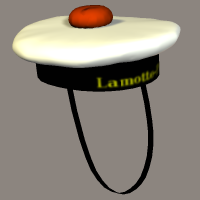
Above is a French Navy hat. Notice the writing on the front looks sort of blurry. It's not blurry on the texture map. How do I get my texture maps to look sharper in Poser? Thanks for any help!!
Gary
Please visit My 3D Freebies
Thank you for your patronage!
RobynsVeil posted Fri, 25 December 2009 at 10:14 PM
Image size of the original texture map might have something to do with how sharp the letters are.
As far as the lackluster aspect: are you using a version of Poser not Pro? If so, my take on it is because of this (explained best by CobaltDream):
We want a linear workflow using Gamma Correction. Why use a linear workflow? The colors you see on your screen are in non-linear sRGB color space. The calculations a renderer makes are linear and produce linear results. If you don't anti-correct colors before they reach calculations like how to shade and highlight a surface, then they make the wrong calculations. If you don't correct the final result, then the render will be in linear color space and won't appear properly on your screen. That means we want to anti-correct all our color inputs and correct all of our outputs.
What this means is going into the material room and creating some nodes for each material that uses colour or a colourMap. Look up Gamma correction on this forum to see how that is done.
Bantha has a Wacro that you can run against your materials to gamma-correct them.
If you are running Poser Pro, then activate Gamma-Correction.
Monterey/Mint21.x/Win10 - Blender3.x - PP11.3(cm) - Musescore3.6.2
Wir sind gewohnt, daß die Menschen verhöhnen was sie nicht verstehen
[it is clear that humans have contempt for that which they do not understand]
LukeA posted Fri, 25 December 2009 at 10:16 PM
hborre posted Fri, 25 December 2009 at 10:30 PM
I have taken a look at your freebie and, unfortunately, you have not included the appropriate textures. My P8 is looking for files that don't exist in the runtime. You will need to go back and repackage your zip.
markschum posted Fri, 25 December 2009 at 10:46 PM
For crisp text a uv map of 2048 is good. If your map is only 256 or 512 you will have problems.
LaurieA posted Fri, 25 December 2009 at 10:49 PM
Yep, make sure your textures are sufficiently large in order to have nice detail, turn off texture filtering as it makes stuff blurry, and in your render settings set the shading rate to 0.00 or 0.02 at the most. That should make things nice and sharp.
Laurie
hborre posted Fri, 25 December 2009 at 10:54 PM

I would check the monitor first.
GaryChildress posted Sat, 26 December 2009 at 10:16 AM
Quote - I have taken a look at your freebie and, unfortunately, you have not included the appropriate textures. My P8 is looking for files that don't exist in the runtime. You will need to go back and repackage your zip.
**Hi hborre, the textures are in the same folder as the pp2 file. When I load the freebie on my machine everything works fine. I think the problem may be that my computer's C drive is actually lettered H. So when Poser looks for the files it is probably looking for an H drive. I'm not sure how to correct the problem on my machine.
Is there a way to manually make the pp2 file look for its files in a C drive instead of H? Otherwise I won't be able to change it. :(**
Please visit My 3D Freebies
Thank you for your patronage!
chriscox posted Sat, 26 December 2009 at 10:40 AM
Most of the paths are correct, :Runtime:Libraries:Props:GRC Props:French Navy Hat:, except for the extraneous image you have plugged in to the Specular Node for the Cap Bottom, H:Documents and SettingsAdminMy DocumentsPOSER UNITSWINGS ProjectsFrench Navy Cap 1500x1200 LP 750x600.png
GaryChildress posted Sat, 26 December 2009 at 10:45 AM
Quote - Most of the paths are correct, :Runtime:Libraries:Props:GRC Props:French Navy Hat:, except for the extraneous image you have plugged in to the Specular Node for the Cap Bottom, H:Documents and SettingsAdminMy DocumentsPOSER UNITSWINGS ProjectsFrench Navy Cap 1500x1200 LP 750x600.png
Thank God! That I can fix! If there is an H drive problem I won't be able to fix it. Thank you!
Please visit My 3D Freebies
Thank you for your patronage!
GaryChildress posted Sat, 26 December 2009 at 11:18 AM
OK. I've uploaded a corrected file. Everything should work fine now. Thank you Chris for the heads up! Please keep me posted if anyone finds any other problems with the file.
Please visit My 3D Freebies
Thank you for your patronage!
IsaoShi posted Tue, 29 December 2009 at 9:01 AM
Quote - ... and in your render settings set the shading rate to 0.00 or 0.02 at the most.
Just a quick note about this.
If the Render MSR (minimum shading rate) value is lower than the object's or actor's MSR (set in its Properties), the latter value is used.
The default object/actor MSR is 0.2. I use a Python script to change it selectively in a scene, but apart from that I have never seen it set to any other value for anything I've ever used. So a Render MSR less than 0.2 is usually meaningless.
For better textures in draft renders, just switch off texture filtering. (You can set this state in the cr2). For final renders, reduce the Render MSR to 0.2.
Izi
"If I were a shadow, I know I wouldn't like to be half of
what I should be."
Mr Otsuka, the old black tomcat in Kafka on the Shore (Haruki
Murakami)