brewgirlca opened this issue on Oct 04, 2011 · 73 posts
brewgirlca posted Tue, 04 October 2011 at 9:42 PM

I am getteing really flat and dull grayish preview screens in my poserpro2012. And the renders look much like the preview screen - flat and gray - none of the great color depth I was promised.
I have poserpro2010 on the same system and its preview looks light, bright and colorfull, just like poser 7 on my old machine. So I don't think it is my video card or system hardware and software because poserpro2010 is working fine on it.
A friend just sent me a site telling me to turn off the gamma correction in the render screen and that seems to have fixed the guts of the render problem. She also said to turn off SSS but isn't that a major reason for going with this upgrade? Anyways I may have the render issue resolved but the preview screen still looks so darn ugly compared to poserpro2010 and poser 7 I just don't think I can bring myself to work with it.
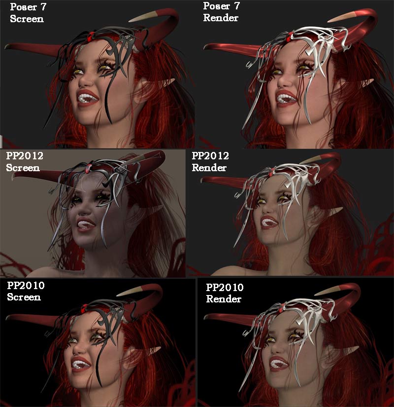
Also notice how the eyes in my preview screen for pp2012 look glassy, like elven eyes. They render ok but just don't show in preview.
Ok, so any ideas on how I can make some setting changes to get my preview screen looking pretty again and to fix those glassy eyes?
I attach here shots of the preview screen for all three versions of poser and the renders (before I made the fixes on the gamma correction for poserpro2010 and pp2012 so they still look ugly here - but it may help someone recognize a similar problem on their system.)
The file I used was made in poser 7 and then imported into both pp2010 and pp2012. The lights were identical in all three - they were from a simple DM set of 3 lights that I imported with no changes. I get the same dull look on raw files I create right in pp2012 so it is not importing from poser 7 that is causing the problem.