piccolo_909 opened this issue on Oct 03, 2012 · 36 posts
piccolo_909 posted Wed, 03 October 2012 at 4:12 PM
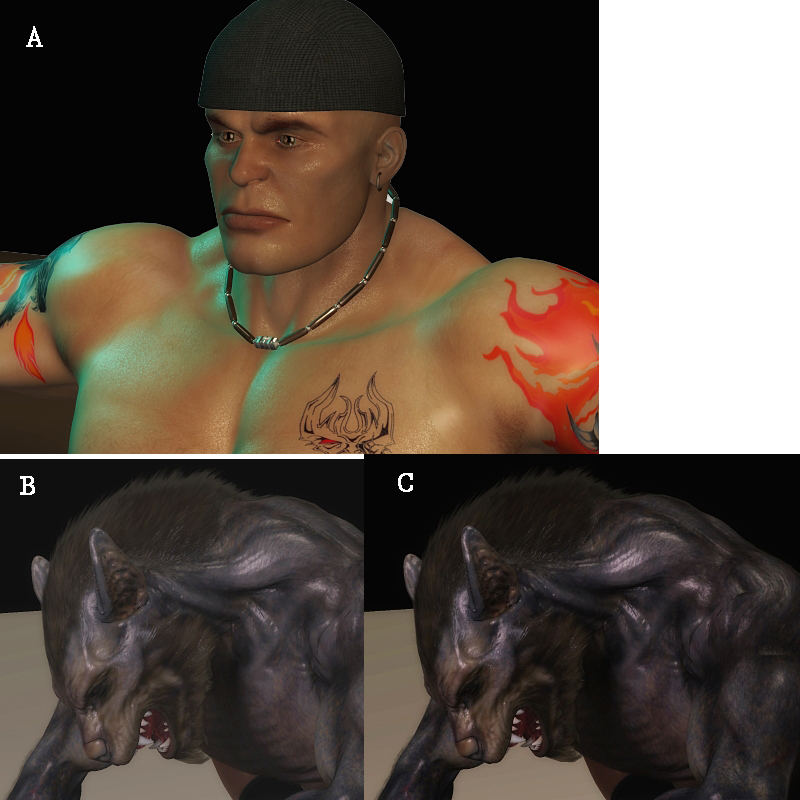
My graphics card comes with settings to increase the brightness/gamma/contrast even more, but i need to see how much more and find a middle ground. So what i did was compile some of my renders, and need your guys help to determine if they're too bright, too white, etc. This is gonna be like a mini-eye exam =P
There's two attachments
Picture A: Does his face look dark orange, orange, tan, light tan, or is it too bright? Does it look good?
Which is better: Picture B or Picture C?
Picture C: Is it too dark or is there too much contrast?
Picture D: Is he dark red, red, lighter red, or is there too much white in his skin?
Picture E: Is there too much white, or is there a "dull gray" that looks like too much gamma? Or does it look fine?
Picture F: Again, is there too much white and gray, or does it look fine?
Picture G: Is it too dark or is there too much contrast in here?
Which is better: Picture F or Picture G?
One the forum background, is it pure black, dark gray, gray, or light gray on your monitor?
Another thing i noticed, is in some renders, when you turn up the brightness or gamma, they still look good, while in other renders, they tend to get very white/gamma washed out. Does anyone know why this is?