Logo Design/Illustration by JohnPelico
Open full image in new tab Members remain the original copyright holder in all their materials here at Renderosity. Use of any of their material inconsistent with the terms and conditions set forth is prohibited and is considered an infringement of the copyrights of the respective holders unless specially stated otherwise.
Description
Hello Rendo!
Here are a few logo designs I created for a client of mine.
My client first approved the style and illustration of the cat. I then incorporated it into 4 logo designs for them to choose from.
Which one would you choose?
Thank you for viewing.
John Pelico
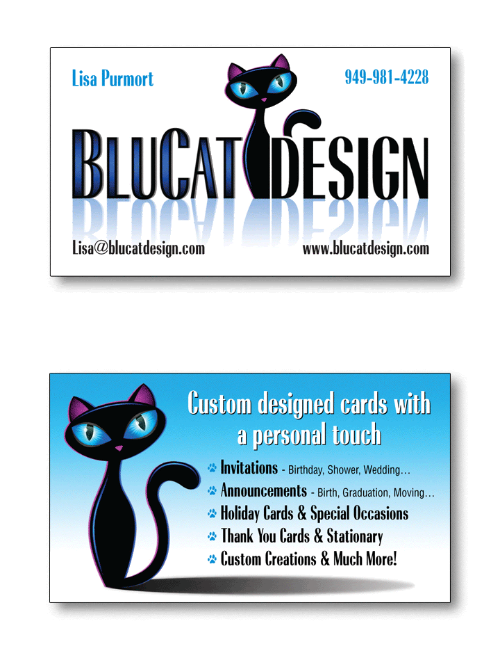
Business card front and back:


Comments (7)
Eseres
Aaaaahhh... That bring back some great memories from back when I worked as a designer :) Great logo designs! I personally like the bottom one best :) Easy to place on business card, headers and so on because it is wide and short and don't need to be scaled down too much. Square logos often needs to be scaled down to fit other info and often gets too small to view properly. The bottom one will also look better as a car decoration. So yes, I'd go for the bottom one if it was my choise :) Great work ;)
KnightWolverine
For me I like them all but do favor the bottom one as today a lot of older than me folks(lol)...have trouble reading fancy fonts and see the bottom one as more reader friendly... ~smiles~
TheOwl68
Definitely the .gif, it's print-ready, imho =) nice layout, easy to read & the cat & lettering look balanced. Great work, John!
jendellas
I like the one with the cat as the G. I do like them all though :o)
npauling
These are such cool cat logos and it is impossible to know which one to choose but I do like how the business card has turned out. There is a great flair to them all.
bakapo
all of them are great, the cat is so elegant and beautiful, but my favorite is the one with the cat as the g.
RachealMarie
Love them all, but I would pick the last one first, then the second, and next would be the first one.