-
Marketplace
-
Free Stuff
-
Galleries
-
Community
Forums General
- News
- Deals
- Poser
- Contact
kftate Bio
BIO: My name is Kathy. Graphics and art have always been a big part of my life. I drew constantly as a kid (mostly horses because that's largely what I wished for). When I grew a little older my father gave me my first introduction into the drafting and design world. It was love at first sight. Since I graduated with an electro/mechanical drafting degree in 1985, I've been a computer-aided designer in the engineering field, and have daily used many drawing/modeling software programs throughout the years. I now consider myself very fortunate to draw, "play" on the computer, and get paid for it all at the same time. The best of all worlds, in my opinion! However, at night I draw purely for my own enjoyment. Since I've discovered Photoshop, and more recently Vue and Daz Studio, I pretty much just move from one computer at work during the day to another at home during the evening. I'm completely hooked. Graphics are my passion.
-
- Renderosity Page
- Renderosity Communities
- Blender 3D
- iClone
- Poser Users
- Poser Software
- Become an Affiliate
- Memorials
-
About
- About Us
- Contact Us
- Team
- Policies
- Terms of Service
- Copyright Policy
- Refund Policy
- Licenses
- Standard License
- Extended License

Privacy Notice
This site uses cookies to deliver the best experience. Our own cookies make user accounts and other features possible. Third-party cookies are used to display relevant ads and to analyze how Renderosity is used. By using our site, you acknowledge that you have read and understood our Terms of Service, including our Cookie Policy and our Privacy Policy.


Comments (16)
Jean_C
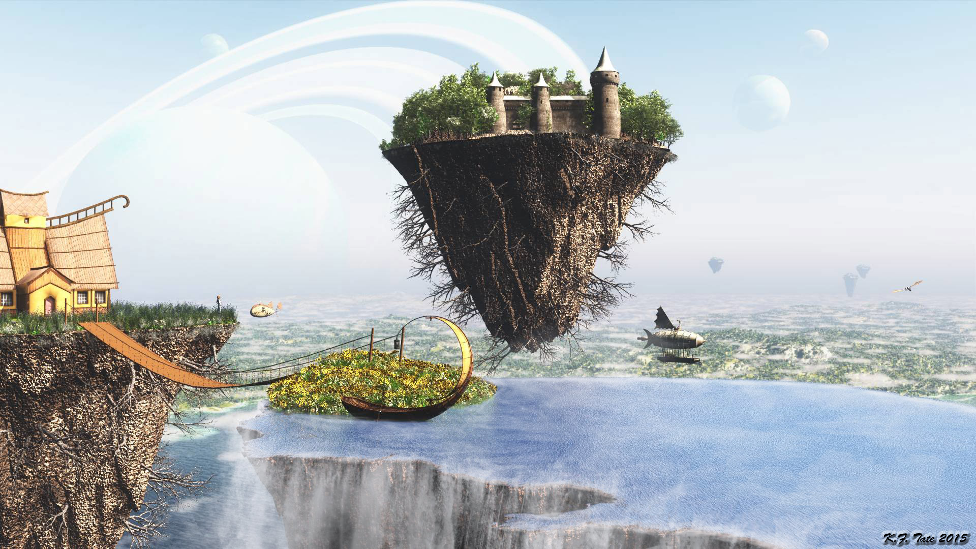
I think this new version of the water is more realistic, but both images are fantastic! EReally great work!
kftate
Thanks Jean! Sometimes it helps me to just have more sets of eyes looking at my work. :)
soffy
Both look wonderful,but I really like the water in this one,amazing work***
Henchmonkey
Yup, I think the water material works better in this one. (Still diggin' the whole concept.)
rhol_figament
I would copy this one to a new layer in photoshop and paste the other one on a layer below this one. Then turn down the opacity on this one a bit to make the darker water below and waterfalls show up a bit more. Slide it up and down to lighten and darken the water with a bit more shadow and depth to your liking... :) Just a fun idea Kf-Te, luv the image!
0rest4wicked
I dare say better!
mtdana
Yes I like this better - its fun to try different things!!!
giulband
WOW !!! Absolutely fantastic and wonderful composition !!!!!!!!!!!
miwi
Agree with soffy and Jean_C!!!!!!!!!!!!!!!!!!!!!!!!!!!!!!!!!!!!!!!!!!!!!!!!!!!!
Leije
I prefer this one, the water is more realistic ! wonderful and dream-like image !
iborg64
I would agree I think the water is better on this one excellent job
Cyve
Absolutely fabulous once again... Marvelous composition my friend and fabulous concept also !!! AWESOME image !!!
Jaynia
The new version is more realistic that the first one. Phantastic scenery!
1971s
I like this very much.
MagikUnicorn
AWESOME
adrie
This is such a outstanding job my friend, on this very beautiful image......love it.
rbowen
Very good scene and work!