Renderosity Forums / Photoshop
Welcome to the Photoshop Forum
Forum Moderators: Wolfenshire Forum Coordinators: Anim8dtoon
Photoshop F.A.Q (Last Updated: 2025 Jan 06 5:28 am)
Our mission is to provide an open community and unique environment where anyone interested in learning more about Adobe Photoshop can share their experience and knowledge, post their work for review and critique by their peers, and learn new techniques while developing the skills that allow each individual to realize their own unique artistic vision. We do not limit this forum to any style of work, and we strongly encourage people of all levels and interests to participate.
Sharpen your Photoshop skill with this monthly challenge...
Checkout the Renderosity MarketPlace - Your source for digital art content!
Subject: CMYK shows dull colors
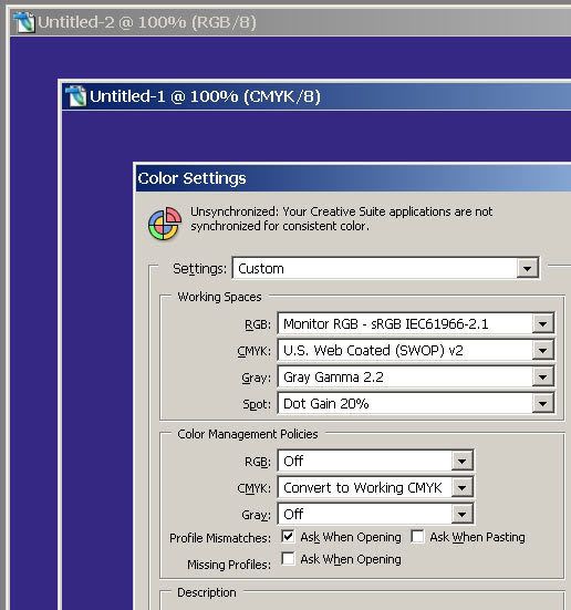
Hi, IN the color swatches, im using C 100 M 95 Y 0 K12 from the "TRUMATCH" book.. I did look and i have the Proof colors unchecked but i do have the proof setup - working CMYK checked. Which book in the color libraries is best for getting the brightest colors? People who print cmyk on vinyl get awesome bright colors. But in Photoshop, all my cmyk stuff is dull... Thanks
Actually, work in RGB first, and convert to CMYK when you are making it print ready (as in for publication - not inkjet where you'd LEAVE it RGB - and this is usually the LAST step in the process). If you START in CMYK, then you limit your color pallette from the beginning, and when you THEN convert to RGB you shouldn't see any difference because RGB can reproduce EVERY color within CMYK.
When picking colors, there will be a little teeny exclaimation point in a yellow triangle when you are picking a color that will be out of the CMYK color gamut - this is something that cannot be reproduced in traditional CMYK printing.
So... HOW do they get vibrant colors in some CMYK print jobs...? There are tricks the printer can do - one guy I heard about desaturates the image by something like 20%, then overprints it by something astronomical like 300% - this makes it VERY rich in a nice way, but if he didn't desaturate in the first place it would be almost neon unrealistic colors.
This is something you would need to call and discuss with the printing house that will be handling the publication.
But yes, more often than not, when you convert from RGB to CMYK your colors suddenly go "blah!" and dull. I find that selecting and duplicating specific colors or sections of the image, then going into the Channels Tab and adjusting individual colors (remember to turn the eyeball of CMYK back ON or all you'll see is a grainy B&W image you're working on which is JUST the Channel you've selected) I can get back MOST of what I lost in the conversion.
But just live with the fact that your most vibrant greens, blues, and reds will be lost - not gonna get 'em back because traditional CMYK CAN'T reproduce them.
Hope this helps-
-Lew ;-)
Very sound advice Lew,
Always, Always, talk to your printer or service provider prior to converting or working in CYMK.
CYMK is totally device dependent and there is no one solution. The default photoshop North American Prepress setting are designed to meet the SWOP standard. It not an Ideal setting for a specific output device.
What is SWOP, Specification Web Offset Publications. It's a standard color target for large run web offset presses. The kind producing catalogs, magizine, and large run color. It a common agreed upon standard that should result in reasonable color consistacy across presses, vendors and print runs. As a result, it not an ideal conversion for the best color on a specific device, press or workflow. It's a comprise that the major agreed upon.
About how do they get such vivid color on vinyl? It's hard to tell without knowing the equipment used. But several large format inkjets are not just CYMK. Many have 6 or more color primary inks or special saturated inks. They typically use special drivers or "RIPs" to convert your RGB or CYMK to produce optimun results at a greater color range then CYMK on its own.
The substrate or paper has an large effect on color reproduction. Traditional CYMK inks are transparent. Light passes through the pigment, reflects off the paper below so a highly reflective clay coat paper will produce better results then say recycled newsprint. Which is why Epson and Hp offer "special photo paper" its designed to among other things, to reflect more light back to the eye repoducing more saturated colors.
Hope this helps.
J. Stuart J.
Privacy Notice
This site uses cookies to deliver the best experience. Our own cookies make user accounts and other features possible. Third-party cookies are used to display relevant ads and to analyze how Renderosity is used. By using our site, you acknowledge that you have read and understood our Terms of Service, including our Cookie Policy and our Privacy Policy.


Hi, I created a new canvas in adobe photoshop CS2. My mode is set to CMYK. I select a bright blue color on the color pallete and use the fill tool on the black canvas. The bright blue now tooks like a dull bluish grey. Is there something im doing wrong? How do people get bright colors with CMYK?