Sat, Sep 21, 7:47 AM CDT

Renderosity Forums / Photography


Welcome to the Photography Forum

Forum Moderators: wheatpenny, Deenamic Forum Coordinators: Anim8dtoon

Photography F.A.Q (Last Updated: 2024 Sep 18 12:22 pm)


Subject: Softly II


Maygen ( ) posted Mon, 07 January 2002 at 9:53 PM · edited Sat, 21 September 2024 at 7:46 AM

file_254232.jpg

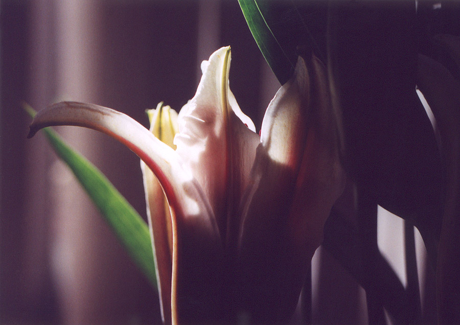
This is one of the leftovers from a roll of film I took of these flowers. One is posted to the photo gallery, and while I was reasonably pleased with it, I was disapointed that the close up came out so faded and dull. I tried playing around w/ it in photoshop but quickly lost interest. any suggestions on how to liven this pic up?


dreamsosweet ( ) posted Mon, 07 January 2002 at 10:13 PM

I think it's rather nice as is - the light and shadows are beautiful, and the left-hand leaf and background look almost painted in comparison to the flower! :-)


mega_cow ( ) posted Mon, 07 January 2002 at 11:26 PM

I think I agree with sweetwonV. The image should be left as is. Maybe more contrast.


PhrankPower ( ) posted Mon, 07 January 2002 at 11:42 PM

file_254233.jpg

That's right. It's lit as high contrast subject, but the finished result isn't. I think that's all it needs. Couldn't resist to repost. Both the gallery and this is nice work!


PunkClown ( ) posted Mon, 07 January 2002 at 11:43 PM

Oh God, here I go again, sounding like a sheep (Baaa!) I also agree with the good folks above. In some ways I like this even more than the gallery posting. It lives up to its title, having a lovely, soft-lit texture about it. I say leave it as is. :-)>


PunkClown ( ) posted Tue, 08 January 2002 at 1:08 AM

Wouldn't you know it! PhrankPower's message and my own crossed...he got in there first, and now I think I'm going to have to eat my words! I really like what the image looks like now!!! Leave it/Don't leave it...what do I know? LOL! (It's nice to know there is ALWAYS something to learn!)


Antoonio ( ) posted Tue, 08 January 2002 at 1:23 AM

file_254236.jpg

Its not a flower anymore, but looks neat still. Autolevels, removed colors a bit, added slight watercolor, added borders and voila. .n


Maygen ( ) posted Tue, 08 January 2002 at 1:37 AM

As always the forum gives great advice! All of these are nice I was hoping one of you would come up with some ideas like this and refresh my intrest in this pic. I'll play around with it some more and see what I can come up with.


Maygen ( ) posted Tue, 08 January 2002 at 1:38 AM

PS Forgot to say THANKS ALL :)


PhrankPower ( ) posted Tue, 08 January 2002 at 9:29 AM

Niko, Im amazed how that slim white line of a border you added did so much in bringing out the flower and overall feel of the picture! Cool!


Finder ( ) posted Tue, 08 January 2002 at 9:33 AM

Yup, Phrank -- that was just the ticket! You're going to explain exactly what you did now, right? (!)


PhrankPower ( ) posted Tue, 08 January 2002 at 10:20 AM

OK, quick and almost instant. Made a second layer of the bright white part so I wouldnt lose any detail. Then hit auto levels (it had too much blue in the dark areas) and then brought up the contrast a bit more. Flattened image; no loss of detail in the white portions. It took about 30 seconds!


Maygen ( ) posted Tue, 08 January 2002 at 11:33 AM

nicely done :)


Finder ( ) posted Tue, 08 January 2002 at 12:27 PM

Thanks Phrank. I'm probably way behind the curve, here, but how do you 'make a layer of the white part'?


Finder ( ) posted Tue, 08 January 2002 at 12:30 PM

Wait - I mean I know how to duplicate a layer or 'paste as new layer', but I'm asking about how to save detail in the highlight areas like that. - thanks, Joe


PhrankPower ( ) posted Tue, 08 January 2002 at 6:05 PM

Well, Im still learning, and probably always will. But one thing Ive discovered about Photoshop is that theres always several different ways to do the same thing. One person says do it like this, and someone else says, Thats stupid, do it like that! Use curves or instead color balance & contrast? The results can be identical. With that being said, heres how I bring up levels in a photograph where some areas are already so bright that theyll lose image detail if you turn up the contrast or brightness by even a small amount. BTW, I use 5.5, will get 6 soon. Click the Magic Wand on the bright area. Adjusting the tolerance of the wand will affect the amount of area chosen. Clicking select/similar will further expand the chosen area, and also select similar levels in the picture separated from your first area. Then go select/feather. The size of the photograph will determine the amount of feather desired. Feather softens the edges enough to prevent the eye from detecting a level change line. Experiment to see the difference. Thank God for History (Window/Show History). After you mess it up, go back and delete your errors! Then open the Layers window, and right click on the layer. Choose Layer Via Copy. Now the chosen bright area is a separate layer, and you can adjust the background layer (entire picture) without affecting the bright area. You can do more than one Layer Via Copy. I also use it to bring up the contrast in a photograph when the dark areas are OK, but the mid and upper levels need a push. That way, when you turn up the contrast, the detail will not go away in the darker areas, where as if you had just turned up the contrast, the dark detail may have turned to solid black. Hope this helps! marshall


APFrey ( ) posted Tue, 08 January 2002 at 6:13 PM

file_254239.jpg

Ok Mayg...Here's my version. I personally thought it could use a yellow filter for warmth and maybe a little cropping and increased contrast. I don't want to take anything away from your photo though, because it is a nice one. Great job BTW. What do you think? Am I wrong? Andrew


APFrey ( ) posted Tue, 08 January 2002 at 6:15 PM

Also, you should take a look at this same version in monochrome. Your pic is terrific in B&W.


Maygen ( ) posted Tue, 08 January 2002 at 6:29 PM

cool Andrew I like the cropping job :) I put the first softly in b/w on my site gallery but like I said I just kind of got bored with this one. Thanks for the tip though I'll give this one a whirl in bw.


Antoonio ( ) posted Wed, 09 January 2002 at 12:35 AM

Phrank, instead of contrast, try using "levels", there you can adjust dark, mid or bright parts of the pic. And like you said, there are many ways to do it, but I have found it pretty easy and reliable. And yes, that thin white 1pixel line works in most of the cases. It kind of gathers the pic. .n


PhrankPower ( ) posted Wed, 09 January 2002 at 6:32 AM

n, yes, I do use levels sometimes too, although there is a lot of overlap sometimes between the dark, mid & bright where as if you wand a certin level out, it's a more exact boundery. Just depends on the pic, I guess!


APFrey ( ) posted Wed, 09 January 2002 at 6:41 AM

Alpha- My guess is that this is the result of a poor scan. Since I have the world's most pathetic scanner, I can tell you this happens to me frequently. Andrew


Syyd ( ) posted Wed, 09 January 2002 at 6:58 AM

AP thats a lovely transition......I prefer myself to use levels.....and Maygen....what a graceful photograph....I love when flowers conjure up all kinds of ideas based on light, and grace and beauty of photograph, this is no exception.


Lisas_Botanicals ( ) posted Thu, 10 January 2002 at 7:33 AM

What a beautiful photo and equally beautiful "touch-ups".


Privacy Notice

This site uses cookies to deliver the best experience. Our own cookies make user accounts and other features possible. Third-party cookies are used to display relevant ads and to analyze how Renderosity is used. By using our site, you acknowledge that you have read and understood our Terms of Service, including our Cookie Policy and our Privacy Policy.