Renderosity Forums / Bryce
Welcome to the Bryce Forum
Forum Moderators: TheBryster
Bryce F.A.Q (Last Updated: 2024 Nov 26 4:28 pm)
Subject: Future City "WIP" Ideas
Woah! Rochr better look out! I like all 3.....
Available on Amazon for the Kindle E-Reader
All the Woes of a World by Jonathan Icknield aka The Bryster
And in my final hours - I would cling rather to the tattooed hand of kindness - than the unblemished hand of hate...
@Robert_Ripley: Made them all myself:) Used Wings for the base(cause thats the only thing I can make in Wings lol) and the top half, made in Bryce. Soon I'll put them in the freebies, if anyone is interested. Cheers!
@TheBryster: LOL! Thanks mate;)
@pumeco: Hundreds? You want me to go insane or somethin:)
Thanks to all of you guys for the kind words;)
Maybe, I'll post all of them, a bit of a series hey.
Cheers Drac;)
Message edited on: 08/15/2005 06:10
I never intended to make art.
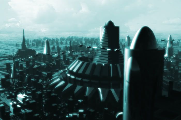
i like them all but the one that catches my eye the most is the first one. Try using the first one with the sky and atmosphere of the 3rd one. Add some more spaceships to it and then see what it looks like.. Place a couple of the skyscarpers further off in the background, about 3 more would look fine..
I have opinions of my own -- strong
opinions -- but I don't always agree with them.
what you might do is assign material regions to some of the faces in Wings, then use some 'window' mats in Bryce. Alas, there's not much of what looks that good, unless you use them on the closest buildings..I've also made edges 'hard' in Wings, then smoothed the interior of a face to get smaller and smaller (and larger and larger polycounts..:|) windows. A touch of 'inset', texture assign as I mentioned above, and then maybe a 'luminous' mat (I use 2, called Yellow Passion and Plasma, for portholes, etc). Hope this helps..
Also, a month or 2 back, someone posted Kevin Cappis' tutorials for citybuilding..might do a search on that. He's the 'Sim City King' of city building..;)
but hey, the above stuff is already better than what I do..;)
I wish I'd said that.. The Staircase Wit
anahl nathrak uth vas betude doth yel dyenvey..;)
@CrazyDawg: More ships for sure;) @pakled: I don't know that much about Wings so thanks for the tips there. I'll probably do all the windows/lights in post work though. I tend to do a lot of post work in my images, I think you have a lot more control that way. Cheers for the ideas guys;)
I never intended to make art.
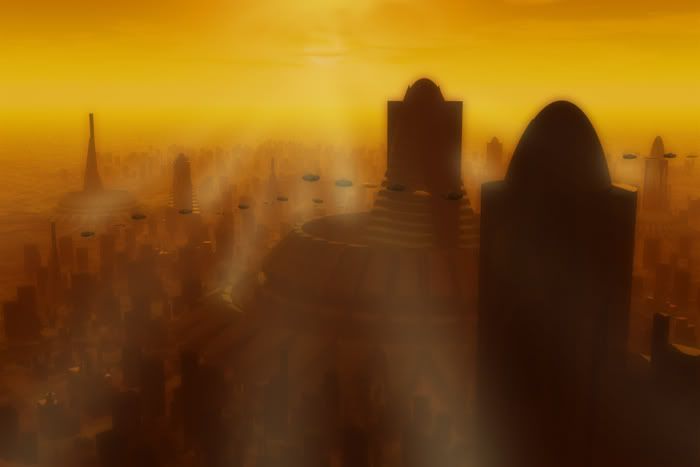
Excellent work Sans! I personally like the first two best, and thats mainly because the use of shadows, which definitely adds to the scene. The one i would continue working on though is number two. I think you have the best and most believable atmosphere in that one, with air that looks like it has a lot of smog, which would suit perfectly in any huge cityscape. :) I think if you tone down the haze just a little, you would bring forward the details perfectly, and all it would need really is a number of citylights in the darker areas(not too much) and some traffic further in the background Not sure i like the rays though. Better to enhance some of the highlighted areas slightly, such as the left edges of the center structure. This is all just a personal opinion though. Youre doing just fine obviously. :)
Rudolf Herczog
Digital Artist
www.rochr.com
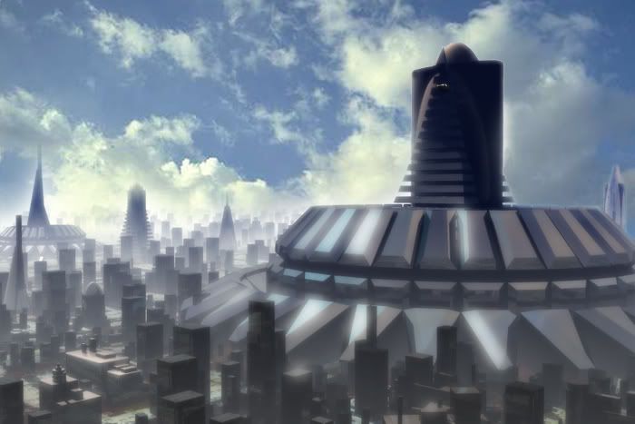
I like the third one because of the lack of smog but would ad the ships from the second to it. As for the far future I would hope that they got rid of smog and all things run on hydrogen. But like Gene Rodenberry I'm ever the opimist. But if this is imeadite future then yep smog it is and plenty of it.
Message edited on: 08/15/2005 14:48
Frank Hawkins/Owner/DigitalDaydreams
Frank Lee Hawkins Eastern Sierra Gallery Store
My U.S.A eBay Graphics Software Store~~ My International eBay Graphics Software Store
@Rochr: I agree there;) The second one definitely has the right atmosphere and mood. I see what you mean, I'll take your advice and add some reflection to the buildings, they do really need it. And more traffic for sure. As for those rays, yep! they are going lol. Cheers mate:) Thanks to electric and ddaydreams too;) I'll probably re-work the last one and maybe the first too. For now though, I'll keep on the second one. As for the direction on pollution, hmm, the way we are all going it will be heavily polluted in the not to far future. But hey, we always got the moon to live on lol. Cheers guys:) Now that Ive had a break from this and received some excellent advice from everyone; I know exactly where to go with this. Thanks to all of you for your amazing help, advice and support:-))
I never intended to make art.
I like the first one best. I might put soem traffic in the foreground in the lower right hand corner. Maybe soem terrain in the distance surrounding the city. Great as is I really like it a lot and my attempts at cities are usually very weak. I am only good for a villiage or a small colony.
The wit of a misplaced ex-patriot.
I cheated on my metaphysics exam by looking into the soul of the
person next to me.
i like the orange best with the added lights its even better. dont add blur did you see any of the old masters use blur in theire paintings? lol
for
some free stuff i made
and
for almost daily fotos
Blur to me is used for a sense of speed or scale. If you want the scene to look miniature then use blur. Look at a camera it usually goes from 30 feet to infinity, (10 meters for metric people) so if you don't have anything within 30 feet no blur.
The wit of a misplaced ex-patriot.
I cheated on my metaphysics exam by looking into the soul of the
person next to me.
Privacy Notice
This site uses cookies to deliver the best experience. Our own cookies make user accounts and other features possible. Third-party cookies are used to display relevant ads and to analyze how Renderosity is used. By using our site, you acknowledge that you have read and understood our Terms of Service, including our Cookie Policy and our Privacy Policy.


Well I've been working on this future city scene for a couple days and I think I've spent too much time looking at it lol. Im not sure about what direction to take it. I made a few different styles/atmospheres with the post work and I just cant make up my mind. The first pic is the original idea with a blue green cast. The second idea is the red setting with the exaggerated rays. These are just quick concept post works so forgive for the exaggerations. I dont know: Also done a second view with a post worked cloudy sky, does this work? So what do you guys think, any ideas? Cheers;)


I never intended to make art.