Renderosity Forums / Challenge Arena
Welcome to the Challenge Arena Forum
Forum Moderators: RedPhantom, msansing
Challenge Arena F.A.Q (Last Updated: 2025 Feb 07 2:54 am)
|
|
|
Checkout the Renderosity MarketPlace - Your source for digital art content!


Subject: how to achieve chaos :)

Also we can get a fresh perspective when flipping an image. If I'm too involved, I'll check it in a mirror or something to see how it balances. Like walking around a chessboard: it helps yield a sense of dynamics, strengths, weaknesses.
Adjusting curves is normally better than adjusting contrast, but in this case, I wanted bold contrasts to clear out noise.
OK, the butterfly is there, but the eyes go to the brightest spot. Since chaos is non-linear, I have to be especially aware of the line tracked by the eyes. I want viewer's eyes to loop out and come back to the butterfly, repeatedly. Fixing the focal point will come later, but it will require a few steps.

Filters and layer styles and blending modes are a lot of fun to play with. When I stumble over something neat, I try to remember the effect. Like a wizard with a grimoire or a chef with a recipe file, it helps to make a few notes of surprising successes or disasters to be avoided.
It also helps to create duplicate layers. Not only does this preserve your image, but you can use blending modes rather than simply "fade" the effect. Selective blending gives more control over various factors. Layers can vary in opacity as well.
Many of the filters are workhorses. For example, I use "render > clouds" as a base for glass or parchment or anything but clouds. But... when to use "artistic > plastic wrap" or "distort > spherize" or "stylize > glowing edges"? Sometimes nothing else will yield the desired effect... and if you want non-linear lines, they might as well glow in the dark, too!
I boosted the contrast a bit more, and tried glowing edges at various strengths, degrees of smoothness, and line width.
I'm recreating something I did many moons ago, but this is close enough for the tutorial. Besides illuminating any edges based upon threshold numbers, this filter also changes the colors. It can get quite wild, but this has some pretty blues and golds. The pink will need to go, however.
The composition needs tweaking. The butterfly is missing part of a wing, and that horizontal brick is far too regular and distracting.

It is starting to display potential. The colors are rich against a dark ground. It is alien, but warm. Viewer reaction should be curiosity and not adversion. Color carries so much emotional quality, that in an abstract work they become even more critical to communication.
However, it was time to stop playing with sliders and move pixels around. Cloning and cut and paste made that brick irregular enough to lessen its eye-snagging habit. Fixing the butterfly wing took subtlety, because I didn't want it to look neatly hand-drawn and it had to match the other linework. I borrowed lines from all over and blended them. There were other areas that got nudged into shadow or lines that gained in importance. Some stray bits got cleaned up, but only if they were too distracting. Remember randomness! Chaos is not tidy.
The composition is more interesting now. It still lacks a clear focus, but the silhouette is stronger.

We can use this to pull the butterfly into prominence.
First, I cut out the butterfly and put it on a separate layer so it would be isolated from the experimental reatments.
I duplicated the rest of the field and tried using a circular motion blur (roughly centered on the butterfly) to give the effect of flapping wings. There were 2-3 layers with different amounts of blur, all blended together. This softened the lines, and staggered them.

So I made a duplicate image, with layers, and changed the blur to a zooming radial blur, zooming various amounts on each layer and blending the result. This was much better. It helped pull the focus towards the butterfly. However, even though frozen in a moving field, there was minimal zoom at the center, and certainly not enough to call attention to the golden butterfly lost in that golden haze.
Time for another layer! This one was slipped betwwen the butterfly and the background. I made a gradient from black to transparent, and centered a radial gradient fill behind the butterfly. It worked like an inverse spotlight to direct the eyes. :) Next steps were to change blending mode and lessen the opacity so that it was quietly there, adding depth, increasing tonal richness, focusing the viewer's eyes, but not calling attention to itself.
Finished image in the gallery has a narrow and discreet frame, making the scene appear more vast.
And at some point between tweaks and before upload, there is the realization that this isn't a photograph anymore.


You are all certainly welcome!
This was a good exercise in memory for me (working to combat brain-shrinkage).
BTW, for the curious, I used "plastic wrap" on an art nouveau seahorse stencil. It went from dry and crisp to luminously wet and shimmering.
Combine that filter with another that adds noisiness, such as film grain, and you can get snow drfts or powdered sugar for a plum cake. :) It is horribly hard to spray paint randomly (either mouse or pen will reflect the mechanics of the hand), but filters go by pure math.
Spherize and other distortions work well for science fiction illos, where you need to show an effect such as gravity waves or hyperspace or magnetism or magic by how the field affects the background. Heat shimmers distort the area behind the road, so we don't need to touch the asphalt to know that it is hot... the brain translates for us. When we see other distorted areas, we can feel the effect.
I did a game screen showing two black holes colliding (the director said something about mating zygotes, so it got changed), but had to show massive distortions of the extremely chaotic starfield. Black holes don't just sit there, they rotate. I get motion-sick on carnival rides, so it was easy to imagine complex movement, but how to show it? Play with the distortion filters! :) Whether the Enterprise is falling into a time warp or the demon is being sent back to the Elemental Plane of Fire, if the universe is being ruptured, a bit of distortion will convey that information without taking the focus from your main character.
Privacy Notice
This site uses cookies to deliver the best experience. Our own cookies make user accounts and other features possible. Third-party cookies are used to display relevant ads and to analyze how Renderosity is used. By using our site, you acknowledge that you have read and understood our Terms of Service, including our Cookie Policy and our Privacy Policy.
Attached Link: the butterfly effect
This is a quick mini-tut on getting some erratic or chaotic or random features into art.Order is easy. The human mind finds patterns everywhere, and it is extremely difficult to draw without creating them. This is partly a factor of mechanics: the hand will place dots a set distance from each other just as feet fall into a rythym when walking. Computer programs for randomness are programmed with rules, so again, patterns will form.
Nature, however, does randomness really really well. So you might place a starfield or beachsand or water sparkles on a layer (I use Photoshop, but any program with layers should work) behind your image as a guide for placing genuinely random points... or you can use the photograph itself as a starting point. I save even bad photographs for this treatment (or, let's be honest... salvage job!)
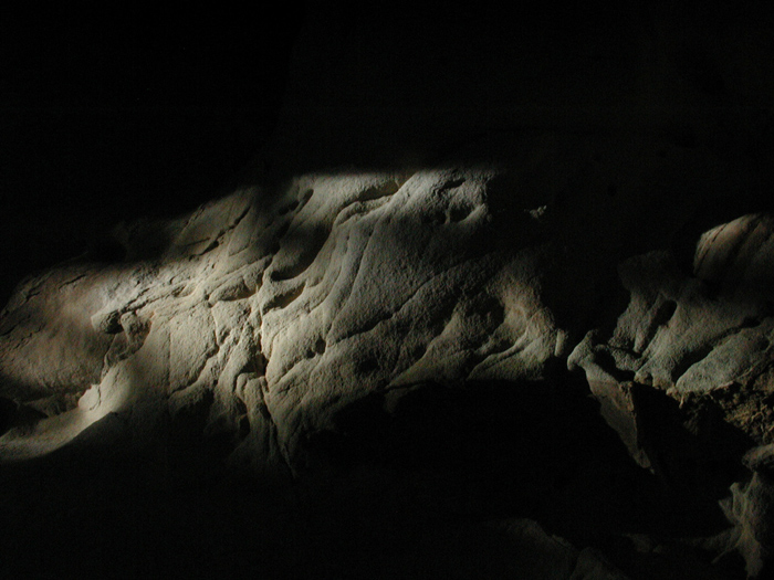
I like rocks. I am especially fond of a particular type of sandstone called "tafoni" where wind and rain have eroded strange and wondrous shapes, and the rough texture captures the light. A couple of my photographs of tafoni turned out well, and they are in my gallery. This one didn't. Yet... there was a hint of a butterfly trying to free itself.
So, image 1 - the raw photo in all its ungainliness.
The link goes to the final gallery image.