Renderosity Forums / Poser - OFFICIAL
Welcome to the Poser - OFFICIAL Forum
Forum Coordinators: RedPhantom
Poser - OFFICIAL F.A.Q (Last Updated: 2024 Nov 11 2:56 am)
Subject: Warming her up
Yup, Photoshop/PSP can do wonders. So can playing with the lights in Poser. Now, in case you think I'm ragging on Wampyr, I ain't, nor am I dissing postwork, since I do use it from time to time. But... Lighting in Poser ain't exactly rocket science. You can get some awesome effects if you're prepared to take the time to experiment. I honestly prefer doing the whole bag of mashings in Poser if possible. Not to be a purist, but to have a sense of "right here, right now" which you will never achieve with postwork.
Coppula eam se non posit acceptera jocularum.

One filter that seems to get used allot but never really used properly is the emboss filter feature. Their result on any image in my mind is used best as giving any plain object three dimensional qualities. Using it as blending overlays on top of other texture element(s) or can be used as a base layer for other textural elements that are blended on top of in the form of an overlay(s).
The Celtic boarder is a black and white vector graphic created in Illustrator(above in the diagram) was imported into Photoshop, blured very little and then a emboss filter was applied (Angle = -90, Height = 2 pixels, Amount =130). Then other texture elements were overlaid with different blending modes such as Multiply and Overlay with different percentages of transpierces. You can eventually see the carved wooden panel emerge from a simple black and white graphic.
I hope this will help some one in future, with their texturing endeavors.
Message edited on: 05/30/2004 11:51
Privacy Notice
This site uses cookies to deliver the best experience. Our own cookies make user accounts and other features possible. Third-party cookies are used to display relevant ads and to analyze how Renderosity is used. By using our site, you acknowledge that you have read and understood our Terms of Service, including our Cookie Policy and our Privacy Policy.


Content Advisory! This message contains nudity

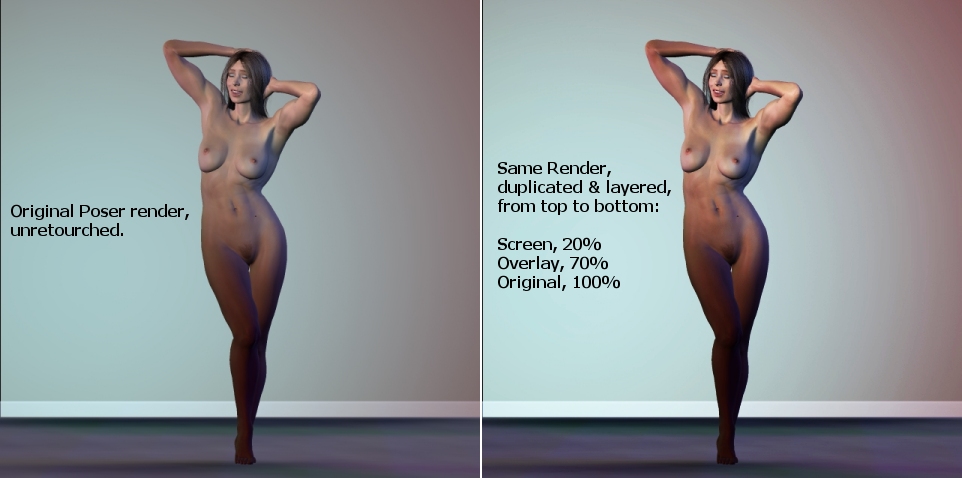
Here's a little post-production trick I finally learned that might be of interest to newbies. For eons I've wondered how DAZ produces Poser renders on their sales pages that have so much warmth and realism. The answer would appear to be layering, via Photoshop or, in this case, Paint Shop Pro.On the left is the original Poser render, unretouched. On the right is the same render, with the image duplicated twice over the original (i.e., the background layer) and blended as follows:
Top layer: Screen mode, 20% opacity
Middle layer: Overlay mode, 70% opacity
Bottom layer: Background (default), Normal mode, 100% opacity
I'm sure the effect these blend modes have will vary greatly from image to image, and I'm sure these percentages won't hold true in every case. But if you're wondering how to make your renders look a little more photorealistic, here's a good place to start (the Multiply blend mode is also very useful).
Comments and suggestions more than welcome.