Renderosity Forums / Photography
Welcome to the Photography Forum
Forum Moderators: wheatpenny Forum Coordinators: Anim8dtoon
Photography F.A.Q (Last Updated: 2024 Nov 26 6:56 am)
Subject: Requesting help on image

"The happiness of a man in this life does not consist in the
absence but in the mastery of his passions."

How come we say 'It's colder than hell outside' when
isn't it realistically always colder than hell since hell is
supposed to be fire and brimstone?
____________________
Andreas
Mystic
Pic
Definitely like the simulated light Andreas. Good idea. The thing though about making it only 80kb is you get back the jpg artifact. But if it was from original, and loaded in a gallery it would be larger and those would not be present. Never tried Neat image.Monochrome works too for this.
"The happiness of a man in this life does not consist in the
absence but in the mastery of his passions."

Attached Link: http://www.popphoto.com/article.asp?section_id=4&article_id=706
Zacko, interesting how your attempts take the view from spring to winter..both work.My concern is lack of sharpness on the stem in original. I have used fill flash effectively on similar shots but you do have to be careful to use just enough and not too much or it will look unnatural.
Check out the link for the "Fill Flash Cheat Sheet" published by Popular Photography. Some time ago, a poster provided this to me and I pass it on... Just saw Brenda's crop..I like that.
Message edited on: 01/28/2006 09:37
Wow! Thanks so much for the info everyone! I really appreciate you taking the time to teach me! All of your versions look so great.
I'll spend some more quality time with the image and see if I can make it look as good as you have. I'm going to have to give Neat Image a try.
I thought I already had cropped aggressively in this image, but after seeing Brenda's hyper-crop, I think I like it much better that way.
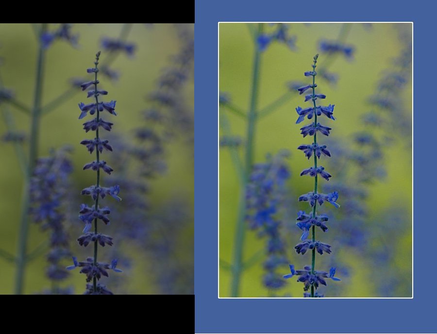
As for the blue border, that's funny! I actually was thinking it looked pretty good before you all enlightened me! Can anyone recommend a tutorial on good taste? :) Alas, I have a history of using sub-optimal borders.
I am curious about the steps Brenda took -- especially with respect to multiple layers.
Thanks again!!!
Using my own rule of thumb, I never use colored borders anymore, the DO take away from any image imho. I either use blakc or white and add a sliver of the dominant color (usually 1 pixel) I responded to your IM. I hope I gave you enough information. Be sure to use edge preserving smooth after step 1, I use a setting of 3, to remove artifacts and noise. If you have any more questions feel free to ask. Here is my reply that I replied via IM: Hi Jared! I use PSP not PS so the steps may or not be close. I am going to try to explain this as best I can OK? 1. Open image is psp. 2. Take original image and go to "effects" "enhance photo" "automatic color balance" 55% temp = 6515 (which is about = to sunlight) uncheck remove color cast and apply. The go to "effects" "enhance photo" "contrast" and I played with the settings. I think it was darken, mild and flat. Then I go to "effects" "enhance photo" "saturation" and make it more colorful and bold. 3. Now duplicate two images (use shift D). 4. Go to one of the duplicates you made in step 3 and go to "effects" "blur" "gaussian blur" using a radius of 5.57 (because the longest edge on the image that used of yours was 557 x XXX) now copy it and go back to the original image and add it in as a layer. Now go to "layers" "properties" and I think for this layer I used the blend mode saturation, adjusted the opacity to where I liked it. And when I added the third copy "as is" I used the mode screen and adjusted the opacity to where I thought it looked best. I then went to layers, merge layers visable and saved. Open your saved image again and applied crop. Geeze I hope all that made sense... it only took a few minutes I swear! Anymore questions, feel free to ask! Brenda :)
Privacy Notice
This site uses cookies to deliver the best experience. Our own cookies make user accounts and other features possible. Third-party cookies are used to display relevant ads and to analyze how Renderosity is used. By using our site, you acknowledge that you have read and understood our Terms of Service, including our Cookie Policy and our Privacy Policy.


Going through some old images and found one I thought had potential. However, I think I've failed to bring it up to standards worth posting in the galleries.Could some of you sages and mages give me an honest critique of my attempt, and possibly give ideas about what I could have done better (or could have done right, instead of what I actually did)?
I'm including the original (but cropped and sized) image, plus the one I've munged.
One concern is the lack of sharpness in the foreground. A combination of low light and a bit of a breeze was a problem, and I just couldn't get things to look any sharper in post work. Any suggestions? Or is my original just not good enough to start with? If not, do you think a small bit of fill flash would have done the trick without making it look like a snapshot?
Thanks!!!