Thu, Nov 7, 12:57 PM CST

Renderosity Forums / Poser - OFFICIAL


Welcome to the Poser - OFFICIAL Forum

Forum Coordinators: RedPhantom

Poser - OFFICIAL F.A.Q (Last Updated: 2024 Nov 07 12:47 pm)


Subject: Realistic Poser Shader, Round 3 - Comments?


Iuvenis_Scriptor ( ) posted Thu, 16 September 2010 at 10:16 AM · edited Thu, 07 November 2024 at 12:49 PM

file_459260.jpg

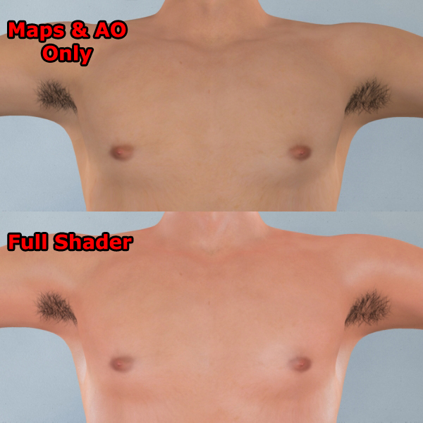
Well, it's been quite a while since I've updated my last critique-this-shader thread, so I think the improvements that have taken place since then merit a new "version 3.0" thread.  This is the latest in my ongoing quest for optimal photo-realism in P8, and your feedback would be very helpful!  To start things off, here's an at-a-glance comparison of an unshaded and shaded Vittorio chest.  There are four spotlights (two rim, one fill, and one main), each with BB's inverse square falloff shader applied, and IDL is enabled.  Thoughts?


Victoria_Lee ( ) posted Thu, 16 September 2010 at 10:50 AM

Okay .. I missed this one ... disregard my other comment ... the full shader looks a little to pink/red to me

Hugz from Phoenix, USA

Victoria

Remember, sometimes the dragon wins. Correction: MOST times.


hborre ( ) posted Thu, 16 September 2010 at 11:47 AM

As BB and I commented on the other post, no need for BB's ISF.  It is already built into P8 lights.


Iuvenis_Scriptor ( ) posted Thu, 16 September 2010 at 1:31 PM · edited Thu, 16 September 2010 at 1:38 PM

You'd be surprised, Hborre.  I tried the built-in ISF and found that the resulting brightness was so blown-out that I'm tempted to suspect faulty math on the part of the developers.  I say that last part only because I seem to recall testing it out on some very simple textures, too, so I'm quite sure it's not my shader that's causing the blow-out.  I'll try it again, though.  If you and BB are using it without problems, there's still a possibility I'm doing something wrong and just don't know it.  Stay tuned!


RobynsVeil ( ) posted Thu, 16 September 2010 at 7:12 PM

Quote - Okay .. I missed this one ... disregard my other comment ... the full shader looks a little to pink/red to me

Agreeing with Victoria_Lee: the shader version looks like he just stepped out of a rather hot sauna...

Monterey/Mint21.x/Win10 - Blender3.x - PP11.3(cm) - Musescore3.6.2

Wir sind gewohnt, daß die Menschen verhöhnen was sie nicht verstehen
[it is clear that humans have contempt for that which they do not understand] 

Metaphor of Chooks


Iuvenis_Scriptor ( ) posted Thu, 16 September 2010 at 7:34 PM · edited Thu, 16 September 2010 at 7:37 PM

file_459271.jpg

Here's the same setup with the hue nudged a bit away from the red and using the built-in rather than procedural ISF.  Technically, I cheated and adjusted the redness of the texture maps rather than the shader, but that's only because I have multiple scenes built using the same texture set and it just seemed easier than opening each one and tweaking the shader.  The effect can easily be duplicated within the shader itself, though, with the addition of a single node.

I'll also be posting a sample from a different angle and in different lighting soon!


lesbentley ( ) posted Fri, 17 September 2010 at 6:29 PM

The colour looks better in this image, not sunburnt. Unless he is supposed to be sweating, there seems to be too much specular reflection. The lighting also looks a bit strange, very bright very diffused lighting. Whilst this effect could look appropriate in some unusual lighting set ups, if it is supposed to represent some average scene, it looks over exposed, and lacking in contrast to my eye.


Iuvenis_Scriptor ( ) posted Fri, 17 September 2010 at 10:25 PM

file_459310.jpg

Thanks for your feedback so far, folks!  Here's another test from a different angle and under somewhat different lighting!


MysticDaniel ( ) posted Sun, 19 September 2010 at 11:29 AM

file_459360.jpg

cool shader but I wonder what the shader would look like with some realistic skin textures :) This is an M4 Shader I am working on...


Latexluv ( ) posted Sun, 19 September 2010 at 4:02 PM

Quote - cool shader but I wonder what the shader would look like with some realistic skin textures :)
This is an M4 Shader I am working on...

Looks good, but I think your bump (or displacement) is a tad too high.

"A lonely climber walks a tightrope to where dreams are born and never die!" - Billy Thorpe, song: Edge of Madness, album: East of Eden's Gate

Weapons of choice:

Poser Pro 2012, SR2, Paintshop Pro 8


Iuvenis_Scriptor ( ) posted Tue, 21 September 2010 at 3:13 PM · edited Tue, 21 September 2010 at 3:13 PM

file_459445.jpg

Well, MysticDaniel, here's a test of how the shader handles V4 Elite Katie.  Some adjustments had to be made since the original shader was designed for texture maps and hair trans maps only (no external spec or bump/displacement maps), but in essence, it's the same.  I also had to use an HSV node to weaken the red tint of the maps.  I read somewhere that the base color of human skin is actually pale green and that the peach/pink hue that we actually see comes mostly from SSS in the deeper layers.  Most commercial sets don't take this into account.  This hue adjustment might result in some discoloration of the lips, but that can easily be masked out (especially if I make my lips mask freely available).


MysticDaniel ( ) posted Tue, 21 September 2010 at 9:05 PM

wow that looks really good now iuvenis! Well done! Yes Pale green is also in concealors and creams to hide redness in skin so I guess that really is realistic ;)

I would like to try your shader if you are willing to let people test it?


Privacy Notice

This site uses cookies to deliver the best experience. Our own cookies make user accounts and other features possible. Third-party cookies are used to display relevant ads and to analyze how Renderosity is used. By using our site, you acknowledge that you have read and understood our Terms of Service, including our Cookie Policy and our Privacy Policy.