Renderosity Forums / Poser - OFFICIAL
Welcome to the Poser - OFFICIAL Forum
Forum Coordinators: RedPhantom
Poser - OFFICIAL F.A.Q (Last Updated: 2025 Feb 02 2:22 am)

Subject: Eeww...What happened to the Forum?


Content Advisory! This message contains profanity
Quote - ... please don't tell me I have to leave again geesh,,, this is getting to be a fulltime job
Shitfire! Don't do that, mate. :(
Coppula eam se non posit acceptera jocularum.
Quote - I just heard back from TPTB. What you are seeing is a work in progress. The techs are still working on it. Give it a day or two and let's see what it looks like.
Sure thing, Basic. Thing is, the cardinal rule of any system changes is to get them running and looking right on an offline server before rolling 'em out to the masses. Naughty naughty developers. Off to bed with no supper.
Coppula eam se non posit acceptera jocularum.


Think about this:
If you want to make enemies, try to change something. ~Woodrow Wilson
Change is inevitable - except from a vending machine. ~Robert C. Gallagher
He who rejects change is the architect of decay. The only human institution which rejects progress is the cemetery. ~Harold Wilson
Didn't some famous person recently say something like "Change you can believe in!" :laugh:
and last and most important....Change always comes bearing gifts. ~Price Pritchett....Wonder what the value of the Renderosity Change coupon will be?
Lets give them time and not panic (unless there is no change store coupon code):biggrin:
Gary
"Those who lose themselves in a passion lose less than those who lose their passion"

I have to agree that the formattng is now way off.
I had set a minimum font size of 16pt in Firefox and used "NoSquint" to make sure text stayed a certain size.
I had to disable minimum font size, re-adjust "NoSquint" and re-enable ABP and ElementHidingHelper to zap several page elements to make the forums readable again on my 1024 x 768 monitor.
Disabling minimum font size meant I had to re-adjust all my other regular sites also. A few clicks with "NoSquint", but still annoying.
I hate it when stuff like this happens. :-(

My two coppers -
I can't stand forums that have so much space reserved for.. nothing, and little space reserved for actual posts. Sure, I'm on a widescreen monitor, but there's a great deal of dead space on the page. It's always been like that, so there's nothing new, there. But, if they're redesigning the forums as well as the site, they need to keep that in mind.
Like other posters, I don't like scrolling through blank real-estate, just to get to the meaningful content.
(Not really impressed with the background color, either. But, everyone has their own color prefs.)
PS - You've got CSS style sheet options available to the forum users. How about packaging up a few and letting users select a choice out of drop-down box if they'd like? That way, users could have a variety of different chocies. You've got the CSS open, it'd be a waste if it wasn't available to us ignorantof-the-ways-of-coding-CSS peeps. :D You could even host a competition for developing that, if you'd like. I'm sure some CSS-Geeks would like to play with creating their favorites.

I've just start learning HTML coding and this is NOT the way to do it at all.
If it ain't broke, then don't fix it !
The whole page code is a mess, I've checked the source code and it's not clean and elegant at all, quite the opposite...HIRE A PROFESSIONAL QUICK !
And how come no MODS have entered this discussion as yet ??????
First sort out the colour scheme, blue on blue WTF ?
Pages should adjust size to fit on your screen resolution.
Commentry box is unusable.
While you're at it, get rid of either "Most commented or Most rated section" rather have more new thumbnails on view for new posts.
P.S. is there anybody out there reading or listening ?
NOT HAPPY JAN ! :o(

Quote -
And how come no MODS have entered this discussion as yet ??????
What am I? Chopped liver?
I believe if you look up a dozen messages or so I have entered into the discussion advising people that the work is not finished.
I encourage EVERYONE to state their views on what is going on. This is (IMHO) VERY valuable feedback to the programmers. At least, it would be to me.
Let's please exercise a bit of patience while all of this shakes out.

"The techs are still working on it."
Does no one beta test anymore? C'mon, this thing wouldnt have even passed alpha before someone complained about the colour arrangement.
docandraider.com -- the collected cartoons of Doc and Raider


the lack of professionalism with this rollout is positively stunning. an unfinished web site should never be made live. you first test on an off-line server to make certain things are OK and then, and only then, do you make it live. to expect the users of your site to let you know what needs fixing is simply unacceptable. Daz did the same thing, and it was a real turn off for lots of folks. their site, especially the forum area, is still FUBAR. spend the money and hire real, experienced professionals to do it correctly the first time.
this is such a sad joke.


Top banner or margin where the Rendo logo is located is way, WAY to large, otherwise, the forum threads and posts are much more readable by my aging eyes. Return the top to the size it was before and I think this would be livable.
"A lonely climber walks a tightrope to where dreams are born and never die!" - Billy Thorpe, song: Edge of Madness, album: East of Eden's Gate
Weapons of choice:
Poser Pro 2012, SR2, Paintshop Pro 8


By all means make the site cool and trendy, but in its current form it's really hard to spend much time in it.
EDIT: who is putting this new look together? I know it's a work in progress but there are fundamental design errors that shouldn't have made it to the first draft, let alone being published on a live site.
I hate being negative and I've looked really hard for something to be positive about, but I can't... this is a dreadful mess.
Windows 10 x64 Pro - Intel Xeon E5450 @ 3.00GHz (x2)
PoserPro 11 - Units: Metres
Adobe CC 2017

Don't like it. It is way too bright and that makes it hard to see. This takes away front what should be the primary focus, that artwork and the thumbs for products. The background should work as a background. What I mean by this is that it should not be the brightest part of the page. The person viewing the page should never even notice the background.
Poser Pro 2012 SR3
Windows 7 Professional 64 bit
Intel Core I7 990x 3.46G 6 core
24G RAM
EVGA GTX580 R Video Card
Single HP LP2475 1920x1200 monitor
______________________________

I have followed the advice above, I am NOT PANICKING, I have my towel and my frood and have draped the towel over the monitor so I don't have to look at it...... I know it's up to Rendo whatever they decide to do, but maybe posting a screen shot of the proposed changes would resolve a lot of problems. I like many others am not anti change, in fact I relish it, but change that makes it very hard/virtually impossible for some people to read certain fonts. headers etc is not imho good change. I don't care if Rendo decide to make it sky blue pink with a purple lemon border as long as I can read it in various light settings.

First, we shouldn't have to use a plugin to change the colors of the site. It should either be well designed enough to not need one for anyone other than the nitpickers, or should have several color options for people to choose from before resorting to a plugin.
Second, can we please, please, PLEASE! Implement code to allow the website to adjust to different screen ratios. There is, and has been since the new forums were introduced, far too much empty space on the sides. Even on a 1280x1024 screen there's more space between the elements of the pace and the edge of a maximized browser screen than there should be.
And lastly, I'm going to go pessimistic cynic here, but I don't see the PTB choosing this time to listen to us and try to make anything better. They repeatedly displayed a "we know what you really want for this site, even if you don't" attitude, and I don't see them changing.
The last Markeplace update has resulted in me practically completely stopping my browsing of it, and with this latest I'm considering either making another site my homepage (first such consideration in over a decade...).
Now, I don't actually mind the color scheme that DAZ chose for their website redesign (but that's the only thing I liked), and that is because it is a fairly neutral, muted complementary color scheme. Renderosity used to have one in regards to blue that served as a kind of site identity, but they've been moving away from that for a while, and (IMHO) losing the site identity in the process.
________________________________________________________________
If you're joking that's just cruel, but if you're being sarcastic, that's even worse.
Quote -
While where terrorizing Renderosity ,A spell checker would be nice.
Quote -
Would it help?
Since renderosity is updataing there site.
Thought a spellchecker like DAZ ,zBrush has would be a good idea.
So Renderosity will be up with the times.
Every one knows what happens to out dated tech.
============================================================
The
Artist that will fight for decades to conquer their media.
Even if you never know their name ,your know their Art.
Dark Sphere Mage Vengeance
Quote - You can re-color with a plugin for your browser called 'color that site' if you want....
That's just shuffing responsiblity off, as far as I'm concerned. This was just a bad move, period, and a plug-in will not correct that.
docandraider.com -- the collected cartoons of Doc and Raider
Completely agree.
The header is WAY too high, and lots of lost space on the sides.
Even on a small screen the header should take no more then 1 inch.
Even on my big monitor the header alone takes half the screen in height while the sides are enmpty.
How did this ever pass alfa stage?.
Poser 1, 2, 3, 4, 5, 7,
P8 and PPro2010, P9 and PP2012, P10 and PP2014 Game
Dev
"Do not drive
faster then your angel can fly"!


does this imply that rendo pro's are testing in the production environment instead of in a local copy? Interesting.
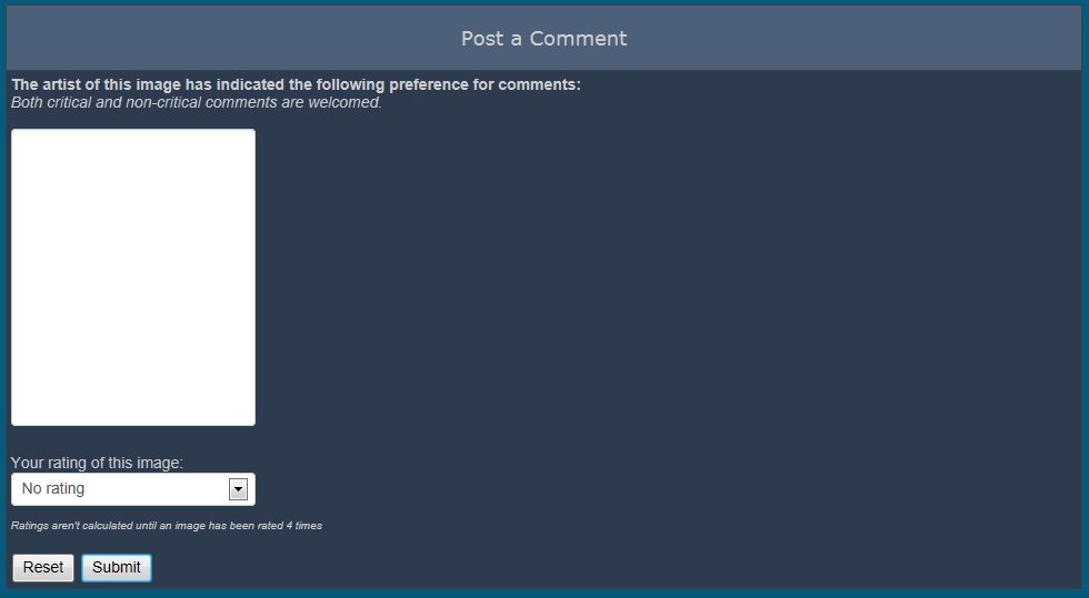
this is how my comment box in the galleries section looks like - way smaller than before.
I hate change but I do like progress.
- - - - -
Usually I'm wrong. But to be effective and efficient, I don't need to be correct or accurate.
visit www.aRtBeeWeb.nl (works) or Missing Manuals (tutorials & reviews) - both need an update though
Anyone else try a simple copy and paste yet for a forum response?
Interesting results.
docandraider.com -- the collected cartoons of Doc and Raider


Wow... blinding... I am not fond of the changes at all. Is there a way for the user to change them? At least it isn't white font on white background (looking at you foriegn film subtitle management who puts white lettering on snow scenes... grrr). This seems very boxy now too. Wow. It does hurt the eyes. Just a few moments and eye strain. Sure the competition didn't do this?
The dust settled, thinking "what a fine home, at least for now" not realizing that doom would soon be coming in the form of a vacuum cleaner.


I tried to read the interview with the Artist of the Month. Gray fonts against the blue background doesn't provide a comfortable contrast
The blue links on the blue background is seriously wrong. I don't know how anybody could see that combo and think it works.
Download my free stuff here: http://www.renderosity.com/homepage.php?page=2&userid=323368
Content Advisory! This message contains profanity
Quote - I only offered this as it's what I'm using to handle the changes. I guess in a pinch, it's worked for me.
Oh yeah; I don't think anyone's disputing that but it seems to me the main gripe(s) are the lack of thought put into the changes.
It's one thing to give us something new and entirely another to give us something that looks terrible, is hard to use and have to fix it ourselves.
As I - and others - have already said, why on earth did this version go live? Should have been tested thoroughly tested before putting it out here. Knowing how fractious many members are here, it can only serve to piss people off more and more.
I hope when it's all finished there's a co-ordinated, coherent look and feel to the site. For now - and for a long time - it's looked a messy ragbag of styles and shapes, and the damn banners all over make it look like a cheapo market stall rather than a professional looking site.
Coppula eam se non posit acceptera jocularum.

Will Rendo be issuing free sunglasses to view the current system??
All the best.
LROG
Who honors those we love for the very life we live?, Who sends monsters to kill us?, and at the same time sings that we will never die., Who teaches us whats real?, and how to laugh at lies?, Who decides why we live and what we'll die to defend?, Who chains us?, and Who holds the key that can set us free... It's You!, You have all the weapons you need., Now Fight!

Put this back on your other sever and get a few people to test it BEFORE you bring it back.
All the best.
LROG
Who honors those we love for the very life we live?, Who sends monsters to kill us?, and at the same time sings that we will never die., Who teaches us whats real?, and how to laugh at lies?, Who decides why we live and what we'll die to defend?, Who chains us?, and Who holds the key that can set us free... It's You!, You have all the weapons you need., Now Fight!
Privacy Notice
This site uses cookies to deliver the best experience. Our own cookies make user accounts and other features possible. Third-party cookies are used to display relevant ads and to analyze how Renderosity is used. By using our site, you acknowledge that you have read and understood our Terms of Service, including our Cookie Policy and our Privacy Policy.
I just heard back from TPTB. What you are seeing is a work in progress. The techs are still working on it. Give it a day or two and let's see what it looks like.