Renderosity Forums / Poser - OFFICIAL
Welcome to the Poser - OFFICIAL Forum
Forum Coordinators: RedPhantom
Poser - OFFICIAL F.A.Q (Last Updated: 2025 Feb 06 4:35 pm)

Subject: Advice on V4 Character

Well it's not just one person not seeing the differences. So -
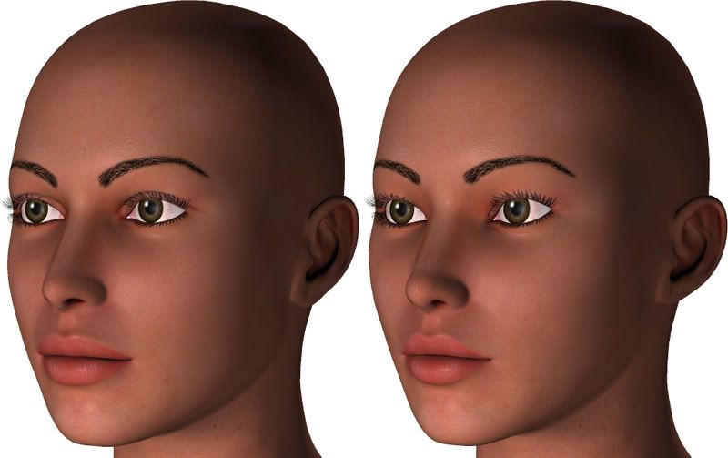
You asked us to really look at those lips. Sure I will, and after doing so I do see a tad bit of difference. However, how long do you guess a person stares at a MP character to determine whether or not it is box vickie before deciding to buy it? My guess is not too long - if I have to wonder at all whether or not it is box vickie Ill pass. I imagine those at Daz who are deciding feel the same way.
If you are afraid that changing the eyes more will take away from your look, then try changing something else - but ALOT more needs to change.
When you say ethnic - specifically which ethnicity do you mean? Perhaps that should get determined and you should look up dominate features within that group.
I am: aka Velocity3d

Iuvenis_Scriptor - It seems as though this is going nowhere. You are obviously on the wrong page to the rest of us. If you feel there's enough in your character morph then go ahead with it, but don't be disappointed when it gets rejected.
Just for the sake of it, do a complete rework, turn lots of dials & make them big changes. Don't worry about what the appearance might look like, just go for it, you might be surpised.

Yes, now the third of those is showing some noticeable morphing.
TBH I would be tempted to alter individual morphs at this stage,....but by all means create an FBM when you are happy that you are near finalising.
( OOOpps looks like the post I was commenting on was deleted :00 )
Klutz :0)
********************************************************************************************************************
Life is a beta.
In faecorum semper, solum profundum variat.
To avoid confusion, the above post was a response to this post made before I accidentally deleted it. Here's my original post again.
First of all, I want to thank everyone for your patience. I know some of you are probably as annoyed with me as I am with the fact that I'm apparently hallucinating when I see any significant distinction between default V4 and Natalie.
Having said that, let's do a three-way comparison this time. I've revised the morphs yet again, but I also created an FBM based on my dial settings. I then removed the dial settings and set the FBM to 1.3 strength. I tried 1.5, but that gave me this weird black poke-through (or something that looks like it) around the eyelids. In fact, it's still somewhat visible even at 1.3, but this will hopefully be an adequate preview, anyway. Personally, I think intensifying the morphs just makes her look a little unnatural, but then again, my perception has apparently been woefully wrong throughout this thread.
Also, the image is too wide to reduce to a width of 800 pixels and still have it retain enough detail for good scrutiny, so I'm posting a link instead of the picture itself.

Maybe in some way the perspective is geting lost here. We are not generally just talking about her looking different to the base V4, we are aslo talking about her looking unique or just different enough to make her appealing. In my opinion the only way to achieve this is to make many more changes, not just in the dials you've already turned but in different ones. Have you also tried using negative values, it's amazing sometimes what can be accomplished when using this method.
Holy crud! There's actually some blue spots on the middle image! So you DO notice some differences with the unintensified morphs!
I do have some dials set to negative values. While I would like her to be unique, our main thrust at the moment is just making her look sufficiently distinct from default V4 (which I think I've already achieved, but I think I'm still alone in my opinion). My goal is a face that's beautiful but still looks like someone you could meet while walking down the street.
I collect comedy tapes/CDs/movies. Bill Hicks relentless is my all time favorite. I can't say I'm bitter or cruel - cold at times maybe : / I'm just not much of a people person I think. I'm glad you noticed - nice to meet others who like Bills work.
Regarding blue dots on the middle image. Well tbh I really couldn't see any difference between the middle and last image - those dots are only there because there is a difference from the first.
I am: aka Velocity3d
Quote - Regarding blue dots on the middle image. Well tbh I really couldn't see any difference between the middle and last image - those dots are only there because there is a difference from the first.
That's the only comparison that really matters. I'm really glad you saw that many noticeable differences between the first and second image, 'cause it means that the unintensified morphs are finally at least starting to meet your mysterious standards for distinction from default V4.
**jjroland - 'Relentless' is a classic. Now I've got this on my mind I think I'll have to get it on DVD, I haven't seen it for years, hilarious!
Iuvenis_Scriptor - We keep talking about morphs, maybe also a change of texture would suffice. What's lacking in morphs could be made up by the texture.
**
'cause it means that the unintensified morphs are finally at least starting to meet your mysterious standards for distinction from default V4."
Iuvenis_Scriptor - Two points here:
1 - It's not just about noticable differences, it's about appeal.
2 - Don't insult jjroland & the rest of us for trying to help.
First of all, I apologize if my last comment sounded bitter. The fact is I truly don't understand why I have to morph her face almost to the point of inhuman distortion in some parts before you and the other regular commentors on this thread observe any significant differences from out-of-the-box V4.
Secondly, let's do one thing at a time. Forget about appeal and beauty for a moment and just tell me on the following scale how different the middle image (unintensified Natalie) looks from the first (completely unmorphed V4)
1 = She might as well not be morphed at all.
10 = Is that really V4 under there?
I don't expect any 10s. It's just there to put the scale in perspective.

Iuvenis,
Not sure if you are going for realism or a fantasy type character, but if you are going for realism, you need to make the irises smaller. I do think your morph is looking better. Now you just need to work on the textures. IMO, the skin is fine, but the eyes and the eyebrows still need some work. The eyebrows look totally fake and painted on, to me. Another thing, if you are planning on using eye colors like green or blue, make sure they aren't too bright/intense and unnatural looking - unless you are making a fantasy character, I mean.
"First of all, I apologize if my last comment sounded bitter. The fact is I truly don't understand why I have to morph her face almost to the point of inhuman distortion in some parts before you and the other regular commentors on this thread observe any significant differences from out-of-the-box V4."
I too have become frustrated with this. I would like to point out the underlined part of your response there. You don't have to. You can keep her exactly and precisely the way she is. It's no matter at all to me. BUT I will bet you my entire V4 character collection, that as it now stands this character will not be accepted - and if it is then it will not be purchased.
You asked for help in this thread for creating a character that would be accepted by Daz, since they are a business thier goal is to sell - not argue with you regarding whether or not that looks exactly like the character they originally created. The changes you have made do not appear as if you have taken any of the advice. So why ask?
Im not personally of the opinion that different cheekbones/ears/lip depth would make her look inhuman - but meh what do I know. I'd say until you are ready to cater to the observations of others you might not be ready to make business ventures. Unless as someone said previously you intend to be the only one buying your product. As it stands the one and only person who thinks this character looks different is you. I highly doubt we are all blind. If so then hey no sense in asking us poor without 20/20 folk.
With that I'm out. If at any time this becomes anything more than an exercise in futility I will be more than willing to give you additional feedback.
I am: aka Velocity3d
So I have a 2 and a 3, so far. I still don't get why you don't see what I see. Natalie's whole head is more teardrop-shaped, for one thing. Her cheekbones are much higher. Her eyes are quite distinctive, especially with the much thinner lids. Her nose is kind of stubby with a more curved slope. Are you not noticing these things or do you just not think they're significant enough? I know I'm not exactly impartial, but still...
Speaking of impartial, I've decided to hop over to PoserPros and get the opinions of some fresh minds. Now, your first instinct will probably be to roll your eyes and say, "They're just going to tell you the same thing, you stubborn git!" They probably will, but I'm going to do it for my own peace of mind if nothing else. I mean no offense to anyone here. I greatly appreciate your help. I'm just still scratching my head at how we're looking at the same pictures and seeing (or not seeing) very different things.

I-S, I really feel for you.
I have spent many hours staring at the screen wondering how many freakin dials I have to turn to turn Vicky into another woman, without turning her into a circus freak.
Have you got Poser 7? If so, use the morph putty tool, forget the dials.
Or use magnets, or an external modelling program, whatever you feel most comfortable with.
I have come to realise after several years of trying to "Un-Vicky Vicky" and "Un-Mike Mike" that custom morphs are the only way to achieve a decently distinct character.
Look at the top sellers here in the MP. All of the character creators are using custom morphs. Rena, Amy (rebelmommy), Thorne & Sarsa, D&M, Rhiannon, Danae, Chris (orion1167), Timo (outoftouch) and of course Aery Soul. All of them produce characters which are so distinctive and unique - even though they may have a similar "look" which serves as that creator's trademark - that they are instant sellers because they look *different.
- These people are at the top of the tree for a reason. Customers crave something different. There are plenty of "slightly-different-but-not-really" V3 and V4 characters in the marketplace already. As you've discovered here, they'll sell few copies, and that's all. Daz have a different marketing strategy to Renderosity - they only want to sell high-volume items. They need to be sure that your character has got that "gotta have it" factor.
Something else that might help: give your character a back story. What kind of person is she? Is she sweet and innocent? Is she a tomboy? The girl next door? A sports freak? Is she a naughty girl with a dirty laugh? How old is she... what does she do for a living... what kind of clothes does she wear... Think about these things, and what they mean for the character. What are you trying to convey? OK, it's foolish to think, logically, that you can tell someone's character by their face. But realistically, we do this every single day, again and again. So use the stereotypes. If she's sweet and innocent, give her big eyes, and raise her eyebrows. If she's a tomboy, give her a squarer jaw. If she's naughty, give her a lopsided grin and a raised eyebrow on one side. Continue that theme to the body - a sports freak will have a muscular frame, a tomboy will have smaller breasts and square hips, a sweet and innocent girl will be unlikely to sport tattoos or a brazilian wax. [Note - I'm playing off the stereotypes here. I don't really think all tomboys have small boobs. I'm a tomboy, and I've got more than I want! But play with the stereotypes, because that's what people see, in those first moments they open the product page. And use it in your promo images! The sports girl should be wearing jogging pants, the naughty girl in lingerie... etc]
Wow, that last paragraph ran on, didn't it?
I'm going to leave it there. Good luck I_S. Don't stop trying. Even if you have to put this character away on the shelf and start afresh, never stop learning and growing!
"you are terrifying
and strange and beautiful
something not everyone knows how to love." - Warsan
Shire

Actaully I was going to post last week but then didn't, I didn't want my comments to be interpeted wrongly.
But it more or less coincides with Karen's post.
There is nothing really different about your character that sets her apart from any other woman character. I would encourage you to be more bold.
Comitted to excellence through art.
I'm sure it probably won't make any more difference to you then what the others have posted but I will throw in my opinon as a DAZ brokered merchant. Frankly if you are looking to sell at DAZ this character is nowhere near original enough to do so. As the others have said while you have made subtle changes to the face, Subtle doesn't sell. It is not different enough in shape for customers to find it worth paying extra for. No one is saying to make characatures, but there are a lot of variations of faces and still some that are not covered in the marketplace yours is too similar to what is out there IMO. Skin textures fall into two catagories that I would purchase. the first is more illustrative, painterly as say the work of Liquid Rust http://www.daz3d.com/i.x/shop/itemdetails/-/?item=5218&cat=350 the second is more realistic such as the work of Danae http://market.renderosity.com/mod/bcs/index.php?ViewProduct=54193&vendor=5262 I have purchased both of these products. Neither of these merchants use premade merchant resources for their textures Danae uses Photographs from 3DSK to create her own custom textures and I am not sure what liquid rust does, but frankly DAZ tends to pass on texture sets that use merchant Resources as a starting point. No offense but there is not enough of an illustrative look to your skin texture for me to be interested in it for that type of look and there is not enough detail for me to be interested in it for a realistic look. In addition the eyebrows look a bit pasted on, eyebrows are more whispy, they have hairs that extend more naturally out of the shape of the eyebrow and vary in size and thickness. take a look at the other textures that have been posted in this thread and see that the eybrows dont form a sharply deliniated block but have variation. Sorry if that was harsh, but I think if you are struggling to get something into DAZ you need to understand what you are up against.

Quote - But is there enough to at least set her apart from the default Victoria 4?
In my opinion? No :( TBH I have to stare and stare at your image and look at small parts of the face and then look at that same part of the V4 face for me to see any difference.
I must have looked at that side by side comparisson for a hour before I saw that the crease in the inner corner of the eye is wider and the mouth when looking front on, is not as wide. Those are the only changes that I noticed.
You are probably seeing huge changes between your Natalie and default Vicky 4 because you are staring at her and turning the dials so you aren't objective. It's reminds me of a Mom who seems astounded at the fact that people can't tell her identical twins apart when to her they look so very different. It's a case of being to close to the "project" which results in tunnel vision.
"It is good to see ourselves as
others see us. Try as we may, we are never
able to know ourselves fully as we
are, especially the evil side of us.
This we can do only if we are not
angry with our critics but will take in good
heart whatever they might have to
say." - Ghandi

This will be my last post here, because honestly there are only so many times I'm willing to hit my head against a brick wall.
The morph as it is isn't far away enough from default V4 by a long shot. WIthout side-by-side comparisons, I doubt ANYONE would label this a unique character.
As I've said previously your concept, while vague, is sound enough as a character ideal. Unfortunately your morph is in no way illustrating this.
Thirdly, and finally. Your texture is leagues below industry standard. You have two options. Inject a HUGE amount of detail into the texture proper, or attach a decent shader tree to your currently bland and flat texture.
You won't find fortune in an essentially out of the box V4 morph coupled with a texture whose resource pack roots are clear as day. If it were me, I'd scrap this project and start a-fresh. Nothing like a clean slate to give you perspective.
If we can hit that bullseye, the rest of the dominos will fall like a house of cards...checkmate!
Well, I think I've had a major breakthrough. I've enlisted a pair of eyes that has had no exposure whatsoever to this project up until last night and furthermore has no experience with Poser or CGI at all. In other words, I asked my grandmother for her opinion. She's an intelligent woman who I trust to be honest even if it's something I don't want to hear. In fact, the first two times I showed her my latest version of Natalie, she too had to look closely to see the difference and told me so upfront. The third time, however, I am pleased to say that she immediately observed a "definite difference" and even went as far as asking how I'd finally accomplished the feat.
So, although Natalie may not be absolutely one-of-a-kind, I feel confident now that she at least looks markedly distinct from default V4. I hope you agree.
You may also notice that the eyebrows look a little sharper. I did some work on them as per some advice I got here. Please let me know what you think.
Thank your Gandma for opening your eyes! :) Now I see some visible differences at first glance. You're on the right track now, but you aren't going to like this part.... she still looks way too similar (IMHO) to V4 (could pass as closely related IE: sibbling) to be considered a "unique" character and at this stage in the morphs, I'm not sure that Daz would accept her because of the similarity.
I'd like to suggest that you change the shape and position of the eyes. Currently they appear to only be moved out so that they are more flush with the face instead of inset like default V4, and you applied a bit of a slope to the outer corners, but other than that they look way too default in appearance.
You're on the right track now towards creating a unique character (you acknowledged that the previous attempts needed altering).
Once you get the facial features and body morphs honed, then we can all get more into your textures ;) and some can even teach you about shaders which will help boost your character and give her some selling points :)
"It is good to see ourselves as
others see us. Try as we may, we are never
able to know ourselves fully as we
are, especially the evil side of us.
This we can do only if we are not
angry with our critics but will take in good
heart whatever they might have to
say." - Ghandi
Finally! I'm so glad you think I've made at least a significant step in the right direction! I'll take a good look at the eyes. I don't know why so many people have trouble noticing that the eyelids are also quite different, but I guess it's just that nobody really pays attention to the lids.
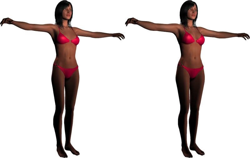
While I'm pondering over the eyes, I'll give you some food for thought as far as the body is concerned. You might notice even less divergence than with the face, since I tend to think facial distinction is much more important and compelling than bodily distinction. Anyway, here's another side-by-side.
no offense but if you have to use side by side comparisons, to convince people that it's different it's still way too close for people to plunk their money down on. for a personal project this work is fine, but if you want to grab customers it has to be original enough that you don't have to convince anyone that it's different enough to plunk their hard earned money down on. as has been said before you are going to have one chance to convince people to click on your thumbnail to even bother to see a larger image, and if the customer can't see a difference without a comparison they will pass it right by.
Iuvenis_Scriptor - I actually thought you wouldn't come back to this thread.
Two points.
OK, yes, we can see the alterations you've made, but you have to scrutinise to really see them. This is the very reason it won't sell. Our first glance at the character should stand out to us, but I'm afraid it doesn't. My first glance says "default V4". I admit with a few slight changes though.
If you think you can go with the basic V4 body then I think you're messing up big time. You're not alone there though, other vendors do it, it drives me mad when I see characters in the marketplace that have had so little done to the body. If I'm going to pay money for a character please vendors, turn the bloomin body dials! I can spend hours & hours fine tuning a body, I use alot of the muscle morphs for realistic shape. Only the top vendors do this, & boy can't you tell. Granted, some vendors create the morphs in a seperate program, but that's another issue.
The only thing I can agree somewhat on is that the face is probably more important than the body as this is the initial attraction to people.
Please Iuvenis_Scriptor, turn the dials.
I think the bottom line here is that the quality in morphs & texture just don't cut it. From the evidence you have shown here alot of people could do it themselves without much headache, so why would they need to buy it. As it stands, if for some reason it was accepted someplace to be sold, I couldn't see it going for more than say $5.00. I think you mentioned between $10 & $15. I can't see anyone paying this price for it when they could pay less for better quality products from other vendors.
Again, I'm sorry to be harsh, you asked for our advice but it seems to make no difference.
I hate having to be negative to you, please don't think for one minute I want to do this, I & others are helping you so you won't have the heartache of being turned down again.
Ok, I just have to ask: what are the textures lacking? When I look at my renders, I can see the pores on her forehead, light freckles on her cheeks, the creases of her lower eyelid, etc. It seems to me that there's plenty of detail. Every skin surface has a bump map and a very slight highlight applied. Has my proximity to the project affected my perception of the textures as drastically as it has that of the morphs, or is there some requirement beyond not looking like she was just painted with a completely homogenous peach color like a simple color fill in MS Paint?
http://market.renderosity.com/mod/bcs/index.php?ViewProduct=52947&
Have a look at a character in the 10-14$ range. Note the skin textures.
and for just a couple dollars more look what I can get:
http://www.renderosity.com/mod/bcs/index.php?ViewProduct=54193
I am: aka Velocity3d
**""Just to add, guess which texture was used as the base on my avatar?""
**wtb a full figure shot because I can't guess LOL
IS: I don't know what else to tell you. It's like if a really obese person asked for advice on how to lose weight and we told him to walk around the block a few hundred times - he walked ten steps and said "HEY HEY what do you think of my progress" well... ten steps are better than no steps but still a far cry from the goal.
Again I'm curious - why ask?
I am: aka Velocity3d
Privacy Notice
This site uses cookies to deliver the best experience. Our own cookies make user accounts and other features possible. Third-party cookies are used to display relevant ads and to analyze how Renderosity is used. By using our site, you acknowledge that you have read and understood our Terms of Service, including our Cookie Policy and our Privacy Policy.
I still don't get it. Seriously, take a good look at the lips, cheeks, jawline, and eyes. How can you not see any significant difference in the lips and the eyes especially? If I morph her eyes any more, she's going to lose her ethnic ambiguity in favor of an Oriental look. The nose morphs aren't that obvious, I'll give you that, but the other key features should at least look moderately distinct! I'd almost swear either you or I need to see an opthamologist/optometrist, 'cause even my close-to-project subjectivity shoudn't cause this much difference in what we see!