Renderosity Forums / Photography
Welcome to the Photography Forum
Forum Moderators: wheatpenny Forum Coordinators: Anim8dtoon
Photography F.A.Q (Last Updated: 2024 Nov 26 6:56 am)

Subject: Rule of Thirds


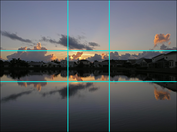
this is another part of the "rule of thirds":
"When taking a picture with a horizon, place the horizon line on one of the horizontal thirds, depending on the emphasis you want in the picture."
i would imagine the emphasis of this photo would be the water (since the sky looks like a flat gray.)
looks like you could satisfy both by moving the horizon up (the building would be at an intersection and the horizon line would be on the upper third line)....
remember....rules can be broken ... i do..all the time :)
gordie


I like it just the way it is Doug.
The building is not the center of your subject, the jutting of land is. It takes up slightly more than two thirds of the center row. Not exactly, just approximate.
Rules, shmules. Who cares? Besides, isn't it more of a general guideline than a rule? Sure, I'd like to follow all the golden rules, "Do unto other," for instance. But if one were to do that, you'd give everything you have to beggars and next week be in the street with them. Hence other rules often apply as well and over rule the rules. Such as, "If I give a man a fish today, tomorrow he will be hungry again. But if I teach a man to fish, he can provide for a family all his days..."
Einstein broke almost all the rules and look where it got him? Like someone else I know, he flunked algebra twice! The rules did not make sense to him, so he made his own, which, later lead to quantum mechanics, even though he disagreed with the premise altogether, because for him, the science of mathematics must be perfect. Even Einstein had the flaw of rigidity in that sense. He believed in God and set about to prove his existence mathematically, and that the universe must be perfect, but forgot that at the end of each day in Genesis, it ends with "...and God said it was good." Note: Good is not perfect, otherwise there would be an absolute solution for Pi !!!
What does this sort of philosophy have to do with the art of photography? Simply put, nothing is perfect, yet everything has the potential for beauty. If we divide a persons face with a vertical line through the center of the nose, we will notice that the face is not symmetrical. If it were, it wouldn't look right. If there is no true symmetry in nature, then how could we expect to follow a rule of thirds each and every time?
Though we may not want to do so for each occasion, in this case I would forget the golden rule and go with what looks right. In my opine would be this is a very good image just the way you have it.
My 2¢. Well, maybe 10¢
Yank My Doodle, It's a
Dandy!

Attached Link: http://www.currys.com/knowledge/landscape.asp
I really like this first interpretation, it gives you the subtle buffers as not to be so stark in format. Even when composing a digital rendering I'm usually looking for "3rds" or the "The Golden Rectangle". I guess If I don't end up with a strict rule in place after a quick shot, it'll probably get cropped to follow one of the comp rules.Here's a decent little landscape Tut that can usually be practiced enough to become part of your Auto-pilot.
___
Ockham's razor- It's that simple

Yeah Doug, I kinda agree with the others here - rules are made to be broked, and that looks ok as it is - my only advice would be to move position next time so you aren't photographing through the white fishing net. Those lines are really off-putting and spoil the image. ;-)
(",)
When you starve with a tiger, the tiger starves last.

Kort Kramer - Kramer Kreations
Hmm, I wouldn't think of pi as either good or bad...I would rather a man teach me to fish than give me one so if I were to do unto him as I want done unto me then I supose I would teach him to fish... at the end of the day,when God said it was good I imagine it was perfectly good.... but I would agree that were can make photos any way we want, beauty being in the eye of the beholder.
Manning
...or the 'beer' holder as it were. ;] Yep, manning, like the rule of thirds, the golden ratio should only be considered a guide, a sprinboard for more daring composition. :)
Kort Kramer - Kramer Kreations
I don't agree with the "beauty is in the eye of the beholder" thing. I think that every artist has a signature of his own. Thus, is the beauty exactly in that - what the artist portray in his work. What he shows the beholder - which part of his soul he shares through his work. Thus, every photographer / arist for himself.
But then, that's just another opinion once again ;0)
The sole purpose in life is serving humanity.
I guess my point was meant to be...the image I'm trying to convey might not be the image another person sees, no matter what "rule" I follow, although I hope it does. I believe those rules/suggestions help and have been proven over time, but if the artist isn't pleased with the end result then what would be the point (thus a signature). I'm not really trying to share part of my soul.
Manning
Rule of Twins? Rule of Pairs? There have been many rules concoted to explain this strange phenomenon... ;oP --edit: Gotcha Manning. LOL, it did sound like you were speaking from the heart there. :)
Kort Kramer - Kramer Kreations

This discussion reminds me of a film from Korea, I cannot tell you the name because the English subtitles do not begin until after the credits, but it is about the life and times of a very famous Korean Painter by the name of Jang Seung-Ub. This movie won critical acclaim at the Canne Film Festival. I must give allot of praise for the cinematography, which is stark yet beautiful, some of the best I've ever seen.
Anyway, this guy Seung Ub lived and died over a hundred years ago during the peasant revolts after the Chinese forced the Japanese and their modern reformist movement out. Historically, this would have been the same era as the "Last Samaria" was written about. No matter who was the imperial power of the peninsula of Korea, Japanese, Korean, Chinese; none would kill the artist Jang Seung - Ub for fear of the loss of his skills.
Steeped in the Asian classics, Seung Ub followed the beat of a different drummer. In his day any artist who was called a professional followed the rules of the classics so much so that one could hardly tell the difference between a work from a long dead artist, and the new kid on the block.
And while Seung Ub did not depart so far from the classics as Van Gogh, Seung Ub's greatest detractors were the art critics of the day who claimed his work was not art because he departed too far from the classics because he did not write poetry on his paintings like the one I've displayed here. Yes, that text is poetry which tells the beholder what it is they are looking at. Jang Seung Ub preferred to let the observer figure what his paintings meant to them instead by writing only the title of the painting in the margins.
Breaking all the rules, his works were purchased by rulers from far away lands who demanded that he add elements (a common practice at the time - sort of like picking a suit off the rack and having it tailored to you). He once called the King of Korea an "Uncouth Fool" to his face for making such demands. And refused a high official of the dominate China to make a replica of an earlier work.
This is not a movie review as per se. Rather what I am doing is to make reference to the fact that classic rules are important for learning, but, once you have a full understanding, they should only become tools which are malleable for creating art that is unique to the artist.
Jang Seung - Ub was a classic artist in the sense that he was not in it for the money; today we would call him a starving artist. After creating a series of simple masterpieces on crockery, Jang Seung Ub disappeared without a trace. Some believe that in the middle of the cold night, he crawled into the kin where his last works were firing, having completed his works.
Yank My Doodle, It's a
Dandy!

I would compare it to this: You're giving a dinner party and you're unsure what kind of soup you'll be offering to your guests. The general rule is: just give 'em regular tomato soup, everybody can eat that, and you'll have no complaints. That's how I see the rule of thirds: if you're in doubt, give 'em tomato soup... But if you are inspired and you have something better to offer, just bring it on, be creative and surprise your guests..!
We do
not see things as they are. ǝɹɐ ǝʍ sɐ sƃuıɥʇ ǝǝs
ǝʍ

All hail the mediocrity of the all encompassing tomato soup! (great analogy)
Kort Kramer - Kramer Kreations
Some rules are hard and fast, i.e., mix yellow pigment* with blue and you get green...with pigments. How much of each you use is your choice, as is photo placement beyond the rules of "what generally makes good composition".
*note, pigments are subtractive colors. It doen't work this way with the additive colors of a computer monitor.
I really think this rule applies only to landscapes myself.
I see a lot of really good portrait images where the photographer has the person at the side of the frame, and see macros where the subject fills the whole frame, so aesthetically, in a scenery image my opinion is that more attention is paid to the geometry.
On this one I posted, my eyes hit the center building then go off to the ferry in the distance.
Showing on the web, the image is small and the eyes will focus on it much different than a larger print.
Good analogy Joe...I have seen these artworks before. Had one on my wall for awhile till I moved. Many Chinese restaraunts give similar calenders out on the new year.
Mikey...ok I'll try...
Kort, your photos is how I like to see it.
"The happiness of a man in this life does not consist in the
absence but in the mastery of his passions."

Doug, I think there's nothing really wrong with the image in terms or thirds and horizons. I think with these types of shots it's always good to take three - centred lowered and higher so that the little 2.5" screen doesn't give you the wrong impression.
In all honesty I can't see the faults in the compo and snapping butthe image is just boring really the sky doesn't add anything and actually takes away from teh building and how great it could be so maybe that's the real problem and coz it's not interesting we look for other things to justify that?
Just my thoughts...
Rights Come With Responsibilities VAMP'hotography Website VAMP'hotography Blog
Privacy Notice
This site uses cookies to deliver the best experience. Our own cookies make user accounts and other features possible. Third-party cookies are used to display relevant ads and to analyze how Renderosity is used. By using our site, you acknowledge that you have read and understood our Terms of Service, including our Cookie Policy and our Privacy Policy.

While not paying attention to any rule taking this photo, I thought afterwards that it would be a good image for me to inquire about the ratio being correct, or if less water and ignoring this golden rule would appear nicer. My goal was no to have the building as a center or main focus either. I liked the jut of land going across the water and the calmness. Let me know the opinions on if a crop would be advised."The happiness of a man in this life does not consist in the absence but in the mastery of his passions."