Fri, Sep 20, 9:55 PM CDT

Renderosity Forums / Photoshop


Welcome to the Photoshop Forum

Forum Moderators: Wolfenshire, Deenamic Forum Coordinators: Anim8dtoon

Photoshop F.A.Q (Last Updated: 2024 Sep 19 10:49 pm)

Our mission is to provide an open community and unique environment where anyone interested in learning more about Adobe Photoshop can share their experience and knowledge, post their work for review and critique by their peers, and learn new techniques while developing the skills that allow each individual to realize their own unique artistic vision. We do not limit this forum to any style of work, and we strongly encourage people of all levels and interests to participate.

Are you up to the challenge??
Sharpen your Photoshop skill with this monthly challenge...


Checkout the Renderosity MarketPlace - Your source for digital art content!


Subject: Photo to Coin


orion23 ( ) posted Mon, 06 June 2005 at 3:35 PM · edited Fri, 20 September 2024 at 9:53 PM

file_251994.jpg

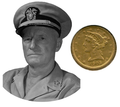
Does anyone know of a good technique for making a b/w photo look like a gold coin? I'm using PS-7, but I've just bought CS. (Not installed yet, but I will install it if the job is easier in CS.)

The attached photo is a jpeg of the image I'm trying to use, along with a shot of a random coin, just to show the basic look I'm trying to create. In the PSD file, the b/w portrait is already cut out and ready for whatever filtering/manipulation is required.

I've seen one tutorial for using a displacement map for doing it, but the final result didn't look realistic enough.

Any help would be greatly appreciated. I'll do the work, I just need a little advice on how to go about it.


retrocity ( ) posted Mon, 06 June 2005 at 8:26 PM

hummmm, i'm thinking towards a "bump map" of the greyscale face on a plan coin surface...

but i'm just thinking off the top of my head and offering a "quick" answer

might be able to embellish a little more later,

anybody else got ideas???

:)
retrocity


Hoofdcommissaris ( ) posted Tue, 07 June 2005 at 5:07 AM

file_251995.jpg

The Render-> Lighting Effects filter is the secret solution. It allows you to select an Alpha channel for a 'height map'. White is high, black is low. I used the photograph straight, with some enhanced contrast, but you could choose to first re-brush it, to add extra height to the middle part and darken the parts you want low (burn/dodge). Of course I first clone-stamped the picture from the coin... Make a new alpha channel and past the adjusted photo in it, after selecting it. Below you see the settings I used.


Hoofdcommissaris ( ) posted Tue, 07 June 2005 at 5:08 AM

file_251997.jpg

Funny language huh? It's Dutch.


retrocity ( ) posted Tue, 07 June 2005 at 5:40 AM

Way cool Hoof!

a couple of tweeks and you could go into the "minting" business!

your screencaps always make it easier to understand (even if the Dutch is a "funny" language ;))

:)
scott


orion23 ( ) posted Tue, 07 June 2005 at 7:47 AM

I tried the Bump Map solution and got pretty good results. I'll also give the Render/Alpha Channel idea a shot, and see which one gives me better results. Thank you all! I'm sure one of these two ideas will do the trick.


karosnikov ( ) posted Wed, 08 June 2005 at 10:51 PM

file_252000.jpg

a high passed layer, an embossed layer, and screen layer for highlights all at 50% opacity and a colour layer on top


Hoofdcommissaris ( ) posted Thu, 09 June 2005 at 12:53 AM

That looks much better than mine! Good one! I never understood that high pass thing, have to check it out...


thuffner3 ( ) posted Sun, 19 June 2005 at 3:22 PM

file_252003.jpg

This posting is exactly what I've been looking for. But still cannot get it right. I have an inge of my daughter that I would like to convert to g-code so my engraving machine can carve it out in wood or foam for casting in aluminum. You guys seem to be on the right track. Take a look at the two images. I have. THe first is the photo I'm working from. The second is a screen capture of what my code software see's. I really would love to have this image turn out exactly like the coin in the right of the posting above.

Thanks heaps in advance.

Neil


thuffner3 ( ) posted Sun, 19 June 2005 at 3:24 PM

file_252004.jpg

And the image my software see's


Hoofdcommissaris ( ) posted Mon, 20 June 2005 at 3:36 AM

file_252005.jpg

It is a bit of thinking here. It looks in your screenshot that you have to work from a diapositive photograph. As far as I can see her hair would now be higher that her face. So in that case black it high, and white is low. I used your picture (I thing a larger original would be better) and treated it for use as a height map. The parts that should be higher, should be lighter than the lower parts. The grayscales in the photo are a start for that, but the shadows on the right side of the face would suggest that that part is lower than the light parts, so you have to compensate that. I also pasted some of her hair on the left to the right, to have some texture there. When you look at this slightly creepy photo and think about that, you will see why the eyes are much lighter (they would become 'holes' if they were as dark as they were) and why i tried to push that white collar back. Below I will post the inverted version, you might want to try which one works best, I think the one below. If you have a larger original and want me to redo this stuff, let me know. Good luck with the coin!


Hoofdcommissaris ( ) posted Mon, 20 June 2005 at 3:36 AM

file_252007.jpg

...looks even stranger...


thuffner3 ( ) posted Mon, 20 June 2005 at 6:19 AM

file_252008.jpg

Morning Hoof, Here's what my software does for the image in B/W.


thuffner3 ( ) posted Mon, 20 June 2005 at 6:21 AM

file_252010.jpg

Here's the inverted image.


thuffner3 ( ) posted Mon, 20 June 2005 at 6:28 AM

Hoof, It looks like the B/W image is the better of the two(2) The shadow on the right side of the nose is still giving me fits. Unfortunately the shadow is what gives the photo depth. I guess it's not that important for what my purposes are. As the photo is looking more and more like a woodcut all the time. I do have and image that is 9" x 7" @ 400dpi. My G-code software doesn't want to handle that on very well though. Orion, Sorry for stepping all over your message. I hope you can get as much from this as I'm getting. Thanks guys. Neil


Hoofdcommissaris ( ) posted Mon, 20 June 2005 at 6:32 AM

Mmmm. The nose needs work (just the one in the file, not her real nose of course ;-). And, I think you need to use the other version, now the face will be pressed into the coin, isn't it? I can not judge if this is a preview of the coin, or of the form the aluminium will be poured in. This looks rather acceptable, doesn't it ? The white shirt under her black sweater give the 'wrong' message, but it looks kind of royal, like she is wearing a robe with gems on it or something... I will post the nose job asap. You do not have a larger file to work from? I can try to reduce the noise that makes her skin look, well, noisy.


Hoofdcommissaris ( ) posted Mon, 20 June 2005 at 6:39 AM

Our messages crossed... you can send me your larger photo: hoof (at) cops.nl Once we have a good B/W original, you can reduce it until your app eats it.


Hoofdcommissaris ( ) posted Mon, 20 June 2005 at 8:28 AM

file_252012.jpg

This is improved version. But, I must say, it could be that her nose is drifting off from her real world version. I tried to make it identical on both sides, but it is hard to keep it real an not distort the pixeled reality too much. This one is smoothed in the skin areas. You be the judge if the result has enough resemblance...


Hoofdcommissaris ( ) posted Mon, 20 June 2005 at 8:33 AM

file_252014.jpg

And the inverted version, because I am not sure which one you used the last time (they are both black and white...)


thuffner3 ( ) posted Mon, 20 June 2005 at 9:16 PM

file_252016.jpg

Hi Hoof, Orion, Again this evening, Here is what my software rendered for the last B/W image. The hair on the right is still in the ditch, but I think that can be easily fixed. Truely much better results. Just so you guys know how much experience I have. I've been playing around with this photo for about three months. I was getting close then I'd get discouraged. Thinking there had to be a quick fix. But allas you guys come along with this great message for coin work. Thanks again.


karosnikov ( ) posted Wed, 22 June 2005 at 2:09 AM

i was thinking very briefly about it, my answers were for creating one that looked good in Photoshop. Simply put high pass will reveal where contrast is. starting with the original pic, turn it into a 72 dpi image , that is about 600 pixels wide. do this useing the menu, image size. click ok, when done. save as. 72dpi.psd. ok. duplicate the background layer once. apply the filter 'highpass. to the background layer. use 3 pixel radius?. fade the layer abouve it by changing the layers opacity try 50%. go to the layers menu, i think and flatten image. paint the image area that you don't want black. i'd be interested to see how it resolves (forgive my dixlexic spelling)


karosnikov ( ) posted Wed, 22 June 2005 at 2:14 AM

when you use a high passed layer with a blending mode of hardlight, it does a verry interesting sharpening effect, depending on the stength/weakness of your filter - and opacity of the upper layer


Privacy Notice

This site uses cookies to deliver the best experience. Our own cookies make user accounts and other features possible. Third-party cookies are used to display relevant ads and to analyze how Renderosity is used. By using our site, you acknowledge that you have read and understood our Terms of Service, including our Cookie Policy and our Privacy Policy.