Renderosity Forums / Poser - OFFICIAL
Welcome to the Poser - OFFICIAL Forum
Forum Coordinators: RedPhantom
Poser - OFFICIAL F.A.Q (Last Updated: 2025 Feb 03 12:46 am)

Subject: Texturing Advice

I'm not a character creator, but I know what I like when I see one.
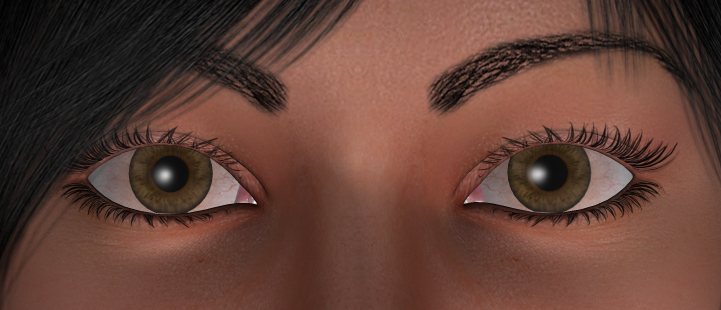
To me the eyes don't look real. I think overall they are too large in dimension and take up too much space on her face. Also the white parts seem plastic, especially in the inner corner areas, and they look blood shot.
I like the face, she's very pretty. But the eyes just don't seem to work.
How do you fix it? I don't know that's why I don't do character creation and texturing, hehe
I think you are on the right track and once you have the eyes ironed out she will be a nice looking character.
"It is good to see ourselves as
others see us. Try as we may, we are never
able to know ourselves fully as we
are, especially the evil side of us.
This we can do only if we are not
angry with our critics but will take in good
heart whatever they might have to
say." - Ghandi

I REALLY like the nose on this character. So much so I would probably get it just for that if the eyes were not so big. Another set back in my opinion is she looks sun burnt and the large lips are way too big a thing these days.
There are a plethora of photoshop tutorials out there for eyes. Even if your not using PS you should be able to get a good idea from some of them. Take some red out and make them smaller will get you a long way towards better. = )
I do like it though.
I am: aka Velocity3d

it looks o.k. to me. perhaps with more realistic lighting, e.g. hdri, and doing something to fix it so the hair doesn't have those white areas showing thru. try changing the set-up from a 90s-style reflection map for the eyes to lighting and an environment which is reflected by the eyes. it takes several chapters of a manual to explain how to do that, unfortunately. they were telling us to use reflection maps back in P3, in order to fake what real 3D renderers could do by default. time to move into 21st-century methods. P7 is capable of doing it, even if the renderer is the slowest of any known renderer, other than maxwell IMVHO.

I'm sorry, I hate to be negative, but I want to give you some fair criticisms.
First, her skin is far too bland. There is nothing in her skin texture that appears real. No blemishes, no moles no real colour differentiation.. I do see some pours in the bump mapping, and this is good.
Eyes are tough. I won't go into the size thing, because that is a stylistic thing, some people like it some don't (same with lips).
But the texture for the white of the eye needs to have a bit of the redness on the inner eye coming from the lacrimal, then fading before it meets up with the colour. The red on the other side of the eyes is over done. The real problem is that since it is so obvious, it also brings attention to the fact that each eye is just a mirror of the other.
The iris part is difficult, I know when I did my own texture for eyes a while back I ran into the same problem you are having; that is, the edge of the iris looks unnatural. Looking at photos of people, I've noticed that the iris is usually darker near the out edge. You'll have to look around to see what I mean.
I don't know if you have any painted on reflections, but if you do, loose them. As Miss Nancy said, this is a throw back to way ealier versions of Poser and is not needed now.
I like to add a real reflection node and an anisotropic on the the cornea (and Eye surface). The real reflection I tone down to about 0.25.
The node stuff is really basic, but the point is that we can get nice natural reflections, so don't paint any on! LOL.
Anyway, the positives are that you have sculpted an attactive face. I think it needs more character, but that is only a subjective thing. Really, a lot has to do with your textures and then you need to knock your promo images out of the park with some great lighting.
Good luck!
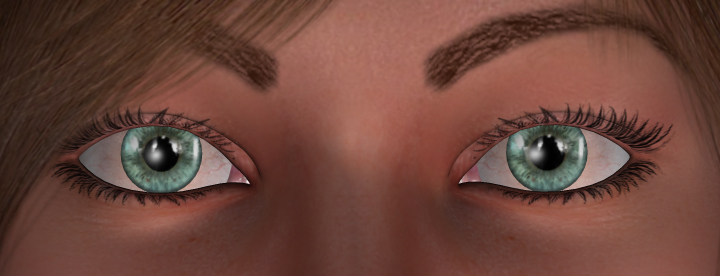
Thanks for all your suggestions! I did some significant work on the eyes, and I think at least some improvement has been made. I moved the slight redness to the lacrimal's side of each eye and darkened the outer edges of each iris.
This is what the eyes look like with a cornea trans map, a tear trans map, the highlight color on the Sclera set to gray and the highlight color on the Iris and Pupil set to black (all three highlights also have the main texture map applied). The EyeSurface has no maps applied and has the color diffusion and highlight color both set to white. There never were any reflection maps or painted-on reflections involved, and that hasn't changed.
Please let me know what you think.

Attached Link: http://market.renderosity.com/mod/bcs/index.php?ViewProduct=55880&TopID=&MostWanted=Y
Go here and see how Rhiannon has textured the eyes on her new character. I think they are amazingly realistic and have no clue as to how she does it.
My idea of rebooting is kicking somebody in the butt twice!

**Try bringing the highlight on the eye surface down to a light grey. It might help offset the whiteness in the eyewhites.
A bit darker on the outer circle of the iris. It's still hard to see that and it's very noticable in real eyes.
I would also suggest that you make the diffuse on the pupil white to show the pupil on your texture map if you have the pupil blending in naturally on that.
As for realistic eyewhites, I strongly suggest using Sarsa's resource for V4 found at Daz. The eyewhites in the pack are really wonderful.
You have really good looking lacrimels in there. Reflections as well. I like them.
I made an eye pack for V4 that took me lots of research and experimenting and people seem to like the results. As was mentioned, it would almost take a manual to tell you how to do it. Examples explain it better to me. If you would like more info, IM me. I'm willing to help.**
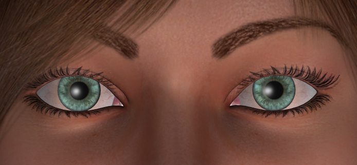
Thanks again for all your help! I darkened the outer edges of the ires further, changed the highlight settings on the ires, pupils, and eye surface, and imported Sarsa's eyewhites. I did lighten the whites up some, though, since in my opinion Sarsa's unaltered eyewhites are too dark and make the character look sickly.
What are your thoughts now?

One thing with selling at daz is that they are looking also for more than just a well made texture set. They are also looking for "character" something in a set that gives it personality and attractability (if thats a word LOL). Even if a set is crafted well and has no technical flaws, it still may not fit what they are looking for. I have a number of "human" figures that I have made myself that didnt fit into the daz idea of what they are looking for (you can find them at www.rawart3d.com). They are also well crafted, but didnt suit what they were looking for. Which in the end was fine by me because they are some of my best selling sets LOL.
But basically, all i am trying to say that daz can be very esoteric in what they look for, but it doesnt mean that something is not of quality, its just not what they are looking for.
Rawn
(RawArt)


-D
---
It's all fun and games until someone loses an eye texture.
It's way easier than my redundant and convoluted and rambling explanation makes it sound, honest. grin Thank you. Also, I find it tends to be easier to work with a slightly larger image. I usually blow up eyes to at least 2048x2048 to work with 'em initially, even if I shrink them back down later.
-D
---
It's all fun and games until someone loses an eye texture.
Well, I've made a few more improvements, and I'm really happy with the results. Let me know what you think.
I decided to test it using the green eyes instead of bluegreen just for a change of pace. I changed the hair color to black 'cause I think black hair and green eyes just go really well together.
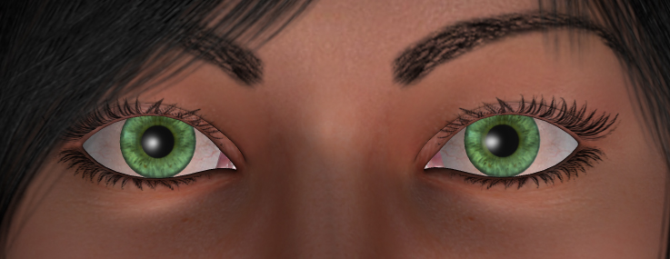
I also re-morphed her a bit and took out a tad of red in her skin tone.
Thoughts, anyone?

I love everything but her eyeballs,(looks too plastic...generic even) eyelashes,(clumpy looking) and eyebrows (reminds me of women who paint them on with eyepencils). If I brought your package, I'd use Surreality's eyes and lashes.
Other than that, she's beautiful. She looks like her name would be, "Alana"
My lashes are from Sarsa's resource in that image, so she definitely deserves every bit of credit there. Lashes, I am convinced, are downright evil. I've been picking on and off at an abstract character set and the lashes have been the worst of all to deal with. Iuvenis_Scriptor, what render settings are you using for these? I think that's what's making some of the difference with the lashes. Lashes tend to look speckly in Poser 6 without texture filtering on at times, or at lower (draft) render settings, and that may be part of the issue. It takes longer to check each time you test render, but it's definitely worth the time.
-D
---
It's all fun and games until someone loses an eye texture.
Yeah, I know. I'm using Poser 6, and the eyelashes do look speckly in all but the closest and/or highest-quality of shots. I have been using default draft render settings, which as it turns out, was detracting much more than I thought it would from the images. Here's a render using settings I learned from Addy. I gave her brown eyes to prevent distraction, since the too-bright green ones will be easy to correct.
Truth be told, most of the skin texture is Sarsa-based. I make texture sets entirely by editing and blending together elements from two or three different merchant resources. I lack the skills to do anything from scratch. I can only hope that the end result is original enough to be eye-catching.
The eye color change made a world of difference. :thumbupboth:
I have no more 'complaints' as far as your end goes. I mean, if I were to buy your package as is, I could fix anything I think needs fixing to make my character.
I would make her eyes wince. As football shaped as they are, they're a bit big. The eye lashes issue would be fixed depending on how I render it. And I'd used eyebrows from a package I liked.
The shape of the eyes are personal taste for me. There are few things more alluring to me in a woman than eyes like a doe. Come to think of it, the whole character sort of emodies many characteristics of my dream girl (and I'm sure I'm not the first male artist to whom that's happened). Her face was designed to be soft and round without looking chubby. Her body was designed to be curvy without being over-the-top (in fact, I set the Thin FBM to -0.2, since I like a girl who's sturdily built).
Anyway, I'm going to wait and see what a few others say about the eyes before starting to update the eye MAT poses (again). I'm also working on a male character (Vittorio-based) whose textures are essentially identical to the ones you see here with the exception of different eyebrows, more body hair, and an option for giving him a five o'clock shadow using a trans map. I'll have to update the MAT poses for him as well.
Not to get too far OT, but would you all recommend selling the two characters separately or together in one pack?
Looking much, much, much better! :)
"It is good to see ourselves as
others see us. Try as we may, we are never
able to know ourselves fully as we
are, especially the evil side of us.
This we can do only if we are not
angry with our critics but will take in good
heart whatever they might have to
say." - Ghandi


-dark rim around outer isis. soft and blended.
-light halo just outside dark rim.
-keep red to the corners and away from the iris.
-add halo of dark around the eyewhite
-less saturation in eyecolor. Less cariation, smaller scale of detail
-crisp highlights on cornea. Look for dots of light.
Hope that helps.
-Anton, creator of Apollo Maximus
"Conviction without truth is denial; Denial in the
face of truth is concealment."

If you guys don't mind, here's my 2c worth on a little detail that may add to realisam, or beliveability of the character...
What detracts from beliveability for me is that the eyes are in mych sharper focus then the rest of the face. Makes it look unrealistic. If the nose and lips skin was in little sharper focus it would look more realistic throughout. I would suggest to either soften the eye foc us, or sharpen the focus on the rest of the face. The amount of detailing should be similar. this is because our eyes are used to seeing the items of similar distance from our eyes at a similar amount of detail and sharpness.
Another detail that seems to stick out at me is the coloring of the sclera. In most people coloring of the slera has the similar hue slant as their skin. If one's skin is of warm tones, then the sclera's white is comprised of very unsaturated tones of a similar hue. In your case, it seems to me that the sclera coloring has a lot of cool tones in it, against a warm colored skin, and it makes her eyes look unrealistic, or at odds with the rest of her face.
Notice people's reaction to making her eyes brown. Making the eyes brown seems to have toned down the overall harsh coloring of the eye, and made it look more complementary. Removing some of the cool tones from the sclera, I think should help it look more like the eyes belong to the face, and create a bit more realistic feel to the whole face.
Hi, my namez: "NO, Bad Kitteh, NO!" Whaz
yurs?
BadKittehCo
Store BadKittehCo Freebies
and product support
I added some redness in the eye corners that's visible if you rotate the eyeballs far enough to on side or the other. I think that'd be more realistic than having it visible all the time.
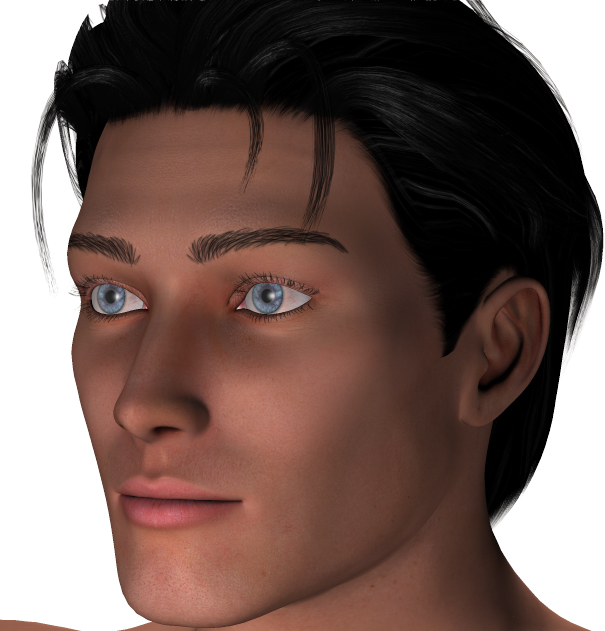
By the way, in case anyone's interested, here's the male character I was talking about. His official name is Victor. I designed him to look at home in a Superman suit, but I also intended for him to have the versatility to play other roles as well. Comments welcome.
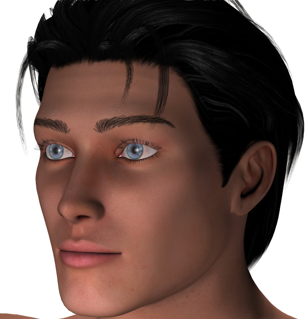
I mean this in the nicest way...Victor looks like a female who's just starting testosterone cycles to become a male. The nose is too perfectly straight for a male. Even if it has to be crooked or wider. Something needs to be done about that. Make it manly. Ugly him up a bit to give him character. The lips... same thing. Such kissable female lips. Maybe give him less volume. Men don't have lips. He has a more doe eyed shape than the female character you have. Such a beautiful male.
yer render/materials settings are causing the eyelashes and hair to pixellate. or maybe it's just my monitor acting up again. the last two images are good, if nearly identical IMVHO. I actually was surprised to see eyes very like yours in a banner on the upper right here. main difference was the girl had big, thick mascara lashes. will let ya know when I see it again.
Privacy Notice
This site uses cookies to deliver the best experience. Our own cookies make user accounts and other features possible. Third-party cookies are used to display relevant ads and to analyze how Renderosity is used. By using our site, you acknowledge that you have read and understood our Terms of Service, including our Cookie Policy and our Privacy Policy.
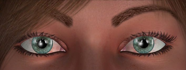
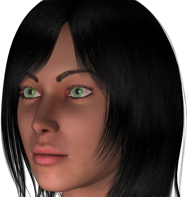
I submitted this character for V4 to Daz a while ago. After seeing the sample images, Daz turned her down. They said that they liked parts of it, but it wasn't something they were looking for at that time. I later asked what it was they felt needed improvement. The answer was the face and eyes.
Since then, I've done some major work on the eyes at least, and I'm going to try submitting the character again very soon. Before I do, I'd like to get some advice from the pros. Is she ready for Daz's scrutiny? If not, what specifically needs improvement? Any feedback will be greatly appreciated.
Thanks!