Renderosity Forums / Poser - OFFICIAL
Welcome to the Poser - OFFICIAL Forum
Forum Coordinators: RedPhantom
Poser - OFFICIAL F.A.Q (Last Updated: 2025 Feb 01 9:10 pm)

Subject: Monitor brightness


Picture A: no shadows. how does it look with shadows?
Which is better: Picture C on my LED mon. CRT is not a good idea IMVHO.
D: maybe it's the right amount of red.
E, F, G: washed out, lighting issues.
try them with hdri on bill's envsphere, use IDL, enable shadows on the single inf lite. No AO if using Poser 8 or later.

calibrated LCD's (on gamma=2.2) over here.
A: too much light-orange, slightly overlit
B: overlit, C is much better
D: far too red
E: looks fine for Japanes skin, otherwise washed out
F: a bit washed out but better than G, which is too strong on color contrast
forum background varies: medium and dark grey
I wrote a tutorial on gamma and other image corrections, just start here http://www.book.artbeeweb.nl/?p=317 and see if there is anything worthwhile for your purpose.
all the best.
- - - - -
Usually I'm wrong. But to be effective and efficient, I don't need to be correct or accurate.
visit www.aRtBeeWeb.nl (works) or Missing Manuals (tutorials & reviews) - both need an update though

Attached Link: http://www.bhphotovideo.com/c/product/838845-REG/Datacolor_S4EL100_Spyder4Elite_Software.html
Buy a Spyder 4 here at this link. I run four 27" monitors for my products and use a spyder 3 unit and all four of my monitors are perfect. Well as perfect as a Samsung SyncMaster SA550 can get.Cost right now is around 250.00 but they do go on sale once in a while. well worth the money, IMO.
Tom

A. The lighting level looks reasonably OK for an indoor scene.
B. Not nearly enough contrast.
C. Too much contrast. The Black Point looks a little too far down, the White Point looks about right for indoors, a bit low for bright sun. C looks a lot better than B.
D. Reasonable, could use just a smidgen more contrast. I could not pick any major fault with this image. The saturation looks quite high (boiled crab), but I assume that is intentional.
E. Not enough contrast. Needs a bit more red and blue.
F. Not enough contrast.
G. Too much contrast. Too much saturation.
Miss Nancy: Yeah, i know there's about 100 reasons to have an lcd over a crt =P But when gaming or watching a movie, i tend to lean back on my chair a lot looking upwards, and on an lcd, when you look at an angle it looks really bad.
Thanks for the info. Most of these were very old portions of renders i did when i was completely new, or fast test renders. I'm just using them to check where my brightness needs to be at.
aRtBee: Thanks! From what you told me, it looks like i have to increase my brightess by around 30%, and everything you said is what i'm seeing now. Except for D. Did you mean to say far too white? Because he gets a bit whiter when i increase my brightness.
DreamlandModels: I'll check it out, thanks.
Keep the responses coming guys, especially those of you with darker monitors. I need to find a good middle ground to where renders will look good on both light and dark monitors. Some of them had intentionally bad lighting or adjustments, so i can tell if i'm seeing the same things as everyone else.

Well, I use an Acer laptop with an Nvidia card and an external CRT as a secondary monitor, and its default screen was ridiculously bright.
The CRT is set to 1.2 gamma to compensate for it's age, but the laptop LED is set to 0.5 gamma for a comparable brightness !
Soo, my point is: Take any suggestions of "you're pictures are too bright" with a big grain of salt unless it comes from a person whose monitor is actually properly calibrated.
Chances are they sit in front of a searingly bright LED monitor and never bothered to check the default settings.
90 percent of the pictures out there on the web look perfectly fine on my CRT, so even without exact calibration, I'm sure it's current brightness is pretty realistic.
There is an ever growing number of "too dark" pictures resulting from the fact that more and more people use those overly bright LED monitors without adjusting the default settings.
So, again, don't go by what other people say unless they have a CALIBRATED monitor.
And just for the heck of it:
A) is fine
B) is washed out
C) a bit too dark
D) & E) are fine
F) is washed out
G) Too dark
In my opinion you're still having problems with the shaders and the light. Try adding a HSV node to the skin and crank up the saturation a bit. GC tends to drain colors so I set mine to 1.05 to compensate.
lesbentley: Thank you. I see the exact same things with my brightness increased by 20%. So far it looks like increasing my brightness by 20%-30% will bring my monitor in line with everyone elses.
On D, does he look more red or more whitish to you? He's supposed to be a red demon orc with a bit of white added, but not too much white.
JoePublic: Yeah! I'm also noticing that. A lot of 3d renders these days are very dark, but i think that's because some modern LCD's are extremely bright at default. My brothers LCD is defaulted so bright that the background of this forum is a light-gray, and half of the pictures look like their gamma is too high. From what you told me, it looks like you got a darker monitor, since C and G were too dark and E looked fine. This is really useful because i need to find a brightness in between those with darker monitors, and those with very bright ones, so it looks decent for everyone. Thanks for the tips!
Keep them coming guys. I'm getting a pretty good idea of where i need to set my brightness.

One of the frustrations in dealing with internet delivery of your work--is that you cant really control how it looks on other monitors. They are different sizes, with different levels of contrast, different shades of colors. I figure you just got to calibrate your own monitor and then hope that your viewers calibrate also...and like you are doing, ask questions, get opinions....
Poser Pro 2014
My personal website:
Novels, photos, video, sculptures and more
Evidence of a Lost
City: An animated movie and novel, in progress
Hag: A novel and live-action movie

Just to add, evaluate your surroundings. Most out-of-the-box monitors are defaulted for office use, very bright for a bright environment. Proper calibration should be performed in an environment where lighting is consistent. If your set up is in a darkened room, then maintaining calibration shouldn't be a problem. However, if lighting is variable and you tend to work at different times of the day, then your display will change dramatically. Either place your workstation in a controlled environment or pick a time of day when to use Poser.

When I used a CRT, I got almost perfect color matching with prints. I could actually hold the prints up next to the same image displayed on the monitor, and they matched. I have never succeeded in getting the same fidelity with an LCD. I expect a little variance these days. However, CRTs do lose considerable brightness with age.
Images I create look quite different in Photoshop, Irfanview, Windows Media Player, and Firefox. So if I'm seeing significant variation in the appearance of an image depending on software, even when using the same monitor, you have to see how impossible a task it is to ensure your viewers, on a different machine, see what you see on yours.
The lighting in the room changes my perception of an image. Also, what I've been doing all day also changes it. If i just went out for a run on a sunny afternoon, it will take hours before my perception of color/contrast/etc stabilizes, even if I sit in a dark room. I've spent painstaking hours converting color photos to b&W (and doing a little manipulation here and there), only to look at the same photo a day later and think it too bright or too dark and so on. Right now, I'm having to rework hundreds of these photos, as my monitor is picking up artifacts that were invisible to me before.
Your images all look within the correct range of colors and contrasts to me. However, in those where you show two varieties of the same image (B&C, F&G), I would probably layer them together to get a midpoint between them.
PoserPro 2014, PS CS5.5 Ext, Nikon D300. Win 8, i7-4770 @ 3.4 GHz, AMD Radeon 8570, 12 GB RAM.

If you're using a CRT monitor, you MUST calibrate and profile it regularly, at least once a month. As it's likely to be quite old now, once a week is probably more like it. I do extremely colour-critical work; when I used CRTs I calibrated and profiled daily.
A hardware profiling solution (e.g. the Spyder mentioned above) is a must. Make sure to let the monitor run for at least 20 minutes to warm up and stabilise. Your target settings should be 2.2 gamma, D65, 120 to 160 cd/Msq; ignore whatever the software recommends, rubbish that gets posted by half-wits in forums or stuff that you once read in a 10 year old book.
These days I use LCD NEC Reference monitors which I calibrate and profile weekly. Your sample images are tagged with an sRGB profile so I'm getting an accurate idea of what the images look like. The only ones I can provide meaningful comments on are B and C: C looks right, B doesn't.
Windows 10 x64 Pro - Intel Xeon E5450 @ 3.00GHz (x2)
PoserPro 11 - Units: Metres
Adobe CC 2017
I still think your main problem is light.
Delete them ALL.
Load bb's free sphere (free in in his signature), put a image on the sphere. => See bb's instructions and discussions here in the forum.
Use only ONE true white infinite light in it at 55% intensity .
Render some control scenes with.
In the render settings goto Manual settings:
Cast shadows ON
SSS OFF
Raytracing ON
Raytrace bounces 1
Irridance catching 0
Indirect Light ON
Indirect Light Quality 7
Pixel Samples 3
Min shading rate 0.5
Max bucket size 32
Min displacement bounds 0.000
Second colon:
Smooth Polygons ON
Use Displacement maps ON
Poset filter size 3
Post filter type Sync
Gamma Correction ON at 2.2
DO NOT DO's
Never-ever use AO, not on any material, not on any lights.
If you can, avoid IBL as if it was malaria. (yes BB, I know, but it creates 90% of the problems if used incorectly)
Never use older light sets that are not created for the Poser version you are using.
Never use older shaders that include "before IDL faking content".
DO's
Always render with Indirect Light => that is the best reproduction of real every day light
Always render in bb's sphere with an image on it => To create the IDL
Always render with GC at 2.2 => Only to be changed for artistic purposes.
These are NOT the best settings.
These are NOT the law.
These are NOT mandatory
But these are to get you on the right track in a "neutral" and reather fast rendering evironment.
Happy posering
Tony
Poser 1, 2, 3, 4, 5, 7,
P8 and PPro2010, P9 and PP2012, P10 and PP2014 Game
Dev
"Do not drive
faster then your angel can fly"!

Quote - Buy a Spyder 4 here at this link. I run four 27" monitors for my products and use a spyder 3 unit and all four of my monitors are perfect. Well as perfect as a Samsung SyncMaster SA550 can get.
Cost right now is around 250.00 but they do go on sale once in a while. well worth the money, IMO.
Tom
I've been meaning to get something like that. Is it really necessary to get the most expensive version (the one you link?)
The cheapest version doesn't let you install it on more than one computer at a time, so that one is not for me. But what about the mid-price models? I gather the most expensive version lets you calibrate projectors and match monitors when you have multiple monitors attached to one computer...but if I don't have a system like that, will I be fine with the $170 version?
I use a test picture (monitor calibration) that I got from Google images. You set brightness and contrast using the grey scale on the pic ( 8 distinct bands of grey from black to white) and then check the appearance of some color swatches .
Many games seem to need contrast and brightness turned way up which is not good for many pictures.
randym77:
these monitor calibration instruments are colorimiters and are basically all the same. A pricier one might be a tiny bit more accurate, but 99% of the added value is in the drivers and software. A less expensive solution will be OK, just check that it has support for your OS and that you won't miss extra features, faster operation, simpler interface etc. Ideally it should generate ICC v4 profiles, but v2 will be perfectly OK. If you want super-accuracy you need a spectrophotometer, like this.
markschum:
whether your approach is better than nothing is debatable; if you're using a CRT or a really old LCD, this approach is worth pursuing.
If you have a recent LCD monitor, it isn't. Don't faff about with any of the controls except to adjust brightness to whatever's comfortable.
Windows 10 x64 Pro - Intel Xeon E5450 @ 3.00GHz (x2)
PoserPro 11 - Units: Metres
Adobe CC 2017
Thanks for the help and tips guys. Yeah, most of the pictures are from either old renders or very fast test renders, which is why most of them are missing shadows, etc. But i needed them as brightness tests to see where i need to set the level of brightness on my monitor to match those of lcd's, which seem to be much brighter. I need to see what you guys are seeing before i can do any lighting fixes =P
My video card comes with a brightness/contrast control. My monitor is default at 100% brightness/contrast, which is still darker than most modern day lcd's, and after calibration it says to reduce it to 90%. So i'm using the sliders that come with my video card. I have those set at 75-80% brightness and the contrast set at 50%, and this seems to reproduce exactly what i see on a friends lcd, and is in line with all your comments. Like if you said it had too much contrast, i saw that now, or if an image was washed out, i could see it, whereas i couldn't before. Is this brightness/contrast setting good enough? Keep in mind i'm doing this mostly as a hobby, not going for professional looks or perfection. I just want to produce decent images. But at this setting, it's slightly darker than the brightest lcd's, but lighter than darker monitors. I needed to find a middle ground so the renders will look decent for those with bright monitors and dark ones.
vilters: I was testing out bagginbills enviroment dome before. I set an HDR image in the dome, and one infinite light, and it comes out nice, but it doesn't get a shadow on the ground, because the background is the full image. Is there a way i can use a scene of props with a ground/maybe some walls, trees, etc along with bagginbills dome without the HDR picture itself taking the whole background? And do i always have to decrease the Focal length of the camera to make the image clearer? I'm still new to using his dome.
I wouldn't bother with an expensive calibrator unless I were making prints on my own printer.
Unless everyone else is using the same calibration tools, perfecting the calibration on your own monitor only ensures your machine displays the images correctly (that is, in line with what you'll get if you print). Almost no one else's machine will be calibrated properly, so you'd STILL suffer from people saying this is too dark, this is too bright, etc, but you'd have spent a lot of money just to know the problem isn't you, but them.
A huge number of people are displaying the web on laptop LCDs -- which pretty much universally suck -- or tablets, which tend to grossly oversaturate.
Anyway, trying to correct for everyone else's display is an exercise in complete futility, IMO.
PoserPro 2014, PS CS5.5 Ext, Nikon D300. Win 8, i7-4770 @ 3.4 GHz, AMD Radeon 8570, 12 GB RAM.
Quote - Anyway, trying to correct for everyone else's display is an exercise in complete futility, IMO.
I understand this, but I am unable to calibrate my new monitor so it looks good to me. Reds in particular do not look right. Too dull, too bright, too orange...I've tried the various calibration images/web sites out there, and have not been able to get satisfactory results.
I never had this problem with CRT monitors, or my old laptop LCD. (The old LCDs never needed calibrating, and everything always looked right.) My new desktop monitor and laptop display are a different story.
Quote - randym77:
these monitor calibration instruments are colorimiters and are basically all the same. A pricier one might be a tiny bit more accurate, but 99% of the added value is in the drivers and software. A less expensive solution will be OK, just check that it has support for your OS and that you won't miss extra features, faster operation, simpler interface etc. Ideally it should generate ICC v4 profiles, but v2 will be perfectly OK. If you want super-accuracy you need a spectrophotometer, like this.
Actually, reading the reviews at Amazon, it sounds like paying more gets you a less simple interface. The cheaper versions have you choose options from a dropdown, while the top of the line lets you create your own profiles and customize everything.
Not sure whether that's worth it. More control is good, but I'm basically lazy, so I might not actually use all that.

Quote - Buy a Spyder 4 here at this link. I run four 27" monitors for my products and use a spyder 3 unit and all four of my monitors are perfect. Well as perfect as a Samsung SyncMaster SA550 can get.
Cost right now is around 250.00 but they do go on sale once in a while. well worth the money, IMO.
Tom
I also use the Spyder 3 and it works well for me. The reason for using it is to match the two Samsung monitors I use while working with Poser. The other reason is that I often have my renders printed and found getting good prints of the more atmospheric ones quite difficult. The prints are now pretty close to my monitor images.
I use Poser 13 on Windows 11 - For Scene set up I use a Geekcom A5 - Ryzen 9 5900HX, with 64 gig ram and 3 TB storage, mini PC with final rendering done on normal sized desktop using an AMD Ryzen Threadipper 1950X CPU, Corsair Hydro H100i CPU cooler, 3XS EVGA GTX 1080i SC with 11g Ram, 4 X 16gig Corsair DDR4 Ram and a Corsair RM 100 PSU . The desktop is in a remote location with rendering done via Queue Manager which gives me a clearer desktop and quieter computer room.
Just for clarity:
the whole point of monitor calibration is to ensure that they are as close as possible to a standard: typically that standard will be sRGB, maybe AdobeRGB if you have a wider gamut monitor (you will have bought it for this ability).
Both sRGB and AdobeRGB standards specify a gamma of 2.2 and D65 (6500° Kelvin); the difference is in the RGB mapping (AdobeRGB has a wider gamut).
The calibration procedure involves (a) defining your target values within the calibration software and (b) with the measuring device in place, adjusting a variety of values via your monitor's OSD while watching the feedback provided by the software. The software prompts you through the process. It can be fiddly. Once you're as close as possible to your aim points, the software will measure a series of colour patches and the results will be encoded into an ICC monitor profile: this should be set as your system profile (by the software in most cases). This profile is used by both the Operating System and ICC-compliant software such as Photoshop to display colour accurately.
Fancier solutions such as i1Display Pro are able to manipulate your video card's LUTs (Look-Up Tables) to save the hassle of farting about in the OSD, but are about twice as much as entry-level packages.
At the top end, graphic arts monitors from NEC, Eizo etc. ship with their own calibration software which interfaces directly with hardware within the monitor, going through several iterations of measuring grey levels, white point, black point and colour values, adjusting them all, re-measuring, re-adjusting etc. until everything is within very tight tolerances: the adjustments are saved in the monitor's hardware. Then it does a quick series of measurements to create the system profile.
On my NEC monitor the calibration phase happens in a linear colour space. At any time I have the option to make the monitor emulate AdobeRGB, sRGB or anything else I might feel like. Lucky me.
Windows 10 x64 Pro - Intel Xeon E5450 @ 3.00GHz (x2)
PoserPro 11 - Units: Metres
Adobe CC 2017

Quote - Miss Nancy: Yeah, i know there's about 100 reasons to have an lcd over a crt =P But when gaming or watching a movie, i tend to lean back on my chair a lot looking upwards, and on an lcd, when you look at an angle it looks really bad.
That's some very outdated thinking. I know how you feel though, I was a hard core CRT user a year ago, my trusty Viewsonic P95f+ was dying and I was desperately searching for a new one to replace it because LCD's sucked. Well when my search became more than I could stand I took a chance on a Dell U2412 which is a e-ips monitor that received a lot of good reviews. I was so nervous that my precious CRT would never be replaced but as soon as I plugged the monitor in I was sold. It was 99% accurate right out of the box and I didn't have to do any calibrations on it. But my biggest fear was response time for gaming. I was a very serious "competitive" player, won a few FPS tourneys in my time so non-blur/fast response time was something that I really needed. You know what? There's almost 0 difference between this monitor and my old CRT. Sure 60hz isn't like the 120hz I was used to but as long as your graphics card can hold the fps steady you're set. I was a twich gamer and moving to the LCD I really don't see any loss of precision or reaction time in my shots. Gaming is not an issue on modern IPS monitors.
As far as viewing angle goes, that all depends on what type of LCD it is. Crummy TN panels can have bad viewing angles but even those have improved greatly over the years. Step up to any IPS panel and you won't have to worry about viewing angles, my monitor is 24" so I'm never looking at it 100% flat, there's always screen areas off to the side of my fov and they look just as good as the center.
Believe me, I know what you're thinking and trust me on this, LCD tech has come a long way and I am 100% satisfied with my monitor. I would never go back to a CRT now that I've had the chance to use this excellent LCD.

I'd strongly recommend getting a Spyder (3 or 4) as well. Either the Express or Pro will work very well, depending on if you have a single or multiple monitor set up. It was driving me nuts because none of my renders looked the same on any of the computers I use, or on my phone or iPad. I got a Syder4 Express, and I can use it to calibrate my laptop and desktop at home, which are the only machines I render on.
True,most of the people looking at the images have uncalibrated monitors that are set up differently than mine, but it's nice to know that the image I see on my monitor is a close to being "accurate" (or the standard) as you can get for brightness, contrast, and color, gamma, etc. Using a color calibration device is probably as close to being "in the middle" and getting an image that looks good on most systems that you can get.
What made me really wonder about my images and monitor calibration was when I'd come across an image in a thread that was sooo dark I couldn't even see it, yet people would say how good it was, and not mention that it might be a bit (or WAY) to dark. Now I know that it really is too dark, and don't have to wonder about mine being WAY to bright.
Sorry, I can't really provide any good feedback on your images, as I'm not using a calibrated monitor right now (I know this monitor display is a bit washed out).
__________________________________________________________
My Rendo Gallery ........ My DAZ3D Gallery ........... My DA Gallery ......
Quote - True,most of the people looking at the images have uncalibrated monitors that are set up differently than mine, but it's nice to know that the image I see on my monitor is a close to being "accurate" (or the standard) as you can get for brightness, contrast, and color, gamma, etc. Using a color calibration device is probably as close to being "in the middle" and getting an image that looks good on most systems that you can get.
That's my thinking, too. Plus, I sell prints (of my photos, usually, not renders) and while I can't control how they look online, I do want the prints to look their best. I spend a lot of time adjusting the color, contrast, etc. so I'd really like some consistency to make sure I'm not making them worse. ;-)
FWIW, new monitors/laptop displays look really bright and saturated to me, compared to the ones I was used to. I think it's the iPad influence. The whole world is going tablet-crazy.
moriador: Yeah, my friend's monitor was one of the older ones, and when i was looking at 3d art on it, not only was everything too bright, but there was like a dull gray to the pictures, like the gamma was set too high. This was on default settings. The background of this forum was a very light gray too.
But there definitely was a problem on my end. When i did that werewolf render, at least 95% told me it was washed out, but i wasn't noticing it because my monitor is much darker than most LCD's. The other 5% told me they turned their brightness down a lot because it gave them headaches or hurt the eyes. After all the help here though, and using comparisons on other people's LCD's with my CRT, i think i've gotten pretty close to what i should be seeing, which involved me increasing my brightness from my video card settings by 25-30%. This was particularly problematic in the brightness of colors. Like in picture A i posted. On my monitor it was a dark orange hue on his face that looked really nice. But everyone was telling me it looked tan or light orange. Which still looked nice on the LCD, but wasn't what i intended.
JohnDoe641: What's up fellow competitive gamer =) I also used to tournament, but in fighting games. Got some tournament wins on games like tekken tag 1 and marvel vs capcom 2 =P But back in those days everything was on CRT and arcade, so input lag wasn't a big issue like on HDTV's. I still play occasionally and know exactly what you mean though. Input lag can really mess up your game where timing is important. I'll have to check out that LCD monitor. But i'm probably gonna ride this CRT out till it dies, since it's still in great condition and i pretty much got it close to what LCD's are seeing (at least i hope i did =P) The viewing angle and input lag are probably the biggest factors on what type of LCD i'll get (i also play some pc games). You know of any other cheaper LCD's or monitors with great viewing angles and no noticeable input lag?
DustRider: Yeah its cool. I pretty much got enough info to set my monitor at the proper brightness settings. I guess i should just loosen up a bit and accept that not everyone is gonna see what i intend. But for me, the problem was worse since my monitor was too dark. I wasn't seeing faulty things in my renders, like a bad background that wasn't showing or a washed up character.
randym77: That's one thing that bugs me too. Too much contrast and it ends up looking too dark or saturated. Too little and it's dull and washed out. I think checking your render after you postwork it at darker and lighter brightness, then taking a middle ground is the safest bet. If you're doing it as a hobby though, nothing serious, then i think it doesn't matter as much. But it can be annoying for those who sell prints or do it professionally, and need the perfect settings.

i wonder how the indivuals eyesight or perception of what is within the calibration parameters has on the effect of monitor calibration.......My eyes are slowly going and i have great difficulty in some calibration tests in picking accurately which bars most closely resemble the bars they are meant to........
OS: Windows7 64-bit Processor Intel(R) Core(TM)
i5-2430M CPU @ 2.40GHz, 2401 Mhz, 2 Core(s), 4 Logical
Processor(s) 6GB Ram
Poser: Poser Pro 2012 SR3.1 ...Poser 8.........Poser5 on a bad
day........
Daz Studio Pro 4.5 64bit
Carrara beta 8.5
Modelling: Silo/Hexagon/Groboto V3
Image Editing: PSP V9/Irfanview
Movie Editing. Cyberlink power director/Windows live movie
maker
"I live in an unfinished , poorly lit box, but we call it home"
My freestuff
link via my artist page

Attached Link: http://www.photofriday.com/calibrate.php
Whilst it is nothing compared to a good hardware calibrating device, you can at least adjust your brightness/contrast levels to a starting point using this link.
Quote - moriador: Yeah, my friend's monitor was one of the older ones, and when i was looking at 3d art on it, not only was everything too bright, but there was like a dull gray to the pictures, like the gamma was set too high. This was on default settings. The background of this forum was a very light gray too.
But there definitely was a problem on my end. When i did that werewolf render, at least 95% told me it was washed out, but i wasn't noticing it because my monitor is much darker than most LCD's. The other 5% told me they turned their brightness down a lot because it gave them headaches or hurt the eyes. After all the help here though, and using comparisons on other people's LCD's with my CRT, i think i've gotten pretty close to what i should be seeing, which involved me increasing my brightness from my video card settings by 25-30%. This was particularly problematic in the brightness of colors. Like in picture A i posted. On my monitor it was a dark orange hue on his face that looked really nice. But everyone was telling me it looked tan or light orange. Which still looked nice on the LCD, but wasn't what i intended.
I get you. Perhaps the solution is to have two monitors. One that is adjusted to your gaming and viewing preferences, and one that either 1 - gives you an idea of what most crappy monitors out there show or 2 - is well calibrated for the purpose of print making. Because, frankly, trying to get a single monitor to fulfil all your needs may be asking too much.
I can't imagine working with only one monitor any more. Well, I guess if it were 40", I might have enough work space. :) My secondary monitor cost me less than $100. I use it to test images that will be posted on the web to see how most people will likely see them, to hold the "tools" in my software interfaces, and to allow me to very easily transfer data from multiple documents.
PoserPro 2014, PS CS5.5 Ext, Nikon D300. Win 8, i7-4770 @ 3.4 GHz, AMD Radeon 8570, 12 GB RAM.

I have two matching 20 inch Samsung LED montitors. I had to turn the brightness down by quite a bit (at least 10%) or my eyes would be melting in no time. As for angle (my monitors are about a year and a half old) I see VERY LITTLE difference whether I look at it from an angle or straight on. The only difference being that it gets only slightly darker. Only the old LED montitors had a problem with that. I think you can buy with confidence and lean back as far as you like ;).
Laurie
moriador: Yeah, i'm gonna use the lcd monitor at my house. I generally got the range on my crt though that almost replicates what i see on the lcd monitor. I pump my brightness up to around 75-80%. 85-90% is what a very, very bright monitor would show, and 60-75% will give me idea of what people with darker monitors will see. I used to have mine at 50%, which was default so i didn't think it was gonna be a problem, but apparently it was =P
LaurieA: Hmm, i'm gonna have to look into them then. A lot of my friends are telling me the same thing, and the other lcd monitor at my house is a much older one. To me, display wise the CRT looks just as good as the LCD, but takes up like 60% of my desk =P
After all the feedback i got from here and a few other galleries, it looks like i found the best brightness setting to render at for my CRT monitor. I set the brightness at 75%, which is in between what those with bright LCD's and dark LCD's would see. Thanks for all the help and extra tips i got along the way. You guys are awesome =) Now i'm off to read artbee's tutorials that he posted earlier in this thread ^_^
Actually, back when LCDs first appeared and for awhile after, I preferred a CRT as well. However, after I bought a modern one (LCD), I can never go back. The images are just so sharp and vivid and clear. I could never get anything even remotely close on my CRT which, in direct comparrison, was blurry and washed out and very, very dim.
Laurie
FWIW, I think I figured out what the problem with my monitor was. It's a wide-gamut monitor, as many are these days. That's why the reds were so eye-searing. Windows doesn't get along with wide-gamut monitors.
Apparently, you are supposed to do a hardware calibration of a wide-gamut monitor, then use that profile in all the programs that will take it.
I did that, and things are a lot better now.
And if anyone cares, I went with the Spyder4Pro. I decided I didn't need the most expensive version, because I don't have a two-headed system. But I needed more than a SpyderExpress, because I want to use it on more than one computer.
Privacy Notice
This site uses cookies to deliver the best experience. Our own cookies make user accounts and other features possible. Third-party cookies are used to display relevant ads and to analyze how Renderosity is used. By using our site, you acknowledge that you have read and understood our Terms of Service, including our Cookie Policy and our Privacy Policy.
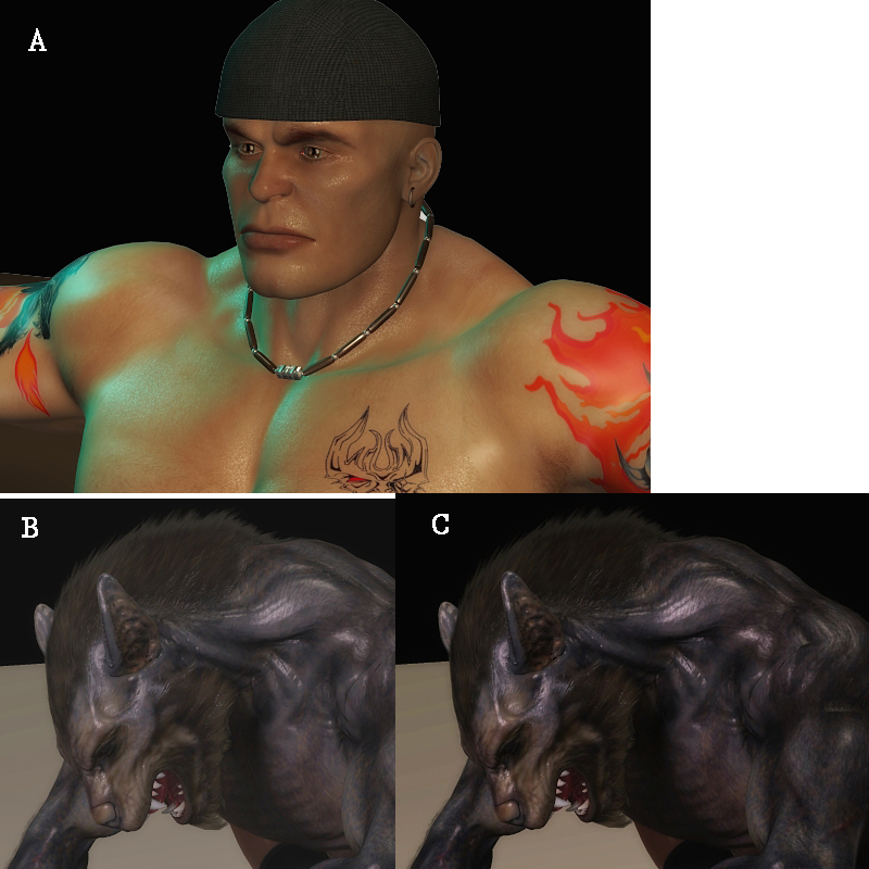
After a few talks with some other people, i started to realize that my monitor brightness is a lot darker than it should be. I became aware of this when people started telling me my werewolf render looked washed out, which i didn't see due to my dark monitor. I made a thread earlier about that, which was resolved thanks to you guys and Bagginsbill =) I'm using a CRT which i prefer when it comes to gaming, and even with the brightness/contrast at 100%, it's still darker than most of my friends LCD monitors. My brothers LCD monitor also seems to have a higher gamma. This becomes a problem since what i'm seeing on my renders is not what other people are seeing when i post it up, and when i brighten it up, it might end up being too bright on other people's monitors. I tried the calibration stuff, but it actually told me to lower my brightness by 10%, which only makes the problem worse.My graphics card comes with settings to increase the brightness/gamma/contrast even more, but i need to see how much more and find a middle ground. So what i did was compile some of my renders, and need your guys help to determine if they're too bright, too white, etc. This is gonna be like a mini-eye exam =P
There's two attachments
Picture A: Does his face look dark orange, orange, tan, light tan, or is it too bright? Does it look good?
Which is better: Picture B or Picture C?
Picture C: Is it too dark or is there too much contrast?
Picture D: Is he dark red, red, lighter red, or is there too much white in his skin?
Picture E: Is there too much white, or is there a "dull gray" that looks like too much gamma? Or does it look fine?
Picture F: Again, is there too much white and gray, or does it look fine?
Picture G: Is it too dark or is there too much contrast in here?
Which is better: Picture F or Picture G?
One the forum background, is it pure black, dark gray, gray, or light gray on your monitor?
Another thing i noticed, is in some renders, when you turn up the brightness or gamma, they still look good, while in other renders, they tend to get very white/gamma washed out. Does anyone know why this is?