Renderosity Forums / Poser - OFFICIAL
Welcome to the Poser - OFFICIAL Forum
Forum Coordinators: RedPhantom
Poser - OFFICIAL F.A.Q (Last Updated: 2025 Jan 25 9:50 pm)
Subject: Advice on V4 Character
Ok...here goes...no holds barred honesty :)
I really like the face. Her features are generic and don't hint to any particular ethnicity.
I don't like the eyes though. They look plastic. And the iris look like they have cateracts because they are cloudy/blurred. The iris looks like it has a drop shadow to it also (left side when looking at the computer). They just lack life and realism.
"It is good to see ourselves as
others see us. Try as we may, we are never
able to know ourselves fully as we
are, especially the evil side of us.
This we can do only if we are not
angry with our critics but will take in good
heart whatever they might have to
say." - Ghandi
well you asked for advise and thats what I'll give you but I do have alot and I hate to type so here is some of the bigger problems.. keep in mind I am a very picky person ^^... I can see a very clear seem where you mirrored the face you should go over that with a patch tool, ad some brighter highlights around the eyes chin and nose, the eyes are dead looking you shout ad some fake reflections to them and maybe make them a little higher in contrast, the eyebrows look painted on and I would need to see the body alot better to give you any advice on that.
please keep in mind I am trying to help I mean no disrespect ^^
It looks very nice from what I can see I am just very picky
I echo Acadia's comments and add that the eyebrows need work. They are too harsh and have a definite painted on look about them.
Coppula eam se non posit acceptera jocularum.
To a certain extent, it really depends what kind of character you are after as to where you need to take her.
If you are gunning for ultra-realism, the textures need a lot of work and you need more assymmetry in the face. If you are looking for anime-esque you are closer.
Body morph looks promising.
Klutz :0)
********************************************************************************************************************
Life is a beta.
In faecorum semper, solum profundum variat.
Attached Link: http://buytaert.net/cache/images-miscellaneous-2006-eye-500x500.jpg

If you look at actual heathy eyes, the iris isn't cloudy
Here is an example of a nice healthy looking eye...it's "clear" and glass-like....almost like a shiney marble.
Here are some other images:
http://www.martinmurphy.ca/eye.jpg
http://www.daveltd.com/photo/rolls/digital/kaneez-right-eye-2155.jpg
http://www.digiteck3d.com/forum_images/workwip/eyeFaceL.jpg
[http://michelemiller.blogs.com/marketing_to_women/eye.bmp
](http://michelemiller.blogs.com/marketing_to_women/eye.bmp)http://photo.net/photo/pcd0865/rachel-eye-2.4.jpg
"It is good to see ourselves as
others see us. Try as we may, we are never
able to know ourselves fully as we
are, especially the evil side of us.
This we can do only if we are not
angry with our critics but will take in good
heart whatever they might have to
say." - Ghandi
Hmm...Change the reflection map on the eyes. Or delete it complitely and add a raytraced reflection. You could allso add some ambience to the irises. Like ambience value 0.2 and plug the texture map on the ambient colour. But mainly the reflection map on the eyes/cornea needs to be more defined. Other than that I think she looks just fine. Alltho you could add a blin node to the skin textures. (assuming DaZStudio has one.)
-Morbo will now introduce the candidates - Puny Human Number One,
Puny Human Number Two, and Morbo's good friend Richard Nixon.
-Life can be hilariously cruel
Hmmm, a smidge better, but they still look like plastic doll's eyes.
Have you looked into merchant resource kits? They have them for all kinds of things including eyes. Most are created from actual photographs of real eyes.
http://market.renderosity.com/mod/bcs/index.php?ViewProduct=52555&
http://market.renderosity.com/mod/bcs/index.php?ViewProduct=53131&
http://market.renderosity.com/mod/bcs/index.php?ViewProduct=35913&Start=31&SearchTerm=resource
http://market.renderosity.com/mod/bcs/index.php?ViewProduct=41368&
http://market.renderosity.com/mod/bcs/index.php?ViewProduct=52996&Start=121&SearchTerm=Resource
There are lots more if you go the MP and search "resource".
"It is good to see ourselves as
others see us. Try as we may, we are never
able to know ourselves fully as we
are, especially the evil side of us.
This we can do only if we are not
angry with our critics but will take in good
heart whatever they might have to
say." - Ghandi
Quote -
Klutz, could you please elaborate on that "textures need alot of work" comment?
I am aiming for realism (with the exception that asymmetry isn't a big concern of mine).
Well, essentially, levels of detail.. Also the textures seem very even.
They look very hand-painted. That is OK for Fantasy -Fae use, but wanting if you are looking for realism.
If you are looking for realism,ultimately assymmetry has to figure in there.
Klutz :0)
********************************************************************************************************************
Life is a beta.
In faecorum semper, solum profundum variat.
Actually, these eyes already are mostly the product of me combining and editing pieces of 2 or 3 merchant resources. That pretty much goes for the whole texture set as well. The reflection map (or, technically, the Tear/Eye_Surface map) was created essentially from scratch, though.
Anway, here's the latest:

For a change of pace, here' s how she looks from a different angle with different hair and eye colors.
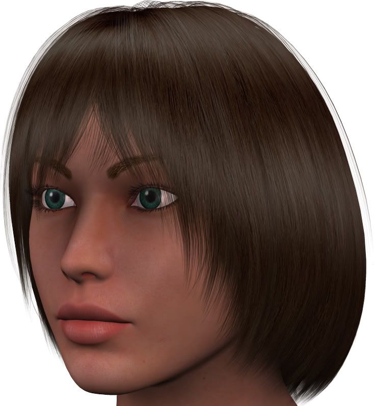
Further thoughts?
Iuvenis_Scriptor - I don't confess to being an expert & I've never made anything for sale but what stands out to me when seeing characters in the marketplace is a look which quite obviously says this is V4, which does put me off unless she has amazing textures. Don't get me wrong, apart from the eyes & eyebrows which has already been mentioned here, I like the fact you're attempting to create a product. You say you want realism, I think her face should be morphed more to take her away from an obvious plastic V4, and the skin texture, this is crucial. If someone wants to do a portrait then those textures have to hold up. I really hope you succeed in what you're doing here, good luck!
Iuvenis_Scriptor,
Do you use specular and displacement/bump maps? Doing so will add more realism to your character. Material room settings are very important, as well. As for your face morph, it's too generic, as others have stated. She doesn't have an 'exotic' look, at all. It would probably help for you to take a look at the V4 character sets for sale on DAZ, to get an idea of what they are looking for in terms of quality.**
**
Quote - The eyes still have a very matte look to them, where they should be glossy or shiny.
Matte!!! That's the term I was looking for. Thank you! I swear I'm so forgetful that sometimes the most simple words will elude me.
"It is good to see ourselves as
others see us. Try as we may, we are never
able to know ourselves fully as we
are, especially the evil side of us.
This we can do only if we are not
angry with our critics but will take in good
heart whatever they might have to
say." - Ghandi
I'll be blunt, but hopefully unoffensive: This looks incredibly remeniscent of your previous attempt at a sell-able V4 character.
The morph is far too similar to default V4, to the point where unless they were side-by-side, I'd swear this WAS default V4. The trademark wide eyes and pin nose are there in all their glory. The same goes for the body.
Your texture is ok for personal use, but as mentioned above looks very flat, and in my opinion lo-res (particularly the eyes). It really looks as though a sub-par photo has been pasted onto the UV map, with very little gone into advanced shader options. Take a look at FaceOff's work (even on the included V4 texture); or for something really incredibly look at BagginsBill's great Apollo shader. I'm not saying copy them, but at least learn from what they've achieved.
Ultimately if you want to sell this character it has to at least be of the same quality as other vendor's work (your competitors, if you will). A unique morph and a quality texture are paramount.
Your concept is sound, but your 'product' doesn't reflect it.
If we can hit that bullseye, the rest of the dominos will fall like a house of cards...checkmate!
What does "matte" mean?
ClawShrimp, first let me say that I respect your willingness to be so brutally honest. One thing I'd like people here to know about me is that I don't get offended easily. Disappointed in the reception of my work, yes. Unwilling to take various opinions and critiques into consideration and use them to improve my work, never. Criticism is improvement waiting to happen.
Having said that, allow me to respond to some of your key points as well as some others' posts.
Honestly, I've seen V4 textures on sale here at 'Rosity that look more unrealistically smooth than the texture I've created. One of my major goals was to avoid both that too-smooth look and the other extreme, 'cause I've also seen textures that look dry and almost cracked to me.
This may look incredibly like my previous character because there are simply some characteristics that characterize my own particular style, and those characteristics are obviously standing out to you much more than the distinctions I've tried to give this character.
Regarding the level of deviation from a standard, out-of-the-box V4, let's do a direct comparison.
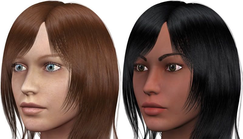
Admittedly, any mildly experienced Poser artist could probably tell that Natalie (my character) is based on V4. While I agree that a certain amount of distinction is necessary and preferable, I don't think one should ever let the drive to hide the V4 base under a myriad of morphs and textures overshadow the more important goal of overall beauty.
I do use bump maps regularly. My skin textures use bump maps, and there's also a very slight highlight applied to them. I have no skills whatsoever with skin shaders and minimal skills in the Advanced Material Room.
**Iuvenis_Scriptor - I actually think your comparison here is a good one for two reasons:
1 - Aside from the skin texture only slight modifications to the face seem to have been made. I understand your reasons for not wanting to go too far with the morphs but remember that when people are willing to part with hard earned money they want to see something different, something real. I doubt they'd want a morph that seems to have been made with just a couple of dial turns.
2 - The texture on the default V4 is far more realistic. OK, they are different skin types but nevertheless it's the detail that matters. I do however, like the tone of your characters skin, I just feel the detail would greatly improve it.
Sorry to be harsh, I really want you to succeed with this. It's just that I, & many others here, have spent alot of money on characters & textures so when we decide to buy a new one, the quality has to be there. I'm actually still amazed at some of the 'average' stuff that gets sold here. Don't get me wrong, this is not a direct criticism at anyone, I admire people for taking up the challenge to create something for sale purposes. I always create my own figures but have never made anything for sale. I can imagine all the work, dedication & pain that goes into doing it.**
Quote - **Iuvenis_Scriptor - I actually think your comparison here is a good one for two reasons:
1 - Aside from the skin texture only slight modifications to the face seem to have been made. I understand your reasons for not wanting to go too far with the morphs but remember that when people are willing to part with hard earned money they want to see something different, something real. I doubt they'd want a morph that seems to have been made with just a couple of dial turns.**
I agree with that. I haven't used V4 so I haven't paid much attention to what she looks like "out of the box", but with that side-by-side comparison I can certainly see that there isn't much difference between the 2 at all. Perhaps a bit in the eyes and a wee bit in the nose but other than that they look the same. I know when I beta test a character package for someone, or buy one, and I see that the face and body are hardly changed at all from default, I am grossly disappointed.
When I buy a character addon I want it to change the base figure into something that looks unique and different from the base figure. If I wanted "base Vicky", all I would do is apply a texture. I don't need to spend any more money to do that because there are gads of textures in my runtime and even more in the MP's and free around the poser community.
I think you need to do a whole lot more dial turning there :)
"It is good to see ourselves as
others see us. Try as we may, we are never
able to know ourselves fully as we
are, especially the evil side of us.
This we can do only if we are not
angry with our critics but will take in good
heart whatever they might have to
say." - Ghandi
I hope you don't mind, but I did a novice try at a morph animation. This gives a better idea of the chnages that have been made between V4 base and Natalie.

"It is good to see ourselves as
others see us. Try as we may, we are never
able to know ourselves fully as we
are, especially the evil side of us.
This we can do only if we are not
angry with our critics but will take in good
heart whatever they might have to
say." - Ghandi
Actually, there's a bit more to the distinction than the eyes and the nose. Here's a list of the features I gave Natalie:
EYES
- slightly enlarged
- slanted
- almond-shaped
- eyelids thinned
NOSE
- slightly narrowed nose
- slightly widened ridge and bridge
- somewhat deeper, more curved nose ridge slope
- tip points a little upwards
- shallowed (i.e. decreased protrusion from the face)
- smaller nostrils
- septum raised slightly and widened
MOUTH
- bottom edge of lower lip raised
- mouth narrowed and shrunk
- top edge of upper lip raised slightly
- fuller lips (i.e. thickened)
- slight poutiness
OVERALL FACE
- rounded
- higher, slightly pronounced cheekbones
- narrowed chin
- higher-sloped jawline
I may be forgetting a few, but those are all the important ones. In checking the code for my head INJ pose, I find that there are a total of 45 morph dials whose values change from the default. Would you recommend using more morphs or intensifying the ones I've already used?
That morph animation is cosmically ironic, since I myself just dabbled in face morph animations for the first time last night. I can't get any more advanced than something that just seems to fade rather than actually morph into another, though.
**Iuvenis_Scriptor - It's probably not how many dials you turn, but how much & in which combination. Is there a particular look you're after with Natalie, if so then maybe you could try & find a photo of someone off the net & make some changes which could resemble her. reference can be a good thing.
Acadia - Cool animation, it really shows what changes have been made. I know they're only slight, but you can see what's been done.**
You say you changed a number of morphs, but the results don't reflect that. The changes are too subtle...minimal...hardly noticeable.
What I would personally suggest is that you change your focus. Instead of focusing on trying to create a character to sell at Daz, I would work on trying to create a character, period!
Character creation isn't an overnight study. It takes months and even years of practice to create a really good character and texture. You can look in the MP here and see who is "novice" and decided they wanted to get poser to make some quick money and put up a store with their very first creations, and those who have dedicated themselves to the craft and worked for months and months to perfect it.
I suggest you look through magazines or on the net for pictures of pretty women and practice recreating them in Poser. Take pictures of your friends and family and try and recreate them in Poser. This way you have an image to work from and a set goal that you need to achieve IE: "I need V4 to look like my Aunty June"
The best way to create anything is to have an actual finished image in your head about what you want to achieve.
You seem hesitant to change V4 beyond a certain degree. Turn those dials, work those features. Put a picture of V4 on a flat square in the material room and have it sitting beside the figure you are working on. Look at the V4 picture and do something different...extreme. Don't just change the facial features, adjust the head, the cheeks, ears.... just turn those dials more than a couple of degrees.
"It is good to see ourselves as
others see us. Try as we may, we are never
able to know ourselves fully as we
are, especially the evil side of us.
This we can do only if we are not
angry with our critics but will take in good
heart whatever they might have to
say." - Ghandi
Oh-ho-ho! My first Poser project was a celebrity look-alike, and I've tried it repeatedly for weeks at a time since then. Trying to make figures look like actual people has just never worked out very well for me. I've found that creating a face without any specific model often produces prettier results, at least with the way I do things in Poser. I guess some people have that portrait artist's eye and some don't.
I've been at this for about two years now (Poser in general, that is), and I've had very little success with character packs previously. What always seems to happen when I release a new character at 'Rosity is that about two people will buy it the first day it's available and then no sales are ever made after that. What's worse, those two buyers always seem to have completely blank profiles/portfolios. My most recent creation, Rachel for V4, broke that pattern briefly when someone bought her about two weeks after her release and actually published a render of her in the gallery (her textures, at least). To be honest, my earlier works aren't very good at all in retrospect, but I suppose that's natural as I keep getting better and better. If I can get just one character pack on the market that sells on some semblance of a regular basis, I'll be happy. I'm not looking to make a living off Poser content, but I would like to make some money to offset what I spend on other third-party content.
Anyway, I've spent some time staring at my best yet render of Natalie's face. I've also put the preview in Smooth Shaded mode and repeatedly INJected and REMoved Natalie's morphs, and the change seems significant. Would any of you be willing to actually try using the morphs yourself if I sent them to you privately? I can post renders 'til I'm blue in the face, but I think what another artist can do with them will be far more telling.
The reason for me being so cautious about changing the morph settings is that a truly beautiful face that looks good in more than one light set or camera angle is not as easy to come by as one might think. I can't tell you how many times I've created a beautiful face in one light set then done a render using a different light arrangement that ends up making my beauty look like a beast! My most recent problem has been Natalie's upper lip. I've been back and forth with the LipTopEdgeHeight and LipTopCenterHeight morphs just because the top lip looks fine in one light set but too large in another. I think I've finally nailed the right setting, but it's still quite annoying.
In terms of the actual look I'm aiming for, it's sort of guided by the characteristics I personally find most attractive in a woman. Doe eyes, plush lips, soft and rounded face, high cheekbones, smallish nose, etc. At the same time, I'm trying to avoid keeping these attributes within natural bounds so she doesn't look like some hyper-idealized doll.
Iuvenis_Scriptor - I'm purely looking at this from a buyers perspective, you need to move away from the generic V4. If your character had an amazing texture, I would buy it. If she had an amazing & unique face and/or body morph I would buy it.
I hope I'm not being harsh, it's just that I've bought enough characters in the past to know the good ones from the average ones. Take a look at the main vendors here, the reason most of them have good sales is because their product says something.
it would be a bummer if daz would reject it because it used inferior poser lighting. my suggestion would be to render it in something like maya, max, lightwave, c4d, carrara, et al. or else read up on HDRI/AO and GI in poser. the latter is one of the hidden features of P7. maybe they're looking for a good render using their in-house software (D S). I dunno if d s has any advanced lighting features.
Quote - I've had very little success with character packs previously. What always seems to happen when I release a new character at 'Rosity is that about two people will buy it the first day it's available and then no sales are ever made after that. What's worse, those two buyers always seem to have completely blank profiles/portfolios. My most recent creation, Rachel for V4, broke that pattern briefly when someone bought her about two weeks after her release and actually published a render of her in the gallery (her textures, at least).
Unfortunately it's very difficult to get established in any MP, especially this one because there are dozens and dozens of vendors and many have a long term following and many potential buyers very rarely look at "unknowns" or new vendors. I know I'm guilty of not looking at all vendor stores here, in fact I look at very few. I usually go by what I see in banner ads at the top of the page, or check out vendors that I've previously purchased from. Most often I find what I'm looking for. I do know that I tend to buy from those whom I've had a chance to sample their work through freebies. I tried some of Neomea's freebie characters and as a result I have purchased nearly every character that she's put out, same with Rhiannon. I have a number of her characters too.
The best way to develope a following is to put out some freebies for people to try out. They don't have to be huge packages.... a morph and a texture, maybe 2 makeup options or a second skin. This gives people an idea of what you are about and they are more likely to look in your store for more quality items.
Quote - To be honest, my earlier works aren't very good at all in retrospect, but I suppose that's natural as I keep getting better and better. If I can get just one character pack on the market that sells on some semblance of a regular basis, I'll be happy. I'm not looking to make a living off Poser content, but I would like to make some money to offset what I spend on other third-party content.
As I said, it's very hard to make money from vendor sales unless you have an established following. If you want a MP to make money, then you need to offer something that no one else, or few others are offering. Find a niche. Take KymJ for example. She does a great number of "older" figures that are "imperfect", and that's a niche. Not everyone wants such characters, but many do. Look through the MP here and elsewhere and see what is "lacking". Start another thread and ask people what it is that they want in a character...get some ideas that way.
Trying to compete with established vendors with items that they are selling, while not impossible, is very difficult.
So far as making money to off set poser expenses, why not try book or CD covers, or some clothing textures for clothing items that aren't already flooded with textures IE: Don't do the MFD!!!! LOL
Quote - The reason for me being so cautious about changing the morph settings is that a truly beautiful face that looks good in more than one light set or camera angle is not as easy to come by as one might think. I can't tell you how many times I've created a beautiful face in one light set then done a render using a different light arrangement that ends up making my beauty look like a beast! My most recent problem has been Natalie's upper lip. I've been back and forth with the LipTopEdgeHeight and LipTopCenterHeight morphs just because the top lip looks fine in one light set but too large in another. I think I've finally nailed the right setting, but it's still quite annoying.
In terms of the actual look I'm aiming for, it's sort of guided by the characteristics I personally find most attractive in a woman. Doe eyes, plush lips, soft and rounded face, high cheekbones, smallish nose, etc. At the same time, I'm trying to avoid keeping these attributes within natural bounds so she doesn't look like some hyper-idealized doll.
Unfortunately no one ever got rich through caution. Sometimes you have to throw caution to the wind and just go for it, you know?
Live on the edge! Don't be afraid to turn those dials so you completely get away from boxed vicky :)
"It is good to see ourselves as
others see us. Try as we may, we are never
able to know ourselves fully as we
are, especially the evil side of us.
This we can do only if we are not
angry with our critics but will take in good
heart whatever they might have to
say." - Ghandi
Just to add. My avatar is my first proper creation with V4. Not my textures apart from retouching, but the morph is mine. While I like her I still think she's a little too generic, I need to work more with her. For this reason alone I wouldn't put the morph up for sale, even if I knew how to go about putting a package together, which I don't.
Just for the heck of it, let's see how she looks with a different light arrangement. This is after I've made slight increases to the contrast, saturation, and sharpness of the skin textures. If anyone knows how to get rid of that glare in the eyes, please let me know. I've tried everything I know of.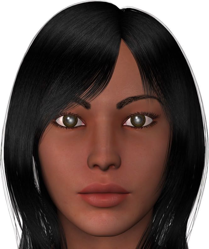
I've just re-read the two pages of this thread, and there seem to be two recurring themes: Unique morph and quality texture.
While you've made slight adjustments to your texture on advice from others here (the eyes specifically), it's still a long way from ideal.
And rather than improving your incredibly subtle morph based on the feedback here, you seem more interested in explaining it away. Telling us to 'look at it this way', or 'it's like this because...' won't change people's perceptions. It is ultimately an almost default V4.
If your last attempt at a sell-able V4 character was knocked back by Daz, shouldn't you be trying to raise the bar with this attempt?
Saying that there are worse products already available in the Market Place is certainley no excuse to produce a sub-par product yourself. And saying you know nothing about shader trees and advanced materials settings is no excuse to ignore them entirely. There are some fine, and FREE, examples out there for you to learn from. Even V4's default texture has a pretty decent shader, care of FaceOff (at least I think so).
The comments you recieve here are from potential customers (myself included). Even if Daz were to approve your character for sale in it's current state, can you honestly say that the reception here has been possitive enough to expect decent sales?
Again, you know I don't say any of this to offend. I'd like nothing more than for you to 'see the light', so to speak; create something great; and go on to be a successful vendor. I just think you need to take a few steps out of your comfort zone and really let your hair down before there's any hope of this happening. As Acadia said, 'no one ever got right through caution'.
Best of luck!
If we can hit that bullseye, the rest of the dominos will fall like a house of cards...checkmate!
Gunna add some more input to this.
I strongly strongly agree with what has been said about you needing to take V4 away from being V4. That character I could easily make myself in a few minutes. Think about why would I purchase it then? Now go onto another character that I LOVE - Nanette (DMs). I would have to seriously spend some time to recreate her - and to get to the level of her textures might not be possible for me - there for buying her was $$ well spent.
My point is you can't put something out there that someone can do for themselves and expect it to go. Especially by Daz. Some research helps TONS. I'm sure you have already but take a look at other eyes out there. Look for ones which you think are fantastic - then compare them to yours. LOOK for the differences. Matte is a flat look - without shinyness or glossiness.
I do like the character - she has a certain pocohantos beauty about her which I adore - shes just not there yet. Try some long hair maybe - I don't know she just really needs alot more oomph.
I am: aka Velocity3d
Hmmm, are you sure those are different morphs? The figures look exactly alike to me.
"It is good to see ourselves as
others see us. Try as we may, we are never
able to know ourselves fully as we
are, especially the evil side of us.
This we can do only if we are not
angry with our critics but will take in good
heart whatever they might have to
say." - Ghandi
I agree with Acadia. There's little discernable difference.
Here's a thought. Whatever dials you've turned thus far, turn them MUCH further. I don't mean to sound facetious...just think of it as an experiment.
Whatever value you've entered into each dial, double it (maybe even triple it). Then post the resulting image here.
I do this for all of my Apollo morphs, using Anton's morph multiplier script, but it's not too arduous a task to perform manually.
If we can hit that bullseye, the rest of the dominos will fall like a house of cards...checkmate!
Download the following files, open them both in Photoshop, copy one on top of the other, and turn the top layer on and off however many times it takes to notice the difference. That's the best option I can think of besides what I've already done.
www.redcapegallery.com/Victoria.jpg
www.redcapegallery.com/Natalie.jpg
Iuvenis_Scriptor,
Why open a thread asking for advice, when you are not going to take any of it? Your face morph still looks too much like the default Vic 4. Yes, there are differences between your face and the default. Are they enough? No. Most people (myself included) are only going to spend money on a unique/original character that they couldn't easily 'dial in' themselves. If the morph isn't the clencher, then the textures have to be exceptional. In short, there has to be something to your character package to set it apart and really grab a potential buyer's attention. Right now, yours doesn't do that, IMHO.
I am at least trying to take most of the advice that's been offered here. I honestly don't see how those two faces look so alike. To me, they look quite different. Plus, whatever distinction the morphs don't make, won't the textures make up for it?
Regarding something that people could easily dial in themselves, you don't think that's what I did, do you? Yes, I did do alot of dialing in, but this face took at least several hours if not a few days of trial-and-error (morph, test render, repeat, ad nauseam) to get just the right combination of morph settings for the look I'm aiming for. Even if someone can technically dial in Natalie themselves, they can still save a heck of alot of tedious work by buying her. Furthermore, if and when Natalie does appear in stores, she's not going to be terribly expensive (probably in the $10 - $15 range).
""Even if someone can technically dial in Natalie themselves, they can still save a heck of alot of tedious work by buying her.""
I'm going to be very blunt here:
I already did buy her.
She is V4.
There is not a difference that warrants spending even 5$ more on her. The difference is absolutely unnoticeable and you are counting on people (I am a person) to see a difference that warrants spending money. When I personally go to buy a character - Im not going to open up photoshop files to turn on and off layers before I will. I want to see the difference right there in the ad.
I am: aka Velocity3d

What I've posted here is a comparison of the default V4 (left) and a morph I worked on some weeks ago (right). I don't show this as an indication of the 'look' you should be aiming for, but more as an example of, at the very least, how far a unique character should deviate from the standard V4. This morph evolved as a result of other forum users offering their advice, and...here's the rub...me taking it.
This also serves as an illustration of the textures you are competing with (this is the Milan texture available in the Market Place). What's interesting about this texture is it avoids most of the advanced material options, instead baking the detail onto the texture. Not ideal by any measure, but the results are still quite lovely. Ultimately, if you're not going to take advantage of Poser's complex material room, you must at least ensure the detail is in the texture.
If we can hit that bullseye, the rest of the dominos will fall like a house of cards...checkmate!

ClawShrimp - That's a really interesting morph you've created, exactly the kind of 'away from V4' we need more of in the marketplace. I love the Milan texture but I'd also be interested to see this face with maybe a slightly darker skin tone as I think her features would suit it. Really good job!**
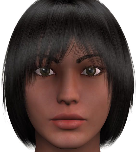
Well, after another round of morph revision, I think I've made some significant improvements, but I'll let you guys be the judge of that. This time, I'm using Natalie's textures as the common texture set. Also, like the past two or three pics, these images use a simple three-point light set that I made myself based on a tutorial in Practical Poser 6. I've also removed the hair for optimum scrutiny of the head morph and textures.
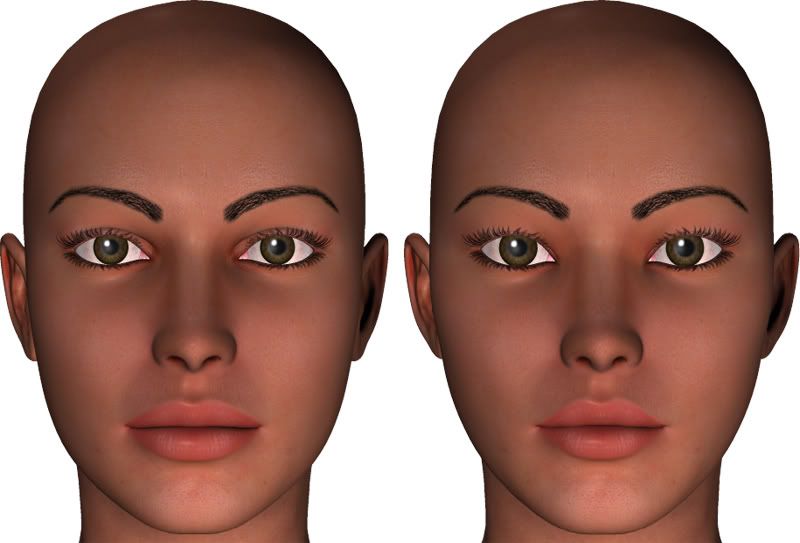
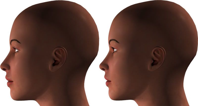
You may also notice that I've finally figured out what was causing that awful glare in the eyes under certain lighting conditions. I promptly remedied it, and I think the eyes are much better for it.
Iuvenis_Scriptor - You've certainly improved on the eyes, but I still feel your head morph is too base V4. I can see what you're doing, I actually like the start you've made with the nose, mouth & chin in your profile shot. I just feel it needs more.
Sorry, I know you are putting your heart into this, I just hope our honesty will lead you into further development with this.
I'm sorry :( I still don't see enough of a difference in her look to make me want to hand my money over to you for the character.
Post after post in this thread have told you that your Natalie looks like boxed vicky and have encouraged you to turn lots of dials and take your character away from boxed vicky, yet each post you come back with looks basically the same.
I don't understand the reluctance on your part to deviate away from the boxed vicky look, especially when you said before that your other attempt, which looked a great deal like this attempt, was rejected by a store you were hoping to break into.
I'm not trying to be mean. I'm just trying to help you, as are everyone else in this thread.
I know you are trying and I know you are probably very frustrated with reworking the character so much, but while you seem to see a huge difference in appearance, the rest of us aren't seeing that difference, and it's us that you have to be worried about, unless you plan on being the only one buying your character.
I had a look through your gallery, and all of your vicky images look like near clones of one another. You need to get that image out of your head and find another to focus on, one that will take you away from boxed vicky.
"It is good to see ourselves as
others see us. Try as we may, we are never
able to know ourselves fully as we
are, especially the evil side of us.
This we can do only if we are not
angry with our critics but will take in good
heart whatever they might have to
say." - Ghandi
Privacy Notice
This site uses cookies to deliver the best experience. Our own cookies make user accounts and other features possible. Third-party cookies are used to display relevant ads and to analyze how Renderosity is used. By using our site, you acknowledge that you have read and understood our Terms of Service, including our Cookie Policy and our Privacy Policy.


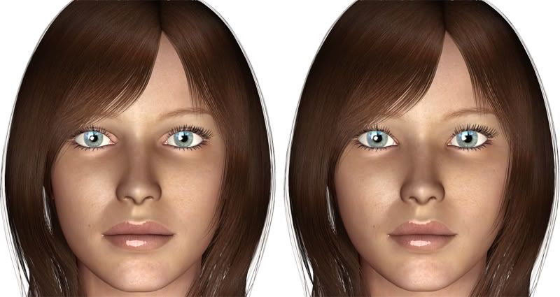

I'm seriously considering trying for the third or fourth time to create a V4 character pack that Daz deems worthy of brokerage on their site. I've been told that the folks at Daz can be very "esoteric" about their criteria, and I know by experience that they take forever and a day to respond to your inquiries unless you keep them on their toes with constant follow-up messages.
Anyway, in order to give my character pack the best shot of making the cut this time, I'd like to ask any of the more experienced artists to critique my work and make suggestions on how I might polish it off or give it that extra something that will catch Daz's eye.
Please take a few minutes to peruse these sample images and let me know your thoughts. My goal was to create an exotic young woman with a moderate tan, a lovely face, soulful eyes, and a body that's alluring without being over-the-top. Let me know what you think of these ambitions and how I've lived up to them (or failed to).
Some of you have helped me out before, and those of you who have probably know that my main weakness is eye texturing. So, here's a close-up of the eyes for your scrutiny.
These images were rendered using the Studio light arrangement from Daz's Global Lighting Pack 2.
The eyebrows are trans-mapped for easy matching with hair color (as is the hair in the nether regions). The only drawback is that I don't know how to create a facial MAT pose that leaves the color diffusion of the eyebrows unchanged from its previous value, so applying make-up will probably reset the eyebrows to the default color (black). I plan to create the make-ups sometime today.
Also, I'd like to ask for volunteers to beta-test the actual content and maybe even do a few artistic renders to see how well she holds up with an artist other than me.
Thanks in advance!